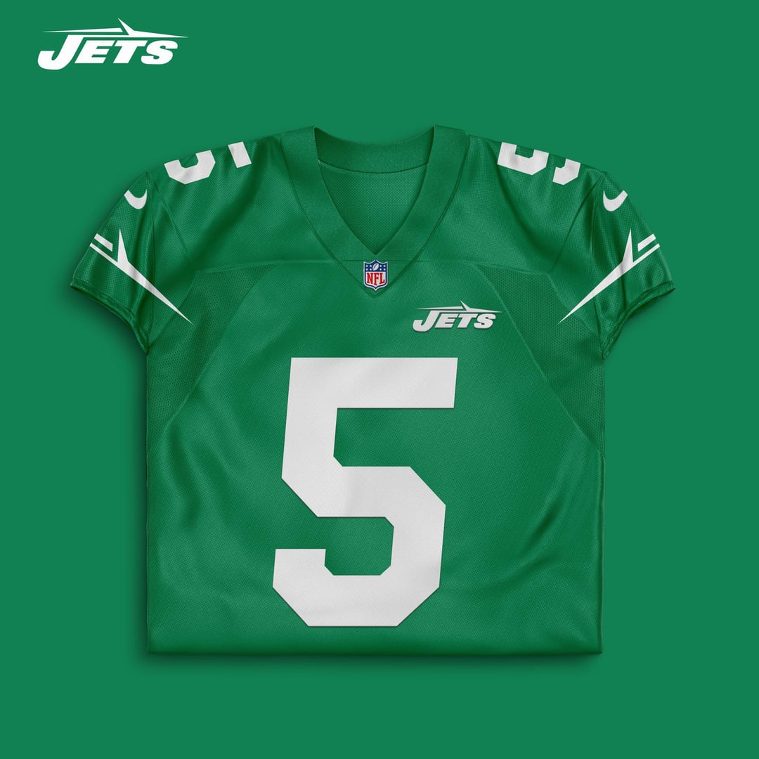
It’s a shame Twitter accounts can come up with better jerseys and logos than a professional organization. Christoper Johnson should be banned from 1 Jets Drive and shouldn’t be allowed to have a say in any decision making processes moving forward.
Not bad. I’d just make the J the same size as the other letters and unitalicize the numbers.
Besides the logo floating off center above the jersey number this is a really cool concept. Old logo was so much cooler
i despise our logo and i think these are a big upgrade over what we wear now but with that said, am i the only one who likes our uniforms? i think the new york on the chest looks great. the white & green combo we wore @ buf i really enjoyed.
white & black combo we wore on the win streak was real ugly though.
Jets logos could be worse. I’m a Panthers fan (grew up on Long Island— y’all are my backup team). We’re stuck with a cartoon cat head. Its childish and dumb.
It’s the equivalent of you having a cartoon plane.
looks clean, def would buy a sauce jersey in a heartbeat
I’m bothered by the non-centered Jets and I never like stripes that go past the shoulder
But overall these are good
Nike is pathetic. The majority of the re designs they have spent millions doing are worse than fan designs
Yes please.
I’m waiting until we change our jerseys to grab one of Sauce, Garrett, or Breece. I just can’t wear the current ones. They remind me too much of the Gase era. It’s time to turn the page. Also I previously had Jamal Adams and Le’Veon Bell jerseys, so they are just even more cursed for me personally.
100000 upvotes these are fire. really any jersey with the kelly green is a W
Huge fan of the no outline look on the numbers. Looks so much cleaner.
Is it just me or is the riser on the 5 just a little too long? The number just seems slightly off.
What about inverting the helmet colors? I feel like it’s the all green that makes us look like a college team
This is hot
This might be the best concept yet.
Logo is exactly what I would want, a modernization of the classic.
Color is on point.
Jersey is mostly on point too. I’m not crazy about the jet as the stripe thing or the bleeding out into the upper chest. I would stick with just basic stripes. I also think theres a bit too much green here, I would make the shoulders white with green stripes like our old jerseys. Other than that…lets start spamming the shit out of this to Woody
Yooooo. Dope. I like it. I’m a huge fan of that 80s tail fin logo…. But this is cool… it pays homage to that, but with a modern twist. Very cool. Would be very happy if these are our new uniforms
This is the way
Not a fan of the logo but I love the colors
A million x better than the football logo helmet we have now
The things that are wrong with our currents are still wrong with this one. Shoulder stripe is too long, the logo is not great with the oversized J and extra stripe, and the chest logo is worse than the centered New York Wordmark.
Love the helmet logo, I absolutely hate the current logo, I don’t mind the current color scheme I just despise the helmet logo and jersey design, sad how there’s so many better options online, Nike should just get a panel of fan designers like whoever made this one and pay them to make concepts instead of using whatever tone deaf boring designer they have now
But there is no football icon how do I know what sport they play! Jk I like it I’d prefer a darker green and I like the “J” from the old logo better but I’d take this over the current uni’s in a heartbeat
Jersey and helmet is amazing 🔥😮💨. Nike/Jets should really hire some of this people. Super talented!
The fans are screaming for this logo to come back, so naturally the next jerseys will be something completely different that no one asked for

26 comments
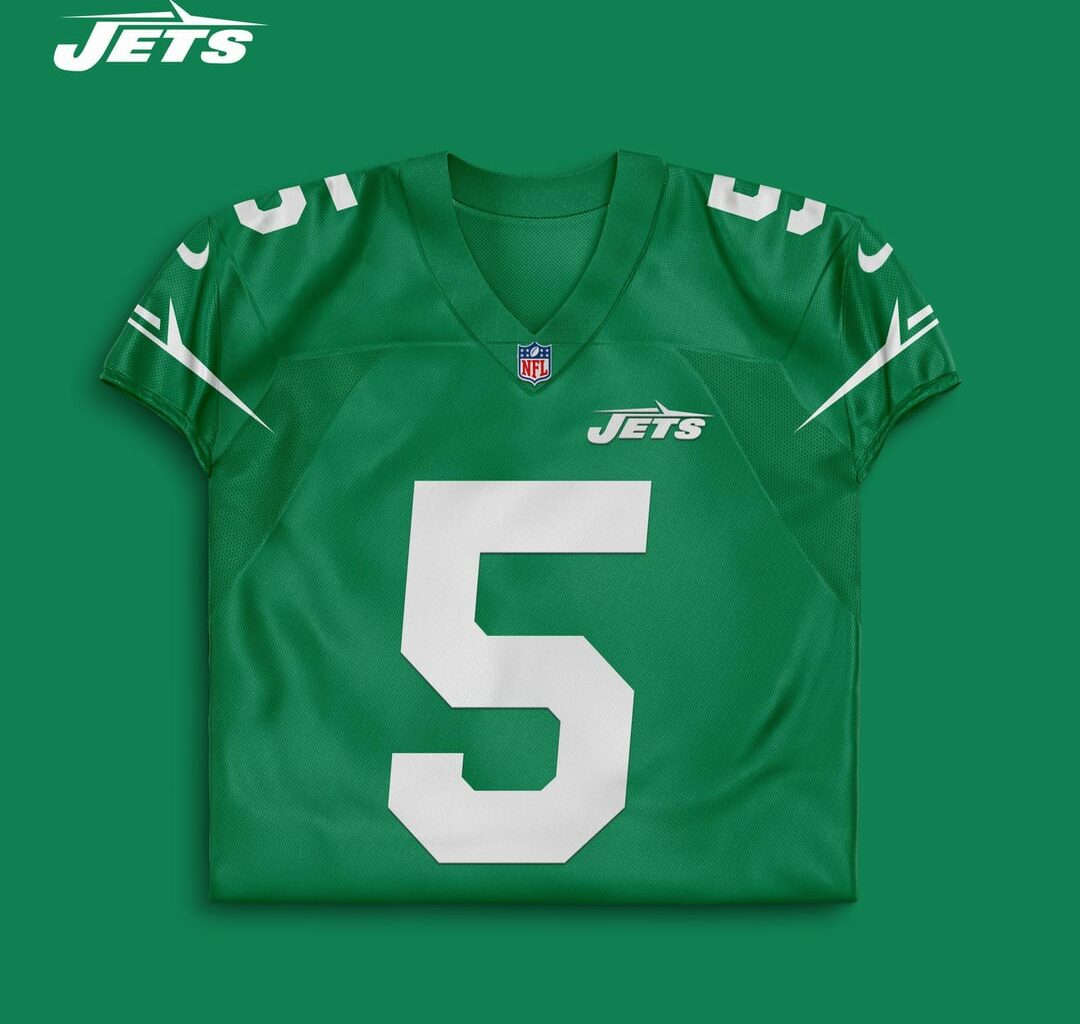
It’s a shame Twitter accounts can come up with better jerseys and logos than a professional organization. Christoper Johnson should be banned from 1 Jets Drive and shouldn’t be allowed to have a say in any decision making processes moving forward.
Not bad. I’d just make the J the same size as the other letters and unitalicize the numbers.
Besides the logo floating off center above the jersey number this is a really cool concept. Old logo was so much cooler
i despise our logo and i think these are a big upgrade over what we wear now but with that said, am i the only one who likes our uniforms? i think the new york on the chest looks great. the white & green combo we wore @ buf i really enjoyed.
white & black combo we wore on the win streak was real ugly though.
Jets logos could be worse. I’m a Panthers fan (grew up on Long Island— y’all are my backup team). We’re stuck with a cartoon cat head. Its childish and dumb.
It’s the equivalent of you having a cartoon plane.
looks clean, def would buy a sauce jersey in a heartbeat
I’m bothered by the non-centered Jets and I never like stripes that go past the shoulder
But overall these are good
Nike is pathetic. The majority of the re designs they have spent millions doing are worse than fan designs
Yes please.
I’m waiting until we change our jerseys to grab one of Sauce, Garrett, or Breece. I just can’t wear the current ones. They remind me too much of the Gase era. It’s time to turn the page. Also I previously had Jamal Adams and Le’Veon Bell jerseys, so they are just even more cursed for me personally.
100000 upvotes these are fire. really any jersey with the kelly green is a W
Huge fan of the no outline look on the numbers. Looks so much cleaner.
Is it just me or is the riser on the 5 just a little too long? The number just seems slightly off.
What about inverting the helmet colors? I feel like it’s the all green that makes us look like a college team
This is hot
This might be the best concept yet.
Logo is exactly what I would want, a modernization of the classic.
Color is on point.
Jersey is mostly on point too. I’m not crazy about the jet as the stripe thing or the bleeding out into the upper chest. I would stick with just basic stripes. I also think theres a bit too much green here, I would make the shoulders white with green stripes like our old jerseys. Other than that…lets start spamming the shit out of this to Woody
Yooooo. Dope. I like it. I’m a huge fan of that 80s tail fin logo…. But this is cool… it pays homage to that, but with a modern twist. Very cool. Would be very happy if these are our new uniforms
This is the way
Not a fan of the logo but I love the colors
A million x better than the football logo helmet we have now
The things that are wrong with our currents are still wrong with this one. Shoulder stripe is too long, the logo is not great with the oversized J and extra stripe, and the chest logo is worse than the centered New York Wordmark.
Love the helmet logo, I absolutely hate the current logo, I don’t mind the current color scheme I just despise the helmet logo and jersey design, sad how there’s so many better options online, Nike should just get a panel of fan designers like whoever made this one and pay them to make concepts instead of using whatever tone deaf boring designer they have now
But there is no football icon how do I know what sport they play! Jk I like it I’d prefer a darker green and I like the “J” from the old logo better but I’d take this over the current uni’s in a heartbeat
Jersey and helmet is amazing 🔥😮💨. Nike/Jets should really hire some of this people. Super talented!
The fans are screaming for this logo to come back, so naturally the next jerseys will be something completely different that no one asked for
★★☆☆☆