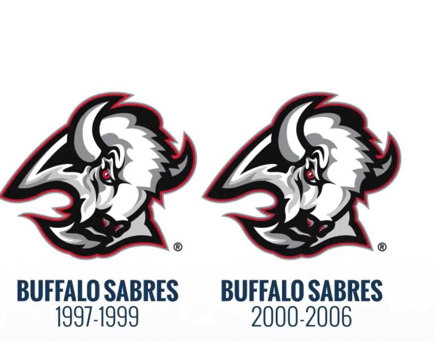
Just my opinion. I think this is the best team logo in their history and this team should go back to it
May 5, 2023
Just my opinion. I think this is the best team logo in their history and this team should go back to it
13 comments
We agree to disagree, but it’s definitely a killer third
It’s got plenty of buffalo but wheres the Sabres?
account is a troll
Awesome third but the blues might be the best jerseys around.
Great logo, but the team’s name is Sabres.
I don’t see any swords in there
No way. Please read up on John Rigas. The man who destroyed the Sabres while he owned them.
Anything but the slug.
Yes please
Karma farmer, OP is posting this in every teams sub.
Completely agree. I think its the most unique uniform in the league, and I personally have watched this entire drought with the Blue Sabres logo that it reminds me of bad times. I still like it dont get me wrong…but I just think black and red is crisp
Yeesh, no
Wrong.
Thankfully, most disagree. I’m still pissed they changed it to that in the first place. Then there’s the fact that the Rigas’s are more crooked than Trump ever was.