[Browns] Introducing our new official dog logo!! 🐾🎉 #DawgPound
and the winner is…
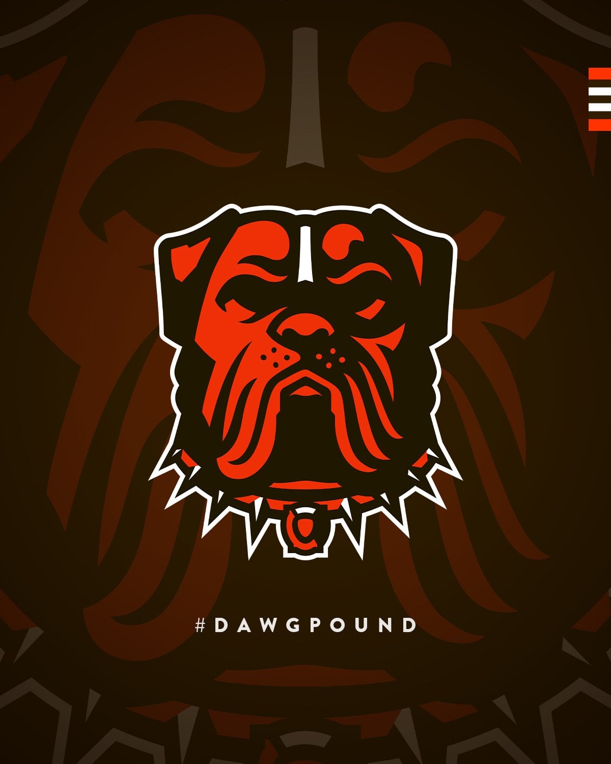
Introducing our new official dog logo!! 🐾🎉 #DawgPound pic.twitter.com/zny6NxobHy
— Cleveland Browns (@Browns) June 12, 2023

![[Browns] Introducing our new official dog logo!! 🐾🎉 #DawgPound](https://www.rawchili.com/wp-content/uploads/2023/06/plOVgqvszHTCVRmbY6_5p6DT22fEd93sfhoSnJ7IzUs-1200x1024.jpg)
[Browns] Introducing our new official dog logo!! 🐾🎉 #DawgPound
and the winner is…
Introducing our new official dog logo!! 🐾🎉 #DawgPound pic.twitter.com/zny6NxobHy
— Cleveland Browns (@Browns) June 12, 2023
19 comments
Welcome back, boys!
Are we back to the sub being open or just this one post to announce this?
Yeah its fine, i guess i wish he had eyes or at least all white so he looks evil.
It is indeed a logo. That’s about all I’ve got.
I didn’t vote for it, but it’s an improvement over the one we were using
Meh
Thank Buddha
All we really wanted was a white facemask. But this is fine, I guess.
Love it. Stoic in the face of the storm. Filled with nuggets of symbolism.
This dog goes hard 🔥
I feel like new sports logos always look bad just because you haven’t been seeing it for decades. Hopefully this one grows on me cuz I’m not feeling it at all
It’s good to be back
On another note I actually like the logo and think the better of the two won for sure.
Its trying to hard to look “tough.” Also, I think it looks terrible on a hat. And the secret references aren’t very creative or appealing.
I fear the elf and he isn’t a tryhard.
That being said, I would probably get a shirt with this logo.
One thing I can’t get over about this logo… is this dog supposed to have its mouth hanging open or shut closed? The triangle shape near the top of the mouth makes it look like it’s closed, but the orange line above the collar makes it look like its wide open.
Edit: This is how I keep seeing it [https://imgur.com/a/PtgYL55](https://imgur.com/a/PtgYL55)
The lack of eyes bothers me
Okay so the logo is cool. I really wish they’d find something they like and roll with it. It feels like they hate the helmet logo and probably a lot of younger fans do as well. In an attempt to find something new and cool that wont upset half the fan base, they find themselves working with 4 different logos at the moment. 2 elf logos, a helmet, and a new dog. They need to pick one and go with it. Personally I favor the old school elf that was on the field this year. Id be fine with this dog too. Just pick something. The branding is confused.
Dog version of Wilford Brimley
You think Dashaun Watson ever asked a masseuse if she wanted to go to the dog pound?
Yo…we aren’t supposed to be checking reddit