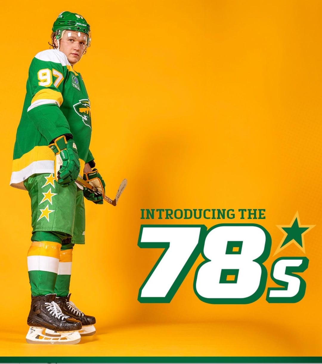
Everything about these unis are perfect except for the ad patch
Certified hood classic straight out of the gate.
Maaaaaaan I need one of these
Beauts
Honestly don’t like their logo recolored like that. Uniforms are great though.
Are they just making them full time alts, or are these gonna be the new home and away like was rumored?
Oh hell ya!!!
Looks like this Winnipegger will be headed to st Paul for a game or two this year!
Not a Wild fan but green and yellow NEED to be their primary look. It POPS
Are these their full-time jerseys? Or a third?
Uhhhh these are sick.
Our royal blues are still my favourites but these are sick.
These are great
dayum tho
Looks awesome. That yellow pops.
Holy smokes that’s incredible
Straight Up 🔥! You certainly knocked out of the park with these new thirds, Minnesota!
These are great, and I do think these should be their mains, BUT… I can’t unsee Subway. London Knights went to a similar colours and well yeah, Subway
I love the stars on the breezers
Are these alternates? Their home doesn’t need to be touched. Either way I love it.
That ad sure sucks.
Norris Division vibes…Basil McRae vs John Kordic
perfection
I’ll never get over ads on the jerseys. These are so clean but that ad just stands out too much
Nice! But that third pose tho…
Minnesota just consistently has great jerseys. Even the ones that were not the best, like when they switched to red for a while, were still pretty good. They just don’t miss, and this is no different.
Huge improvement over the Christmas Elf theme, but still in contention for ugliest jerseys in the league, IMO.
Ugh… so sick of re-treading the North Stars…
Dude the modern logo in those retro colours? Fuck yeah, these are sick
Man this is a great jersey. Too bad that fugly ad patch has to be there.
Full time pleaaaaaase
JEEK looks like an action figure here lol
Hate Minny but these are straight 🔥🔥
Those are boss. Reminds me of John Deere tractors.
These are so much better then their regular unis
YES!!!
Really great jersey but when will this team give up on the North Stars? It’s not their franchise so there’s no history to 1978.
They need white skates to complete the look.
Amazing unis and it is a straight up travesty they aren’t called the north stars. The wild is such a bad name, I hate when franchises relocate and then don’t rebrand them name, it’s super disrespectful imo.
I mean I like them but they aren’t these the reverse retro they just had last year?
Yuck
I like it. Nice call-back.
Fuck those are NICE! Don’t get me wrong I really like their forest green, red and cream jerseys, but when you think Minnesota hockey the North Stars are one of the first thing you think of, and those colours really pop out at you
They look like they are modeling for new Sprite cans
Sorry but the design of the 2000s logo does not match the retro colours one bit. They should have put an M on there similar to the old N.
These are beauts.
The ad patch is terrible but the rest of the uniform is sweet especially the stars on the pants
My one gripe is the Minnesota state emblem being on the jersey twice, but not in a symmetrical way. Maybe on both shoulders would have been fine, IMO, or just as the C/A badge. Nitpicking, I know. Otherwise, a good look.

50 comments
Fuck that’s hot
[deleted]
Terrific
I dig the “A” patch
Fuckin’ *LOVE* these.
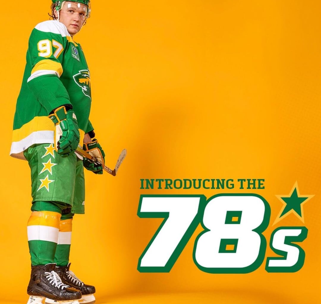
Everything about these unis are perfect except for the ad patch
Certified hood classic straight out of the gate.
Maaaaaaan I need one of these
Beauts
Honestly don’t like their logo recolored like that. Uniforms are great though.
Are they just making them full time alts, or are these gonna be the new home and away like was rumored?
Oh hell ya!!!
Looks like this Winnipegger will be headed to st Paul for a game or two this year!
Not a Wild fan but green and yellow NEED to be their primary look. It POPS
Are these their full-time jerseys? Or a third?
Uhhhh these are sick.
Our royal blues are still my favourites but these are sick.
These are great
dayum tho
Looks awesome. That yellow pops.
Holy smokes that’s incredible
Straight Up 🔥! You certainly knocked out of the park with these new thirds, Minnesota!
These are great, and I do think these should be their mains, BUT… I can’t unsee Subway. London Knights went to a similar colours and well yeah, Subway
I love the stars on the breezers
Are these alternates? Their home doesn’t need to be touched. Either way I love it.
That ad sure sucks.
Norris Division vibes…Basil McRae vs John Kordic
perfection
I’ll never get over ads on the jerseys. These are so clean but that ad just stands out too much
Nice! But that third pose tho…
Minnesota just consistently has great jerseys. Even the ones that were not the best, like when they switched to red for a while, were still pretty good. They just don’t miss, and this is no different.
Huge improvement over the Christmas Elf theme, but still in contention for ugliest jerseys in the league, IMO.
Ugh… so sick of re-treading the North Stars…
Dude the modern logo in those retro colours? Fuck yeah, these are sick
Man this is a great jersey. Too bad that fugly ad patch has to be there.
Full time pleaaaaaase
JEEK looks like an action figure here lol
Hate Minny but these are straight 🔥🔥
Those are boss. Reminds me of John Deere tractors.
These are so much better then their regular unis
YES!!!
Really great jersey but when will this team give up on the North Stars? It’s not their franchise so there’s no history to 1978.
They need white skates to complete the look.
Amazing unis and it is a straight up travesty they aren’t called the north stars. The wild is such a bad name, I hate when franchises relocate and then don’t rebrand them name, it’s super disrespectful imo.
I mean I like them but they aren’t these the reverse retro they just had last year?
Yuck
I like it. Nice call-back.
Fuck those are NICE! Don’t get me wrong I really like their forest green, red and cream jerseys, but when you think Minnesota hockey the North Stars are one of the first thing you think of, and those colours really pop out at you
They look like they are modeling for new Sprite cans
Sorry but the design of the 2000s logo does not match the retro colours one bit. They should have put an M on there similar to the old N.
These are beauts.
The ad patch is terrible but the rest of the uniform is sweet especially the stars on the pants
My one gripe is the Minnesota state emblem being on the jersey twice, but not in a symmetrical way. Maybe on both shoulders would have been fine, IMO, or just as the C/A badge. Nitpicking, I know. Otherwise, a good look.
Well guess I’m buying a Kaprizov one