I’m not a huge fan of the arm stripes, other than that it’s pretty fucking ugly.
That ain’t it.
Boring
I like the color scheme but it just looks…cheap
I thought the Liberty jerseys might be given another go?
Not only no, but fuck no
I kind of like it. It’s not great though
Looks like shit
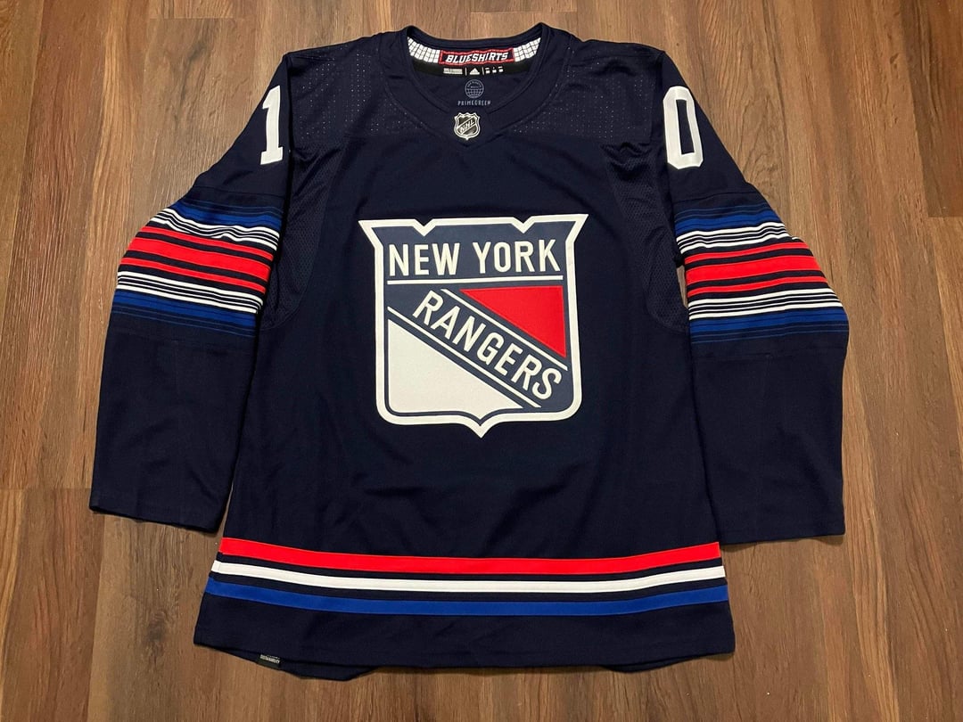
The stripes on the arms remind me of those year-long per-day temperature maps.
BFBS
fuuuuuuuuuuck that
I mean it literally says “Blueshirts” in the collar but the thing is fucking black. Just stupid.
Every time a third jersey gets leaked people say it sucks then it looks good on the ice
Yes please. I want one
Is that just placeholder text or is this what they’ll look like on the ice? Because stripes and color schemes aside, wow is that a boring font for the nameplate and number.
I’m pretty sure my Mom has purchased a shirt from Costco with that elbow stripe pattern
Unleak it!!
Why does it feel like it would work great with the Islanders or Capitals but with the Rangers logo it just looks very, very off.
Put it back.
that looks like something you’d try to make in a video game and give up 30 seconds into the process
What was the vision or inspiration here? This is the most dull, lifeless Rangers jersey I’ve ever seen.
Hm maybe I *won’t* miss adidas when they stop making jerseys. 🤢
Here’s more detail photos of my jersey if anyone wanted to see more.
especially with THAT crest what a weirdly unbalanced and busy jersey
That’s terrible
Good Lord that is fucking ugly.
Something about using the shield as a primary logo feels so lazy. I always liked the Statue of Liberty one because it was at least unique. This feels like some weird template type of thing
You had *one job*, Rangers. Literally all you had to do was bring back the Liberty jersey, maybe add a proper hem stripe and you were *golden*. This just looks like a shittier version of the Devils alt, which was *already* considered a mediocre alternate; so they somehow made a jersey more mid than the *definition of a mid alternate*.
Well, I guess it *could* also be a Stadium Series leak, which might make it a bit more bearable. That, or some kind of scrapped alternate that leaked out.
Truly the circle of Reddit. Guy on Reddit finds it listed online, drives hours to get it, posts it here, it gets posted to Twitter, then someone posts it here with a link to Twitter 🤣
No “3D” numbers/letters on a Rangers jersey just looks so wrong. I don’t mind their shield-like crest on the front, but between the main shade of blue used and the mono-white numbers/letters, they managed to take a very distinct and recognizable uniform and make it look generic as fuck. Those arm band stripes look pretty ugly, too.
I think it looks great.
I buy one jersey every year and NYR is always tough to pass up, but I always do. We shall see..
Man I think its great. Sucks.
Rags logo just doesn’t work as a main crest. Other than that I actually like it
Just bring back the heritage jerseys. Literally every ranger fans favorite alternate and they’ve been gone for so long. I’d buy a Shesterkin heritage jersey so fast
this looks like a knock off jersey that you would buy for $10 on a NY street corner
Do the owners mistreses design these black uniforms yeeesh.

44 comments
I can dig it
Wow that’s awful
If it just a few more stripes it would be perfect
The sleeves gave me vertigo
I’m not a huge fan of the arm stripes, other than that it’s pretty fucking ugly.
That ain’t it.
Boring
I like the color scheme but it just looks…cheap
I thought the Liberty jerseys might be given another go?
Not only no, but fuck no
I kind of like it. It’s not great though
Looks like shit
The stripes on the arms remind me of those year-long per-day temperature maps.
BFBS
fuuuuuuuuuuck that
I mean it literally says “Blueshirts” in the collar but the thing is fucking black. Just stupid.
Every time a third jersey gets leaked people say it sucks then it looks good on the ice
Yes please. I want one
Is that just placeholder text or is this what they’ll look like on the ice? Because stripes and color schemes aside, wow is that a boring font for the nameplate and number.
I’m pretty sure my Mom has purchased a shirt from Costco with that elbow stripe pattern
Unleak it!!
Why does it feel like it would work great with the Islanders or Capitals but with the Rangers logo it just looks very, very off.
Put it back.
that looks like something you’d try to make in a video game and give up 30 seconds into the process
What was the vision or inspiration here? This is the most dull, lifeless Rangers jersey I’ve ever seen.
Hm maybe I *won’t* miss adidas when they stop making jerseys. 🤢
Here’s more detail photos of my jersey if anyone wanted to see more.
https://www.reddit.com/r/hockeyjerseys/s/DcrrmLbLjZ
“Which shade of blue?”
“YES!”
No.
Just…*no.*
not a fan of the dark navy color
Yuck
lmao oh god its so bad jesus
especially with THAT crest what a weirdly unbalanced and busy jersey
That’s terrible
Good Lord that is fucking ugly.
Something about using the shield as a primary logo feels so lazy. I always liked the Statue of Liberty one because it was at least unique. This feels like some weird template type of thing
You had *one job*, Rangers. Literally all you had to do was bring back the Liberty jersey, maybe add a proper hem stripe and you were *golden*. This just looks like a shittier version of the Devils alt, which was *already* considered a mediocre alternate; so they somehow made a jersey more mid than the *definition of a mid alternate*.
Well, I guess it *could* also be a Stadium Series leak, which might make it a bit more bearable. That, or some kind of scrapped alternate that leaked out.
Truly the circle of Reddit. Guy on Reddit finds it listed online, drives hours to get it, posts it here, it gets posted to Twitter, then someone posts it here with a link to Twitter 🤣
[Here’s the thread from the guy who found it](https://www.reddit.com/r/hockeyjerseys/s/xSs4XSDrsF)
No “3D” numbers/letters on a Rangers jersey just looks so wrong. I don’t mind their shield-like crest on the front, but between the main shade of blue used and the mono-white numbers/letters, they managed to take a very distinct and recognizable uniform and make it look generic as fuck. Those arm band stripes look pretty ugly, too.
I think it looks great.
I buy one jersey every year and NYR is always tough to pass up, but I always do. We shall see..
Man I think its great. Sucks.
Rags logo just doesn’t work as a main crest. Other than that I actually like it
Just bring back the heritage jerseys. Literally every ranger fans favorite alternate and they’ve been gone for so long. I’d buy a Shesterkin heritage jersey so fast
this looks like a knock off jersey that you would buy for $10 on a NY street corner
Do the owners mistreses design these black uniforms yeeesh.
I like it
looks like the inside of a gobstopper