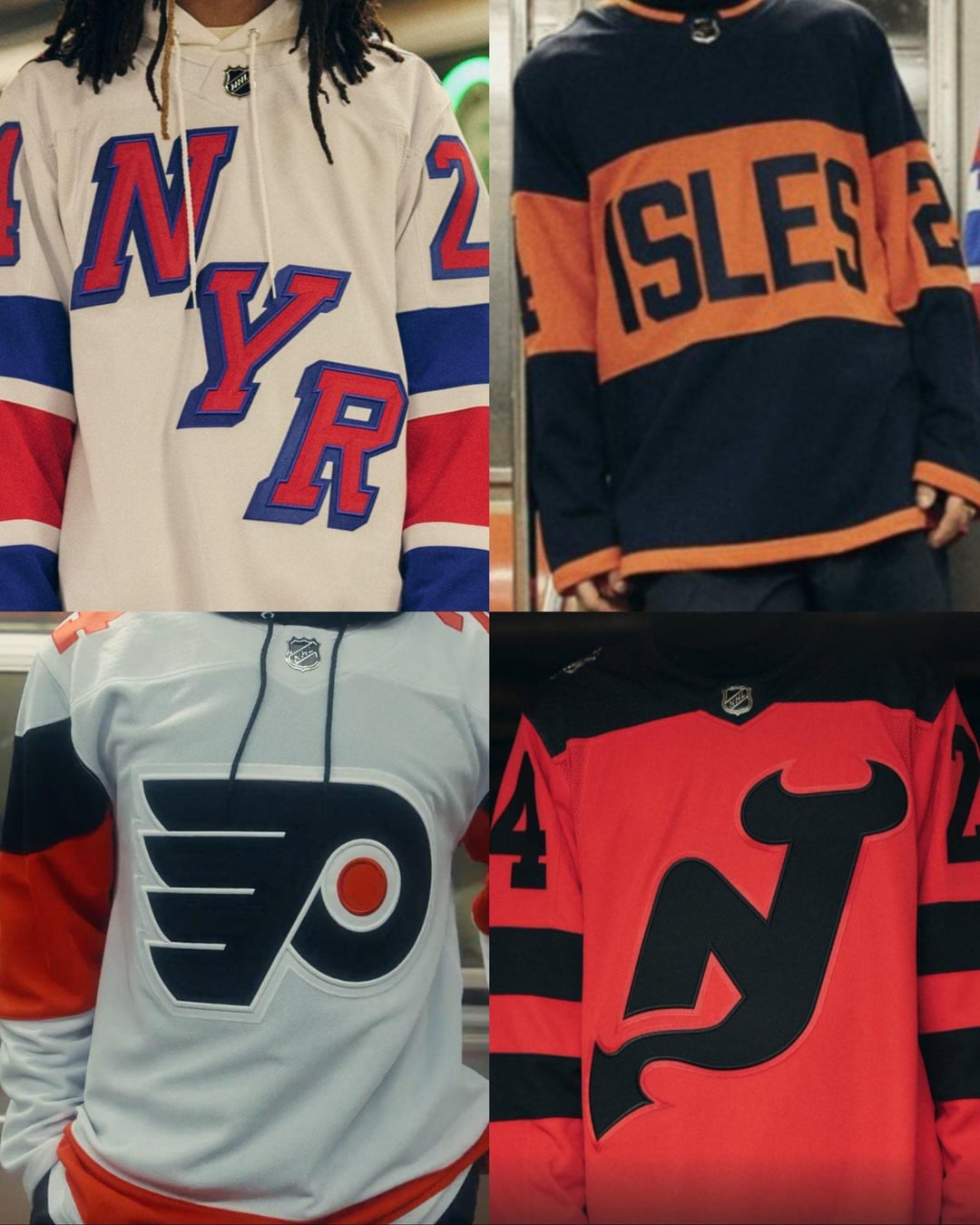
Hate to shit on someone’s 3 minutes of hard work but those Islanders jerseys suck, thought they were the Flyer’s at first. Not like the other’s are winning any awards tho.
I hate the Flyers one less by just looking at the others.
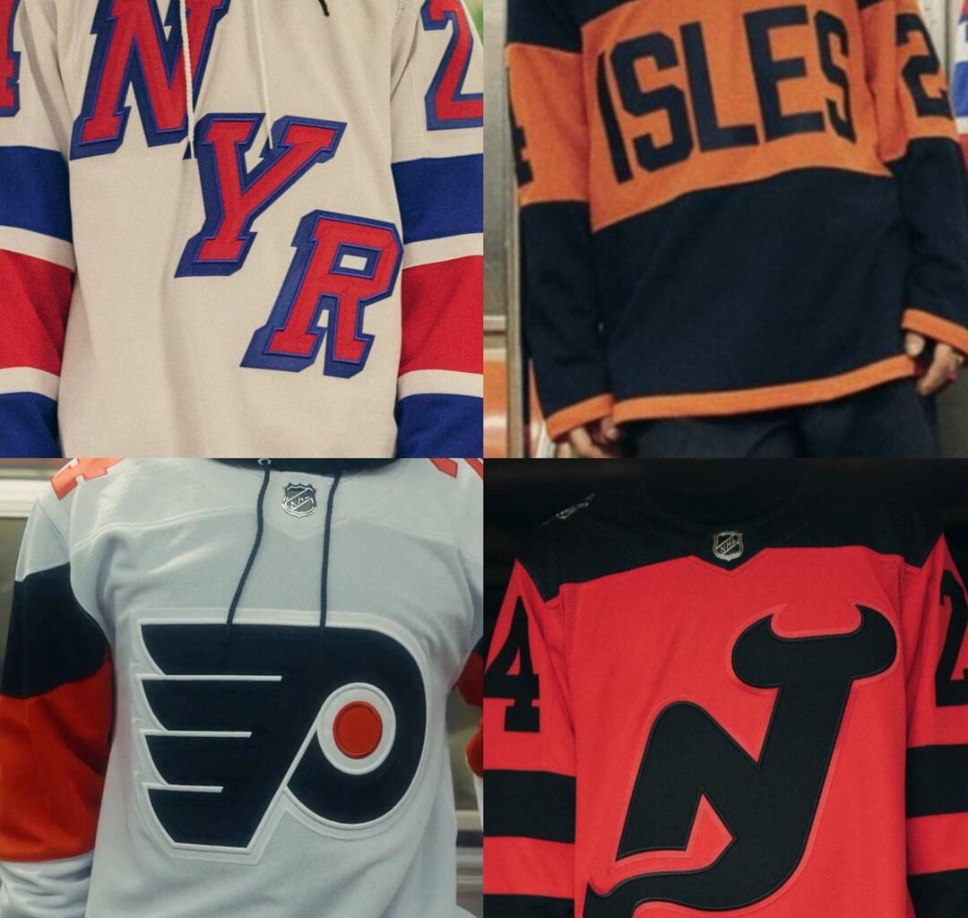
I mean, they’re alright. Inoffensive. I’d even say that the flyers one is neat. But they’re boring.
Like the flyers and Devils jerseys, they play with color inversion pretty well.
The New York teams look like jerseys from like a football manager esque 3D engine where they don’t have the rights to make realistic jerseys and just made 2 incredibly generic jerseys
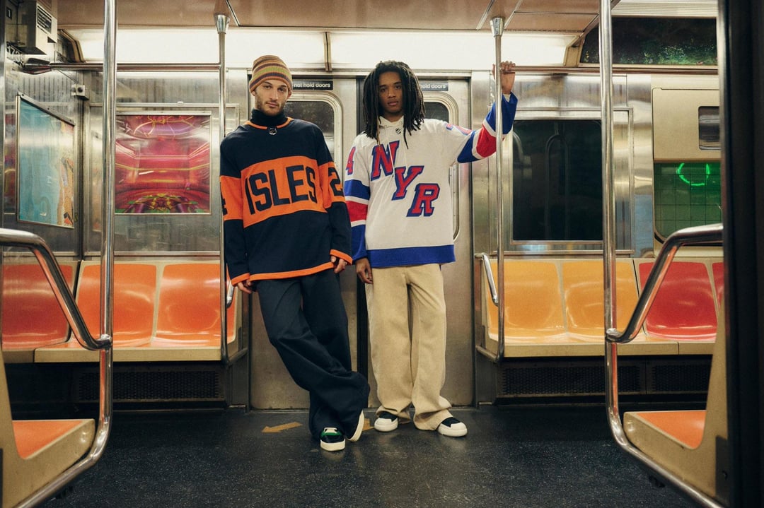
I figured people would appreciate the photos themselves rather than a link to a twitter video
These make me feel even better about the Sharks new Alternates
Definitely whelmed
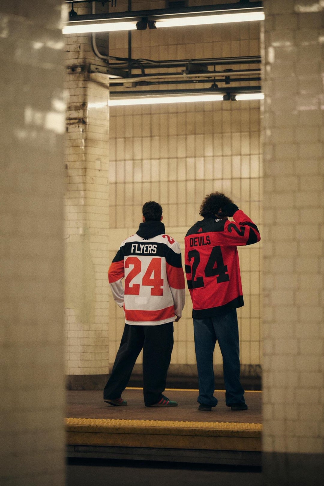
Flyers one isn’t too bad but then the back design. Pretty much have to get a name on it otherwise.
These are all pretty sick. You guys just have bad taste.
Gonna be grateful for what we had when fanatics takes over I swear
im impressed by how awful these are.
I had zero expectations and yet I’m still disappointed looking at these.
Devils and Rangers are good. Flyers are solid.
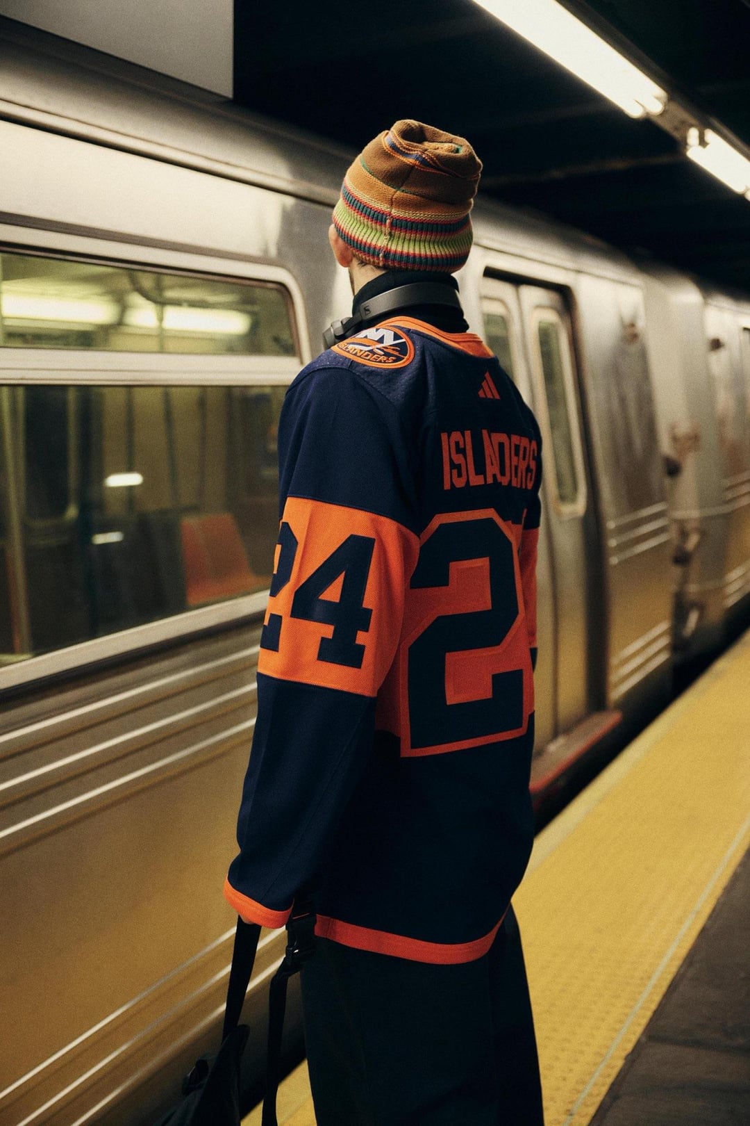
Islanders are horrendous
All of them are very boring. NJ’s is ok because it’s hard to go wrong with red and black. Isles and NYR are awful.
Designer saved me like $180 thanks bro
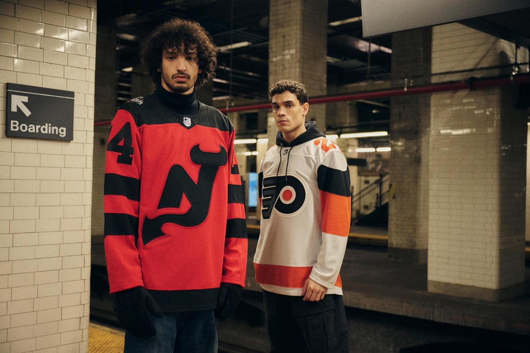
I like the New Jersey and Philadelphia Jerseys.
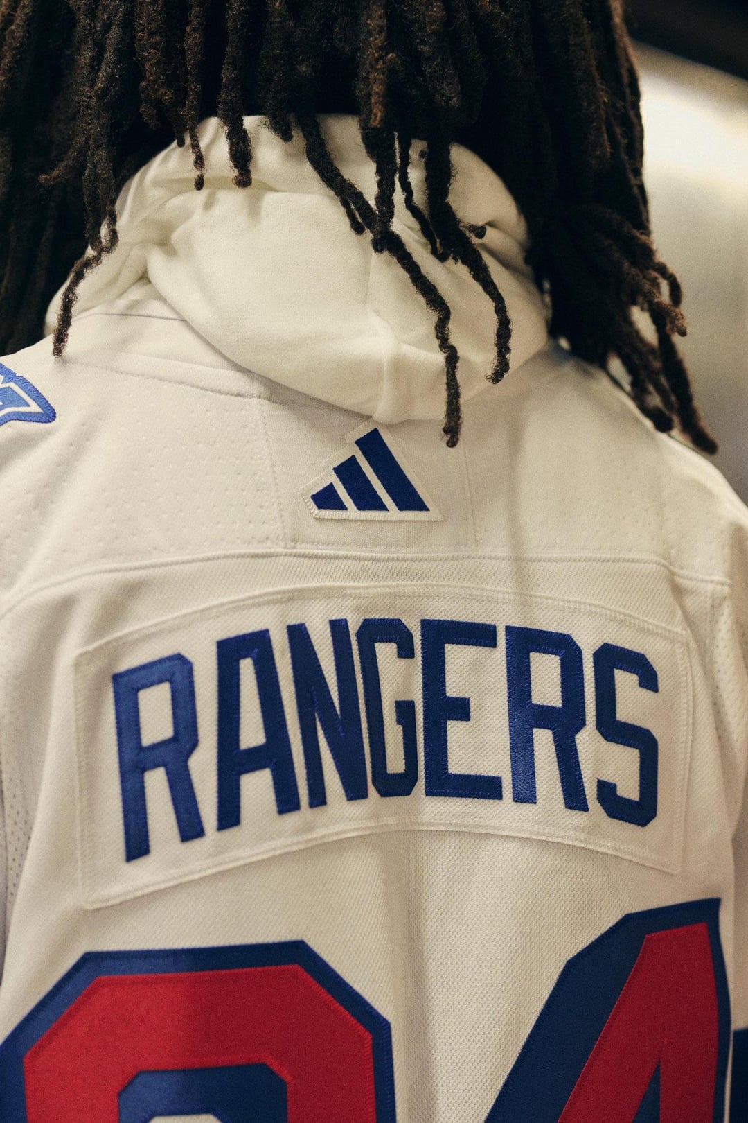
The Rangers one is okay but nothing special.
The Islanders Jersey is awful.
The Rangers one is okay, though generally I don’t like the diagonal word logos
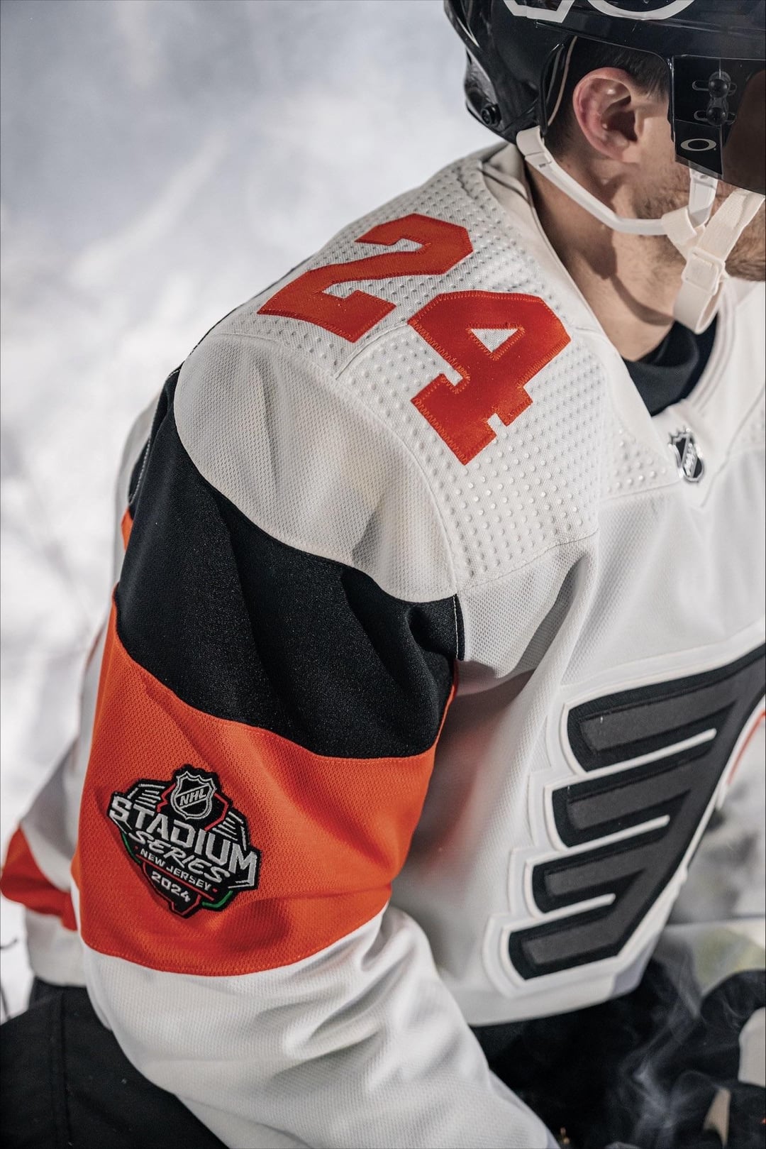
Flyers is okay because the striping is like, kind of unique?
Isles and Devils are really bad to me
Can we talk about how they used Chambers Street, widely known as the most disgusting station in the system, to promote these jerseys
I like all of them individually, but I feel like the matchup colors aren’t very cohesive. Like both the Isles and Devil’s have that dichromatic look, but rather for doing something similar with the Flyers and Rangers, they took a different direction.
Some of you guys would hate any jersey that came out
I like the Flyers, the Devils isn’t that different from what they already wear so it’s fine I guess. I get why the Islanders and Rangers look the way they do (they’re meant to be seen from far away) but man the script is just a little too big on those for me.
Edit: typo
Flyers and Rangers are pretty nice.
The back of the flyers jersey is pretty cool how all the colors flow and make an interesting name plate.
Rangers just looks clean with the letters and the colors on the sleeves are perfect.
The devils just followed the canes inverted color scheme/logo and splashed a whole lot of red.
Islanders just said what if we took the smashville jersey made it more boring and minimal….
Flyers are easily the nicest imo. The Rangers and Devils are decent. The Isles one sucks.
If your jersey could pass for an Oilers or Flyers jersey, it’s probably terrible.
Lazy fuckers.
Flyers best imo. Devils is fine. Rags and Isles… Could’ve been worse I guess?
Flyers one is nice. The rest are hideous.
I hate the fact that I like the Rangers one the best
New Jersey A-
Flyers B+
Rangers B
Islanders D-
Fucking loooooove the Devils one
I don’t get it.
Every Summer, there are plenty of people posting awesome mock jerseys that they have made on their spare time and yet the NHL would rather pay actual money to designers that create those ugly ass monstrosities.
Isles is the worst, Devils is bad, Flyers and Rangers are okay/good. Probably an unpopular opinion though.
The jersey unveiling pics would be way better if they were waiting for the train at Secaucucs junction.
Devils and Islanders goin hard
I wish they would show the full uniform when they did this. Seeing the full kit really helps. Was that released? Seeing the players wearing them on the ice always makes them look cooler. I think that will make the devils jerseys look better..I hope they go black shells and all red socks..maybe one or two black stripes on the socks, but not their current socks. The white would look weird. Black helmets are probably a given. Rangers are cool. For me the flyers are not different enough. And the islanders. Oof idk if there’s any helping that.
The devil’s one goes hard
Whoever designed the Isles jersey is obviously a Ranger fan
NYR > NJD > PHI > > > > > NYI
NJ’s 🔥
Simple but clean
Devils looks really good. Def better than the stupid “jersey” jersey.
Flyers looks like a normal Flyers jersey of year’s past, so…okay.
Rangers is not great. Like a knockoff or fan concept.

40 comments
There’s low effort and then there’s these jerseys
Hate to shit on someone’s 3 minutes of hard work but those Islanders jerseys suck, thought they were the Flyer’s at first. Not like the other’s are winning any awards tho.
I hate the Flyers one less by just looking at the others.
I mean, they’re alright. Inoffensive. I’d even say that the flyers one is neat. But they’re boring.
Like the flyers and Devils jerseys, they play with color inversion pretty well.
The New York teams look like jerseys from like a football manager esque 3D engine where they don’t have the rights to make realistic jerseys and just made 2 incredibly generic jerseys
I figured people would appreciate the photos themselves rather than a link to a twitter video
These make me feel even better about the Sharks new Alternates
Definitely whelmed
Flyers one isn’t too bad but then the back design. Pretty much have to get a name on it otherwise.
These are all pretty sick. You guys just have bad taste.
Gonna be grateful for what we had when fanatics takes over I swear
im impressed by how awful these are.
I had zero expectations and yet I’m still disappointed looking at these.
Devils and Rangers are good. Flyers are solid.
Islanders are horrendous
All of them are very boring. NJ’s is ok because it’s hard to go wrong with red and black. Isles and NYR are awful.
Designer saved me like $180 thanks bro
I like the New Jersey and Philadelphia Jerseys.
The Rangers one is okay but nothing special.
The Islanders Jersey is awful.
The Rangers one is okay, though generally I don’t like the diagonal word logos
Flyers is okay because the striping is like, kind of unique?
Isles and Devils are really bad to me
Can we talk about how they used Chambers Street, widely known as the most disgusting station in the system, to promote these jerseys
I like all of them individually, but I feel like the matchup colors aren’t very cohesive. Like both the Isles and Devil’s have that dichromatic look, but rather for doing something similar with the Flyers and Rangers, they took a different direction.
Some of you guys would hate any jersey that came out
I like the Flyers, the Devils isn’t that different from what they already wear so it’s fine I guess. I get why the Islanders and Rangers look the way they do (they’re meant to be seen from far away) but man the script is just a little too big on those for me.
Edit: typo
Flyers and Rangers are pretty nice.
The back of the flyers jersey is pretty cool how all the colors flow and make an interesting name plate.
Rangers just looks clean with the letters and the colors on the sleeves are perfect.
The devils just followed the canes inverted color scheme/logo and splashed a whole lot of red.
Islanders just said what if we took the smashville jersey made it more boring and minimal….
Flyers are easily the nicest imo. The Rangers and Devils are decent. The Isles one sucks.
If your jersey could pass for an Oilers or Flyers jersey, it’s probably terrible.
Lazy fuckers.
Flyers best imo. Devils is fine. Rags and Isles… Could’ve been worse I guess?
Flyers one is nice. The rest are hideous.
I hate the fact that I like the Rangers one the best
New Jersey A-
Flyers B+
Rangers B
Islanders D-
Fucking loooooove the Devils one
I don’t get it.
Every Summer, there are plenty of people posting awesome mock jerseys that they have made on their spare time and yet the NHL would rather pay actual money to designers that create those ugly ass monstrosities.
Isles is the worst, Devils is bad, Flyers and Rangers are okay/good. Probably an unpopular opinion though.
The jersey unveiling pics would be way better if they were waiting for the train at Secaucucs junction.
Devils and Islanders goin hard
I wish they would show the full uniform when they did this. Seeing the full kit really helps. Was that released? Seeing the players wearing them on the ice always makes them look cooler. I think that will make the devils jerseys look better..I hope they go black shells and all red socks..maybe one or two black stripes on the socks, but not their current socks. The white would look weird. Black helmets are probably a given. Rangers are cool. For me the flyers are not different enough. And the islanders. Oof idk if there’s any helping that.
The devil’s one goes hard
Whoever designed the Isles jersey is obviously a Ranger fan
NYR > NJD > PHI > > > > > NYI
NJ’s 🔥
Simple but clean
Devils looks really good. Def better than the stupid “jersey” jersey.
Flyers looks like a normal Flyers jersey of year’s past, so…okay.
Rangers is not great. Like a knockoff or fan concept.
Islanders is abysmal.