
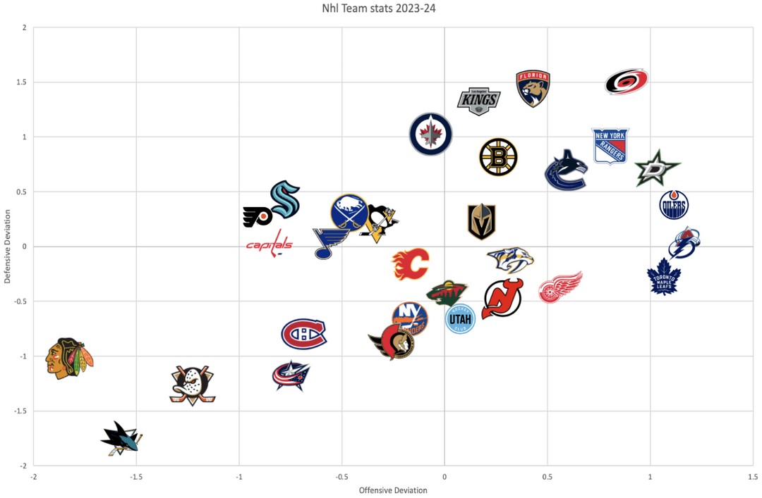
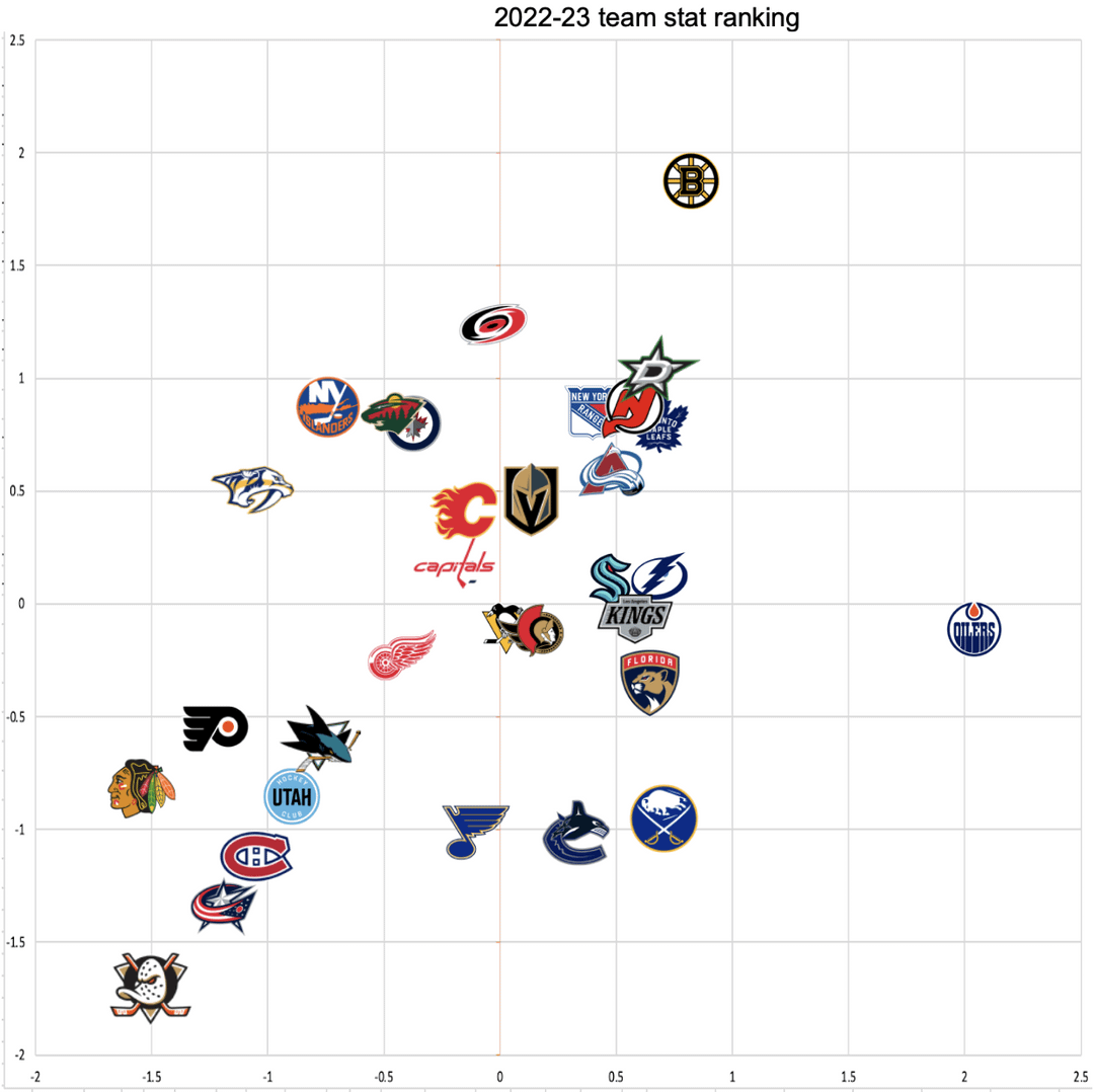
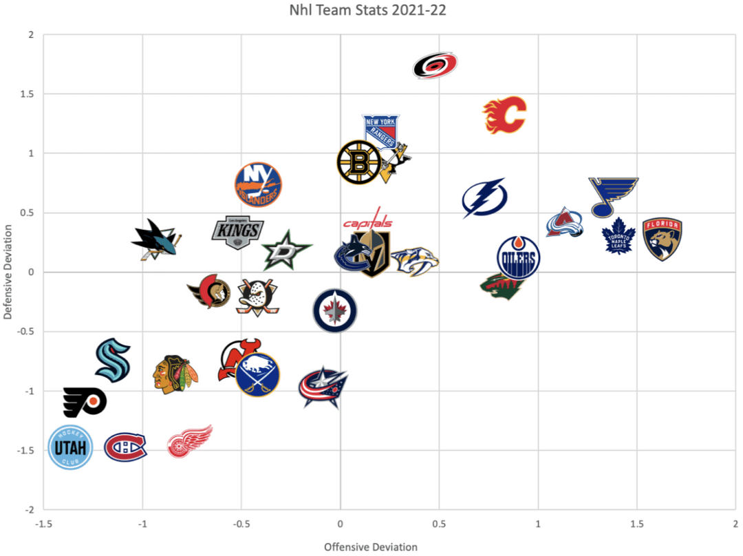
This is a 4 quadrant graph. Quadrant 1(top right) is teams that are above average in both offense and defense, aka "good balanced" teams. These teams are almost always playoff caliber.
Quadrant 2(top left) is teams with above average defenses and below average offenses. Moneypuck calls these teams "boring" on their charts(usually corsi or expected charts). These teams usually play slower grinding games or are teams that are heavily helped by goaltending.
Quadrant 3(bottom left) is teams with both below average offenses and defenses aka bad teams. These teams rarely make the playoffs and many here are usually the bottom 10 or so teams by point %.
Quadrant 4(bottom right) is teams with above average offenses and below average defenses. Moneypuck calls these teams "fun" on their charts because they usually have high scoring shootout type games.
If you'd want me to make more graphs/charts like this in the future lmk.
10 comments
Flames in the middle, as is tradition
Don’t mind me, I’ll just be over here crying about our playoff underperformance again.
I knew the Leafs defense wasn’t the best but worse than Buffalo?
>>These teams are almost always playoff caliber
Yet somehow the Canucks have managed to go 1/3. Sound about right.
Swirly logo team good at analytics piece 100
So the jets are good but somehow middle of the pack. Yea, it sounds extremely right.
Show us inclusive of 2020.
I know what you’re hiding
What do these numbers signify – deviations from what? Which team stats? Are we talking GF and GA? Expected stats? 5v5? Why are the x and y scales different in some graphs? Why are the scales different year to year?
I feel like a frustrated math teacher here.
Having a bad offense feels so weird
I see the milky way and orion’s belt