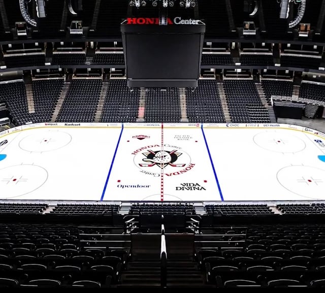
New Center Ice Logo at Honda Center 7 comments That’s such a clean look. So happy they moved on from the duck foot. Careful you don’t get fired for sharing this The 10th centre ice design in team history. See the other ones here: [https://twitter.com/AnaDucksHistory/status/1831814913511379146](https://twitter.com/AnaDucksHistory/status/1831814913511379146) finally, all is right in the world [better quality](https://i.imgur.com/CT6BSmL.jpeg) close up provided by the ducks instagram really liking how the red line is outlined around the logo. previously was a solid red line all across, essentially splitting the logo into halves We had some banger looks locked away in storage for decades I’m thinking they should’ve gone with dual logos so that the eye doesn’t have the center ice line slicing through it Leave a ReplyYou must be logged in to post a comment.
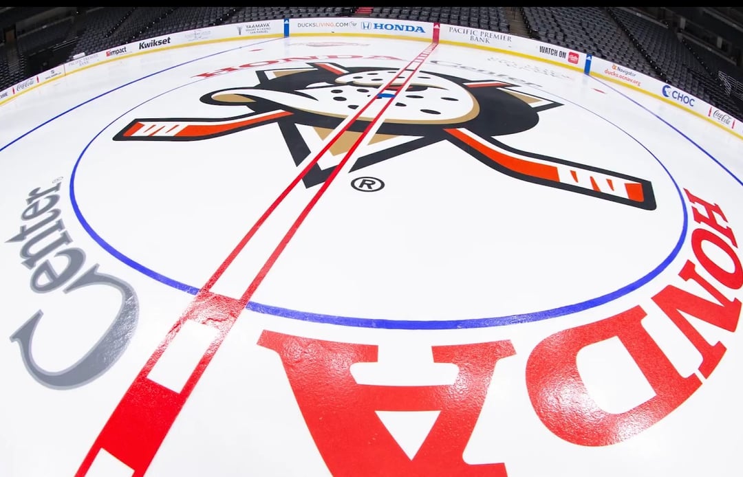
The 10th centre ice design in team history. See the other ones here: [https://twitter.com/AnaDucksHistory/status/1831814913511379146](https://twitter.com/AnaDucksHistory/status/1831814913511379146)
[better quality](https://i.imgur.com/CT6BSmL.jpeg) close up provided by the ducks instagram really liking how the red line is outlined around the logo. previously was a solid red line all across, essentially splitting the logo into halves
I’m thinking they should’ve gone with dual logos so that the eye doesn’t have the center ice line slicing through it

7 comments
That’s such a clean look. So happy they moved on from the duck foot.
Careful you don’t get fired for sharing this
The 10th centre ice design in team history. See the other ones here: [https://twitter.com/AnaDucksHistory/status/1831814913511379146](https://twitter.com/AnaDucksHistory/status/1831814913511379146)
finally, all is right in the world
[better quality](https://i.imgur.com/CT6BSmL.jpeg) close up provided by the ducks instagram
really liking how the red line is outlined around the logo. previously was a solid red line all across, essentially splitting the logo into halves
We had some banger looks locked away in storage for decades
I’m thinking they should’ve gone with dual logos so that the eye doesn’t have the center ice line slicing through it