
If you all would allow me, I’d like to start a tradition that r/baseball does every season, and that’s look at scorebugs. I have OCD and one of my biggest obsessions, along with passions, is graphic design.
With the start of the 2024-25 NHL season, we’ve seen a LOT of new scorebugs are a result of teams going off and doing their own broadcasts over the air, as opposed to traditional RSNs like ROOT, Bally, etc. I imagine this will continue over the next few seasons, so I thought this would be a great time to finally start this tradition, as scorebugs are important whether you’re an old or new fan. You need to know what’s going on and what the score is.
Let’s start with the national broadcasts:
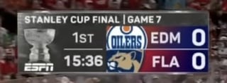
ESPN: I hate scorebugs with the network logo in there, as if we didn’t know what channel we were on already. Just an unnecessary waste of space. Other than that the scorebug is solid, not really a huge fan of the gradient colors for each team in the back. No shots on goal is an L also, and some of the animations (goal animation specifically) are a bit over the top for me. I like that they only abbreviate the Kings and Lightning as LA and TB, I hate how LAK and TBL look. Overall, solid look but could be better, 6.5/10
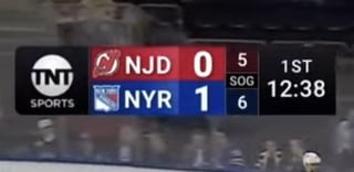
TNT: the hallmark of scorebugs. I could do without the network logo, but overall this has everything you want. Clear colors, SOG throughout the entire game, a simple but effective scorebug that gets the job done. Their abbreviations annoy me though (NJD just makes me cringe). Other than that though, this is perfect and the second best national scorebug imo. 9/10
TSN (MTL, OTT, TOR, WPG): perfection. Absolute perfection. I would knock off .5 for the network logo, but I’ll allow it here as I think it would look a bit weird without it. Shots showing at all times, graphics in general are really good, and the thinnest of the scorebugs here so it’s very out of the way and shows you what you need. Also, the theme is beautiful. 10/10
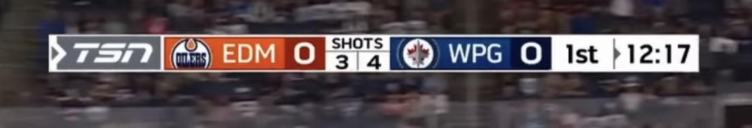
SportsNet (CGY, EDM, TOR, VAN): gross. A massive downgrade from what they had prior. Animations like a team on the power play doesn’t look great, and if you’re gonna choose between the logo or the abbreviations of the city/state, I’d prefer the logo. At least they show the shots? 6/10
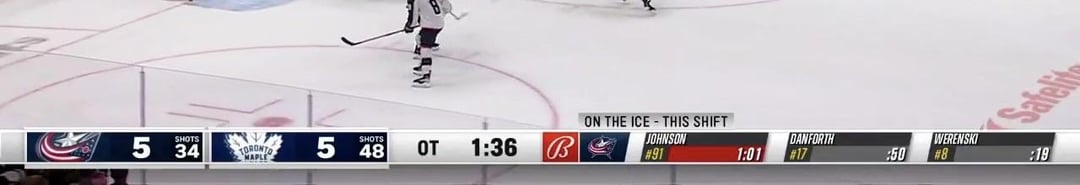
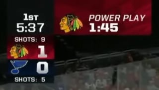
Bally Sports (CAR, CBJ, DET, LA, MIN, NSH, STL, TB): a travesty to sports. Fox’s theme and most recent scorebug were beautiful and perfect, so of course what we got to replace them was the exact opposite. The scorebug graphically is pretty good, but that doesn’t matter when it takes up all of the bottom screen. Ugly and soulless is all I can describe it as. But hey, at least none of the Bally channels will be around in the next 5 years? 4/10
MSG: (BUF, NJ, NYR, NYI): uhhhhh? I don’t dislike it, a lot of my criticism for it mainly comes from the scorebug that they just had wasn’t around too long, which is a shame because that was one of the best in the league and I’m not sure why they felt the need to change it. I do think this is a downgrade, but it’s not bad. I wish all the animations were 60fps though, along with SOG. 6.5/10
Scripps Sports (FLA, VGK): this is as basic of a scorebug as you can get, but I’ll allow it. Shows shots and gets the job done without being flashy. I wish some animations were better, but overall it’s fine for what it is. 6.5/10
Victory+ (ANA, DAL): one of the things I was excited about with Victory+, aside from it being free, was to see the graphics. The scorebug started off as too big and the time/period was on the left. They’ve since fixed both of those issues, even if they hadn’t I would’ve had this as one of the best in the league. For sure now it’s up there with TNT and TSN. I love the animations and use of 3D elements, along with SOG. The one thing I’ll nitpick is the score being too close to the teams, just move it closer to the right like it was at the beginning and we’re good. 9.5/10
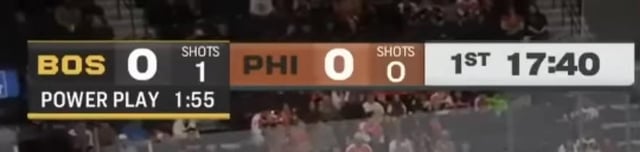
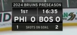
NBC Sports (PHI, SJ): not sure how long NBC will last in the regional sports department, with only two teams remaining (I’d imagine Philly stays long term since they’re owned by Comcast and I believe the first team on NBC/CSN since 1997). Because of this I thought they would never change their graphics, which have been the same for around a decade, but they finally made a change and brought something similar to what NBC does for their football coverage. The end result is mixed. It’s pretty much the same with font changes, and the logos are gone in favor of abbreviations. The graphics overall are a massive upgrade, and the new goal animation is really cool, but overall they could’ve done more. At least it’s better then what they did for basketball. 6.5/10
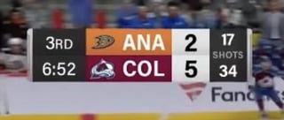
Altitude (COL): one of the better scorebugs in the league that almost nobody in Colorado has been able to see for years, until recently with the new app and seemingly progress with Comcast. This scorebug is basic but I like it, shows the whole logo with shots on goal, and one of my favorite things is it shows alternate logos when the team is wearing it. Animations are basic but solid. Overall, no real complaints. 8/10
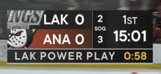
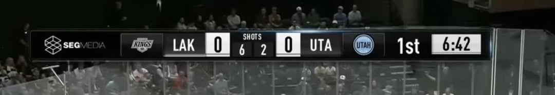
Scripps (Utah): I separated Utah into their own since they use the NHL Network scorebug, but they are under Scripps with the Panthers and Golden Knights. I’d rather they’d use Scripps scorebug, I’ve never liked this, just looks dated. UTA and LAK hurts my eyes. Not much good to say about it except it shows SOG. 4.5/10
Monumental Sports Network (WSH): this scorebug started out as too big when it debuted, but has since fixed that. Overall I like this scorebug, but one thing that bothers me is the constant ad on the side. Just unnecessary. What bugs me even more than that though, is when they’re playing against Calgary and for whatever reason put their color as white on the scorebug, which I love if Calgary is the away team, but they do it when they play in Calgary too, which just bothers me. Make WSH blue if you can’t put them in away colors, not hard. Overall a clean look, 7.5/10
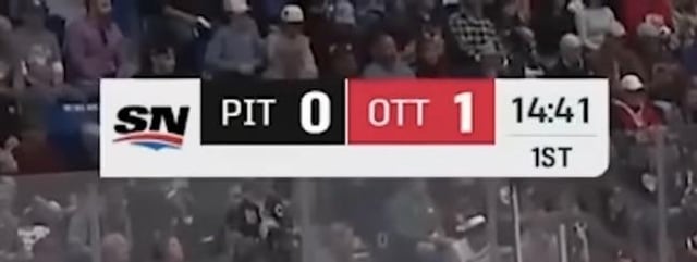
NESN (BOS), SportsNet Pittsburgh (PIT): lumping these two together as the scorebug is the same for both, but my god, can you get any more basic than this? At least give it some color like you do for Red Sox broadcasts. Painfully plain. 5/10
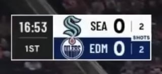
Kraken Hockey Network (SEA): PERFECTION. This is beautiful. To my knowledge this is the first scorebug to properly show home and away colors on it for both teams. Shows SOG, animations (especially for goals) are unique and stand out, while also being out of the way. This is how you do it, take notes. 10/10.
Chicago Sports Network (Blackhawks): saving the best (not really) for last. I was excited to see the graphics for my new team, and at first I wasn’t sure how to react when I saw this. I straight up hated it at the beginning, but it’s grown on me since and now I think it might be one of the best in the league. I’m pretty sure this is the only scorebug of its kind across the four major sports, the last time I saw something like this was NBCs old scorebug for ND football back in the early 2000s. It shows SOG, no ad protruding from it (no space for it up there at all without it looking weird, which I love), still not sure how I feel about the goal animation but the other animations overall are solid to really good. I love how it’s so small but still readable and out of the way of the action. SOG is welcome and I like how the logos and colors look. I still wish we could’ve had something like the rest of the league, and maybe we will in the future, but I think this is honestly pretty good. It’ll definitely be the most controversial of the scorebugs here. I’m thinking a 7.5/10
Please feel free to delete if you don’t want it in this sub, but I thought this would be fun to look at with so many new broadcasts since Vegas started the trend. I’d imagine there will be more as the years go on as Bally slowly fades into obscurity. Feel free to give your own ratings and opinions!
45 comments
Patrick Bateman type post
Bally is the worst one. A screenwide scoreboard at the bottom of the screen makes no sense. Put it in the goddamn top left where it’s laying over the crowd and not any of the play. What the fuck is this
Scorebugs that don’t have shots anger me more than they should
I’m pretty sure Sportsnet does SOG below the teams, but they didn’t for pre-season games. They likely had a skeleton crew for these broadcasts.
TNT/TBS bothers me because of their abbreviations.
For example, ESPN lists the Kings in their scorebug as **LA.** No problem there, we’re the only club in the NHL with Los Angeles in the city name.
Turner meanwhile lists the Kings as **LAK.** This just irritates me as unnecessary filter just used to hide empty space in the bug, instead of centering the two-code abbreviations like ESPN does to theirs. Also irritates me seeing other teams on Turner being called **SJS,** **TBL,** or **NJD;** clubs with two-code abbreviations for their city name but are also thrown their club’s first letter also on the bug.
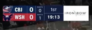
Also, don’t like how the Blue Jackets are given **CBJ** as their abbreviation. Yes, because of the Avalanche, Columbus can’t be given **COL** as their call. But somehow, **CBJ** is for the NHL team while in the same sports city, **CLB** is given for the Crew of Major League Soccer. Seriously inconsistent.
And don’t even get me started on the complete disastrous abbreviation known as **VGK.**
I like TSN the most, for clarity and design. But honestly, the Kraken one is clean, and I actually like the WSH one too. I like when the bugs incorporate the team colours (especially without 2006 Web 2.0 glossy button energy).
I’m of another mind about the team name abbreviations—prefer standardization, myself.
Also, I love this post. It is the intersection of three big interests of mine: hockey, design, and thorough research of the inconsequential.
Love these kinds of posts! Always thought that scorebugs were an underrated part of any broadcast. Though I wonder what type of scorebug will Amazon use for their Monday Night Hockey package. Wonder if it’ll be similar to one used for Thursday Night Football.
What is that empty white space in the SN bug? That is so terrible.
TSN uses the same one for their IIHF broadcasts (minus the MWC; whose scoreboard is provided by the IIHF), I like its simple design.
About the one Sportsnet had before this one… it wasn’t bad on its own, but the shots were near unreadable if you had a small TV. They put them under the team abbreviations, if I remember correctly.
Fellow scorebug obsesser, I salute you. My $0.02 on a few of these…
I can somewhat tolerate bugs with no shot counter at all, but any bug that *has* one but hides it is immediately F-tier – looking at you, ESPN. They *have* a shot counter, but you don’t see it for large stretches of the game for no reason unless they decide to show it to you. It’s not a bad design in general, the gradients maybe are a little much, but playing hide and seek with the shots just grinds my gears so much. MSG’s old one falls in this same realm, it was a good bug but they did the same thing with having a shot counter but hiding it often.
I see the SN one way too much as a Blue Jays fan in baseball, it’s bad. Shot counter is a plus but it’s way too simple and the SN logo takes up a ton of space for no reason, and in conjunction no team logos is an immediate demerit in my books. It also cannot handle double digit goals, which is rare enough that it’s not a problem but it’s funny when it does happen, because the “10” just runs off the edge of it slightly (see TOR 10-goal game from last season).
The Bally bug is a disaster. The logos scale so poorly in the wide bars, they take up like 1/4th of the bar width and it’s just so much wasted space. Surely there’s a reason bottom tickers are industry standard and nobody’s felt the need to reinvent the wheel in order to display out of town scores and stats and whatnot. The best thing about Diamond/Bally losing tons of teams is not having to see it anymore, and I hope my Jackets soon also get freed from this scorebug hell.
NESN is the only bug with a shot counter I hate. Their old one was even worse. A splash of color, a logo, literally anything please. It feels like a wall scoreboard that you’d see inside like an ice arena rink where your local beer league plays.
Scripps one is funny. Any scorebug which oversizes logos and cuts them off doesn’t play nice with certain logos – ie the LAK one in your screenshot where it just says NGS. The graphics are nice though, I agree w/ you that the score itself could move further away and/or be a bit larger and bolder kinda like the Kraken’s.
The new NBCS one is weird. I’m not a huge fan of the fonts, and dropping the logos from it detracts from it.
TNT, TSN, Altitude are great. I’ve not seen that Kraken one yet and I love it. Maybe could size up the shot counter font slightly, it’s a bit small, but it’s a minor gripe. Chicago one will definitely grow on me, it’s unique without being super obnoxious. I prefer minimal bugs so honestly I really like the “no text” look – the vast majority of people will know what teams are playing, I don’t think it’s necessary at all to have the abbreviations.
I’m glad NHL bugs are largely simpler though. Across other sports, especially football, I feel like so many bugs try to reinvent the wheel in the interest of uniqueness and fail horribly at it in some way. The NFL does this a lot with their rotational system where every broadcaster comes up with a new design for their Super Bowl so it’s basically on a ~4 year life cycle, and they’ve just gotten larger and more elaborate while being either garishly in the way of the action (or) just have some really weird design choices that I can’t understand. The new CBS one sucks, it uses like 3 different fonts haphazardly and the primary ones are way too thin, plus it has some visible alignment issues. FOX had a couple good ones in recent memory but the current one is just way too big.
Give me back the 2002-2006 CBC one.
>Please feel free to delete if you don’t want it in this sub, but I thought this would be fun to look at with so many new broadcasts since Vegas started the trend. I’d imagine there will be more as the years go on as Bally slowly fades into obscurity. Feel free to give your own ratings and opinions!
You did such a good job, I really enjoyed this post and I am so proud of you. Welcome to this subreddit and keep posting 🙂
Only psychopaths don’t care about having a shot counter
I actually really like the new CHSN one. It’s small, simple and clean.
I am today years old that I learned they are called scorebugs. Are we sure they are called scorebugs?
TSN’s scorebug is perfect. I also like the ESPN and TNT scorebugs.
The sportsnet Canada one is SO bad compared to what it used to be
Unpopular opinion I guess? I don’t like it being a whole bottom bar, but I like that bally occasionally shows shift timers when I’m intermittently watching a game so I can look for the tired players to make miracles or blow plays lol
Wait someone get freedman or what ever his dumb ass is to change the short forms….
Fellow scorebug nerd here. Appreciate the post
1. TNT 😁
2. TSN 😁
3. Altitude 😊
4. NBC Sports 😊
5. Monumental 🙂
6. ESPN 🙂
7. Victory+ 🙂
8. MSG 🙂
9. Scripps 😐
10. Kraken Hockey Network 😐
11. Sportsnet 🙁
12. Bally’s 🙁
13. Scripps (Utah) 🙁
14. NESN 🤮
15. Chicago Sports Network 🤮
Wonderful post!
The small nitpick that I have is that a rubric would make the ratings feel less subjective. Going through these pictures and reading the reviews, I don’t see how the NBC sports bug gets a 6.5/10 while the TSN gets a 10/10. They are very similar, but the NBC sports bug lacks the network logo, which you claim to hate.
Regarding all these score bugs, I’m surprised that only the Kraken use white for the away team’s background. It makes it so much easier when turning on a random game to know where the game is being played, especially for casual fans.
Wish you had included plain text in the graphics to say whom it belonged to, but I like the Anaheim/Colorado one shown.
whats the difference between scorebug and scoreboard
Glad this got a lot of attention! I love talking about graphic design with people, so I’m happy this is popping off a bit.
I was debating waiting until the end of the first week of hockey to do this, but we’ve already seen all scorebugs and I doubt there will be any big changes made, so I just did it now. I forgot that Amazon is doing hockey broadcasts, I’ll post that as soon as they do their first game.
Update to some scores: TSN down to a 9.5/10 because of the repetitive network logo, NBC up to a 7.5.
I don’t think I’ll do this every year unless there’s a change to one of the scorebugs, or a new one added. Definitely possible as more teams leave Bally, and I’ll try and in the picture what network and teams the scorebug is for. Thank you all for the constructive criticism and talking nerd stuff with me!
man that chicago one is just not it. idk how to explain it but it just does NOT work
Kraken one is beautiful. Should be what every network in every sports use.
Across the bottom is insane. Honestly, I don’t usually advocate for capital punishment publicly, but whoever is in charge of that decision needs to be trebucheted into the sun.
Monumental/Washington gets an L for unnecessarily having “Shots” text twice in the same column, likely because their scorebug wasn’t designed with a shots column in mind; insane for a fairly new display.
It throws off the symmetry and vertical alignment of the entire scorebug.
NBC finally got rid of their outdated glossy scorebug. I have a soft spot for that era of design but it looked very out of place when everyone switched to a 2D design.
Whichever is the Kings/Ducks one is sexyyyyyy
>> I have OCD
Doesn’t everyone these days
TSN is the goat. Praying they get that big contract instead of Sportnet next time.
The way you used it, *out-of-the-way* is a compound adjective and thus it should be hyphenated. Long compound adjectives are great, seize the opportunity to use them!
I don’t understand why you dislike NJD. I think it’s a great initialism. Care to elaborate?
Sportsnet will always be my favourite scorebug.
It bothers me that the ones side by side like the TSN one don’t do it like
Team A 0 – 0 Team B
so the scores are next to each other, especially with the way they have shot counters where they are, it means you’d get all the relevant info in a small patch.
Really like the Victory+ one. And I do wish that MSG kept the scorebug from the last two years, I thought it was way better than the new one.
If your scorecard doesn’t include a permanent display of SOG, it sucks
sportsnet needs to bring back the old ones.
I ain’t readin allat but congrats/condolences. TLDR?
God NESNs bug is so fucking boring. Who green lit that snoozer
It’s so irritating when there’s no shot clock.
I’ll be really interested to see what Amazon does for their Monday night Canadian broadcasts.
God I hate the gradient for espn I rather watch Bally than that