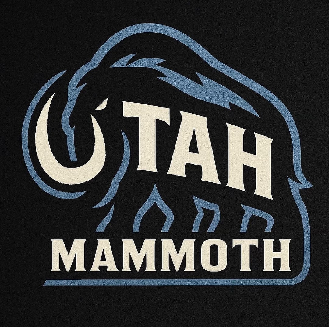
I’ve been toying with this idea lately. I've been trying to think of ways to utilize the “U” in the logo somehow. This was the low-hanging fruit idea I came up with. I just thought I would share!

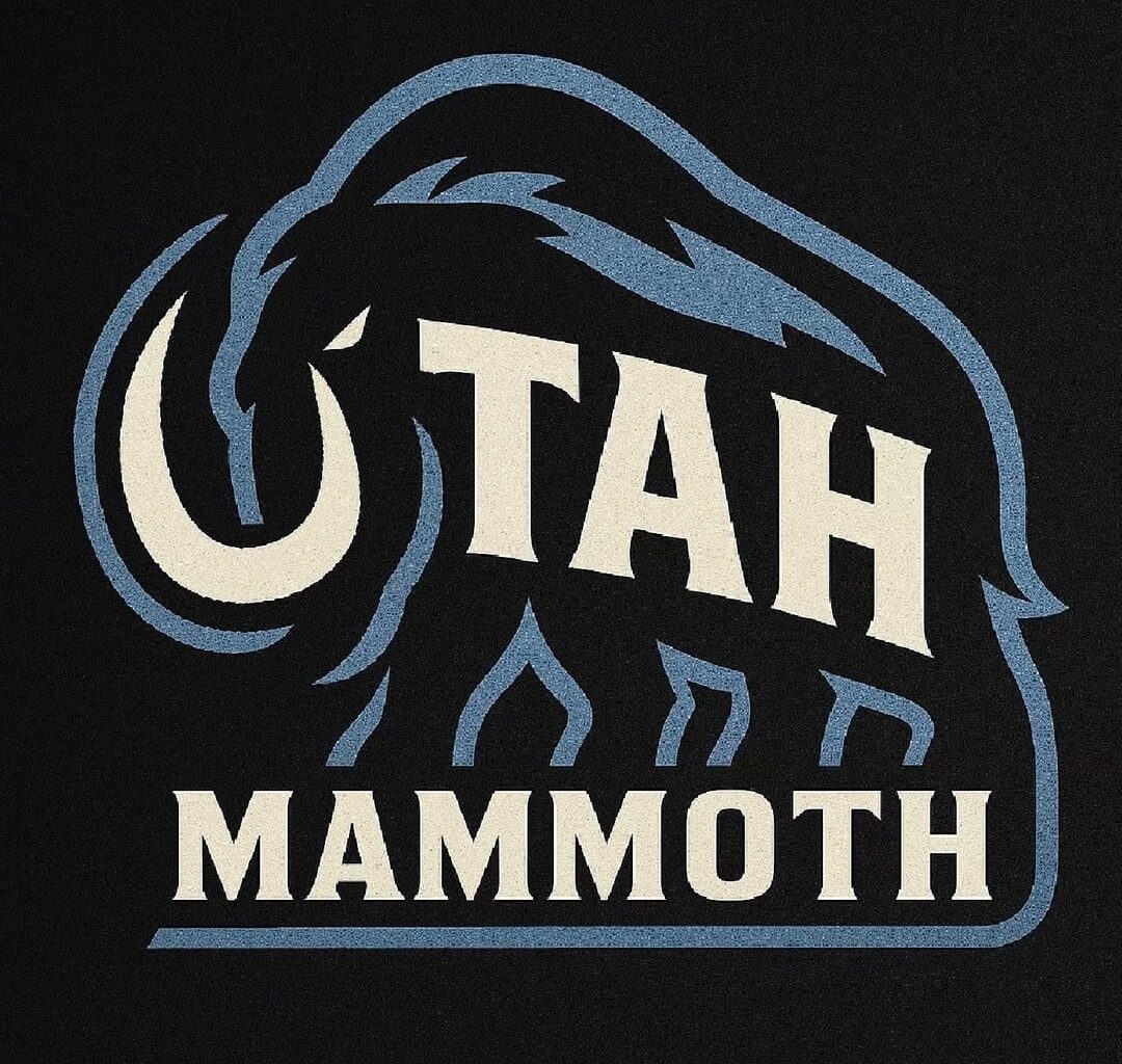
I’ve been toying with this idea lately. I've been trying to think of ways to utilize the “U” in the logo somehow. This was the low-hanging fruit idea I came up with. I just thought I would share!
11 comments
I like this a lot, it’s reminiscent of the UHC logo, looks professional and unique, and fits the branding well.
It also reminds me of the Kraken logo a bit with the eye
I love this so much
Whoa!! So cool. What an awesome design.
Legitimately great
One of my fav that I’ve seen. I super dig it.
arches for legs?
No.
A+
Now this… it’s classy. Love it!
I think it would look better without the text at the bottom. So good! Well done
That’s really nice
😍😍😍Wow! Absolutely amazing and 100% the way the logo should go. OP could you try a version without the Mammoth letters ?