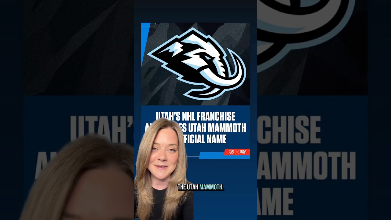
Utah HC Unveil New Franchise Name, Utah Mammoth 👀
Utah’s NHL franchise has officially announced their new name, the Utah Mammoth. And this rebrand is so good. Looking at the primary logo, you’ve got the mammoth head with the snowy mountain peaks at the top. Over on the left, you have the outline of the state of Utah with an icy M in as like kind of a shadow. And then the mammoth tusk is curved to form the letter U. And that will be the team’s rally cry for season 2. Tusks up. And finally, they are sticking with the original colorway. So you’ve got the volcanic rocky black, the mountain blue, and the salt white. So what do you guys think of the name choice and logo? I personally love it. that I think Utah hockey club was good for season 1, but Utah Mammoth a lot more fun moving forward.
#NHL #Hockey #shorts #NHLshorts #NHLhighlights #StanleyCup #Utah #UtahHC #UtahMammoth

36 comments
Thank you so much for your quality content! Your videos are always packed with smart ideas.🪱🐅🪱
Mon petit ami m'a demandé de lui murmurer quelque chose de sale à l'oreille. Je me suis penchée et j'ai murmuré : "Lessive… vaisselle… impôts…" Apparemment, grandir est le summum de l'excitation🐱
Been watching you for a long time and your videos always leave a positive impression. Thank you for your hard work!❄️☄️🥳
I have been watching your channel for a long time and every video is like a new pleasant discovery. Thank you very much!🤓💶🍦
Your channel has become a source of inspiration for me. Thank you for interesting topics and quality execution.🍓🐱🦆
Will be a good rivalry with Nashville
Keep giving us your highlights! Your videos add freshness to the world of online entertainment.🌃🥪🎼
Colours are boring… Too kraken like. No plural on mammoth sounds dumb
the logo is giving EA Sports
ARE YOU KIDDING ME!?
Go Utah can’t wait for the upcoming season
MammothS would have been better…..but it sou ds like a high school name
This actually looks pretty cool.
The "tusks up" thing is a rip-off and should be rethought.
it is really good except it looks almost too much like the kootenay ice from the dub
Too modern ai looking
Love it
Dumb name, awesome logo though
Love it!!
Yeti would have been better
The logo is actually really cool! Not sure about the name though
Me likey
nice name
Looks like a woman's league jersey. Should've just gone with the Utah Soakers.
I think Yeti would be better
Mastodons or SunDancers would have been better. Logo sux; no gravitas.
Why didn't they come up with a proper name for the first season? Who names their hockey club… Hockey club?
MORMONS
And we'll call the the "Woolies" as a nickname.
Tusks up, hahha elbows up
The mammoths are extinct so is this a look into their future?
I like it.
It better then there old one but it is the nhl team logo ever
No , should of went with the bandits as the name
Yep,call your team after a slow extinct animal.
I like it a lot, but other options surely would have been great too 🙂