
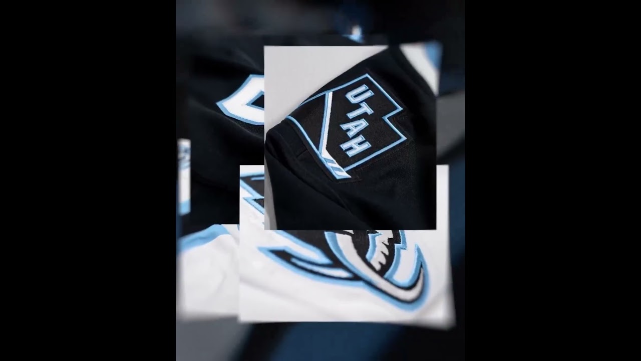
Utah Mammoth was revealed as the new name of Utah Hockey Club 👏 (via @utahhockeyclub/IG)
✔️ Subscribe to ESPN+ https://plus.espn.com/
✔️ Get the ESPN App: http://www.espn.com/espn/apps/espn
✔️ Subscribe to ESPN on YouTube: http://es.pn/SUBSCRIBEtoYOUTUBE
✔️Subscribe to ESPN FC on YouTube: http://bit.ly/SUBSCRIBEtoESPNFC
✔️Subscribe to NBA on ESPN on YouTube: http://bit.ly/SUBSCRIBEtoNBAonESPN
✔️Watch ESPN on YouTube TV: http://es.pn/YouTubeTV
#nhl #espn
43 comments
Now its time for Hawaii to get a team.
Stupidest name ever after yeti and kraken and what not. Why?! What a dumb dumb name
They copied the Colorado Mammoth (indoor lacrosse team)
That's an excellent name.
Honestly LA and Utah have the cleanest looks in the show hands down. So sick!
If it couldn't be Yeti, it had to be Mammoth
Congrats on the new identity Utah👍
At first the Yeti would be best. Now looking at this, this actually really good! Kind of sucks that Yeti couldn’t be used but the logo and the name is clean!
Thank GOD it's not hockey club
Missed opportunity on Yeti
All we need are the sloths and the NHL can have the main cast of Ice Age represented
Like the logo and all…but Utah Mammoth doesnt roll off the tongue…utamamut?…maybe in time i guess.
What a horrible name
They couldnt just be the Utah Coyotes and keep the design they had already?
Utah Yeti
The whole yeti thing was soooo cringe and minor league. This is MILES better. Absolute blessing in disguise for the league. Very clean and professional looking and feels worthy of the NHL. Of all the expansion/relocation teams over the last 25 years Minnesota has by far the lamest branding, name and colors. I never got used to it. This on the other hand is fantastic. Vegas and Utah have the best branding and logos of the new teams over the last decade.
THE UTAH SISTER WIVES
Oh no it’s the Mammoth! 😂😂😂 Might as well have used the Coyotes instead. Worst name ever!
The Team mascot should be named Woolly.
it sucks they gave mormon af utah the best unused colors that were left. they shouldve done purple and baby blue like the old looknof the utah jazz. and let a better place get carolina blue.
Golden Eagles would have been better
The goal horn is going to sound like a mammoth trumpeting!
Nice touch Smith entertainment group!
Couldn’t be prouder I have an NHL team in my home City!
Clean that’s all that I can say❤
🎉🎉🎉🎉🎉🎉🎉🎉🎉🎉
That's a Kool logo
As a Canes fan, #TusksUp!
Alright, very nice 👍
Nice Logo
Really was hoping for stormin Mormons but okay
dumb
Not my favorite name but damn those are some good logos
Love it
The letter U is in the tusk, while the letter M is in the upper left of the logo. Utah Mammoth! The mountain range in the logo is pretty obvious, but also a nice touch.
Utah Mammoth. I like this!
I can't wait to see what the pre game show is gonna look like 🤩!
that is cool logo ! i like it.
Really Utah. Ever heard of the Colorado Mammoth? Even the logo looks similar.
Fuck yes. Sharks fan and CA native here who loves the state of Utah. Spent my first fathers day in Zion National Park with my beautiful wife.
Welcome to the show! 🦈🏒🦣
The graphics designer deserves an award because that looks sick!
Very nice but was hoping for a little purple trimming to get a little closer to the Jazz – and no NHL teams have purple. Lightning also has a blue white and black scheme.
The no name hockey team got its first name
Awesome
I’m a canes and I will still be a canes fan but since I’m excited for this team LETS GO MAMMOTH!!!!!
🎉
What a mammoth failure