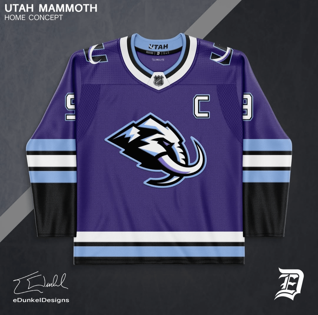
Last I checked, purple isn’t one of the team colors.
What’s with people trying to force purple?
I wish they went with purple! I’ve been waiting for a team to make their primary colour purple, or at least one of their 2nd/3rd primary colour. I know Kings did it for a bit, as well as the Coyotes and the OG Ducks, but a team needs to bring purple back into the league.
Like the purple ! Too many blue teams, this is an improvement
No thanks. I don’t want our hoops team jersey (Jazz) colors on the hockey jersey.
These look nice. Wish they would went with purple as primary color
I like this. We don’t have enough purple in the league!
Not a fan of the Coors Tusked Tapir.
Looks so much better and pops on the purple.
Huge improvement.
Instead of adding purple, change black to navy or midnight blue.
Four colors looks like too many
I don’t understand this obsession with purple. Maybe do a third as purple but it’s not a good main jersey colour as shown by it never being used.
I’m all for adding a little more color but I wouldn’t do purple. Brown feels like a more natural addition considering the mammoths from Utah were brown.
I want to see a graphic designer take the final jerseys and add a fourth minimal color in gold/copper or red or an orangey red that could represent Central/Southern Utah. A fourth and minimal accent color in a warm color pallet. Would also help balance it out and add a little more interest. Seattle jersey would be a good example
Nah
No thanks. I don’t want Jazz purple.
Objectively hideous
No. No purple please. We already have a purple team here. Let the Mammoth’s colors be different.
Purple is awful. I won’t buy it. I won’t wear it. Downvote me.
The captains C should be a tusk
I don’t know how I feel about the purple. I really dig the standard colors as is.
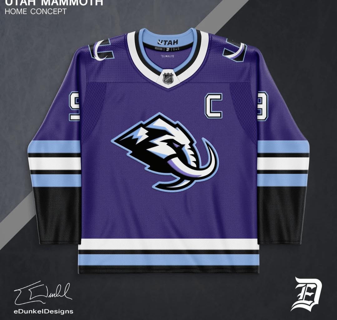
Love the away hate the home.
No purple. If they add a color it needs to be copper.
Would buy 100%
I love the purple. LOVE it. Although this does feel a bit much. I imagined it more secondary, similar to Kings usage

25 comments
You should do one with brown instead of black
Last I checked, purple isn’t one of the team colors.
What’s with people trying to force purple?
I wish they went with purple! I’ve been waiting for a team to make their primary colour purple, or at least one of their 2nd/3rd primary colour. I know Kings did it for a bit, as well as the Coyotes and the OG Ducks, but a team needs to bring purple back into the league.
Like the purple ! Too many blue teams, this is an improvement
No thanks. I don’t want our hoops team jersey (Jazz) colors on the hockey jersey.
These look nice. Wish they would went with purple as primary color
I like this. We don’t have enough purple in the league!
Not a fan of the Coors Tusked Tapir.
Looks so much better and pops on the purple.
Huge improvement.
Instead of adding purple, change black to navy or midnight blue.
Four colors looks like too many
I don’t understand this obsession with purple. Maybe do a third as purple but it’s not a good main jersey colour as shown by it never being used.
I’m all for adding a little more color but I wouldn’t do purple. Brown feels like a more natural addition considering the mammoths from Utah were brown.
I want to see a graphic designer take the final jerseys and add a fourth minimal color in gold/copper or red or an orangey red that could represent Central/Southern Utah. A fourth and minimal accent color in a warm color pallet. Would also help balance it out and add a little more interest. Seattle jersey would be a good example
Nah
No thanks. I don’t want Jazz purple.
Objectively hideous
No. No purple please. We already have a purple team here. Let the Mammoth’s colors be different.
Purple is awful. I won’t buy it. I won’t wear it. Downvote me.
The captains C should be a tusk
I don’t know how I feel about the purple. I really dig the standard colors as is.
Love the away hate the home.
No purple. If they add a color it needs to be copper.
Would buy 100%
I love the purple. LOVE it. Although this does feel a bit much. I imagined it more secondary, similar to Kings usage