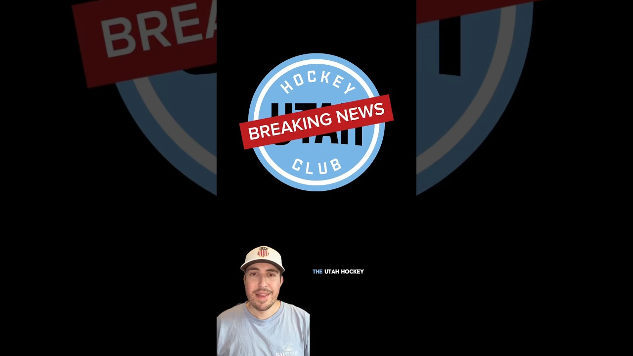
The Utah Hockey Club officially has a new name! #nhl #hockey
May 7, 2025
The Utah Hockey Club officially has a new name! #nhl #hockey
37 comments
Honestly, great jerseys and logos. Glad nothing was altered with them (yet). Would like to maybe see some purple in the future
The mammoth looks too much like an NHL 24 logo. Hope they get a better graphic designer to do it.
Exited for them to be named mammoth
8/10 in my opinion
Cool
Clean af
Rest Up Coyotes
Fire
W
It looks like a madden relocation logi
this looks like an NHL 25 logo and that badge is awful 😭 anyone saying this is good needs their head checked
Before you complain about the name being not being plural, keep in mind that mammoth are a game and herd animal. We tend to keep the singular and plural the same for those, as in moose, deer, and bison.
Should have been the Latter Day Saints Mormons are found all over the state too
Day 27 of asking you to make the cheap seat episode on penn medicine park in Lancaster Pennsylvania which is the home of the Lancaster stormers baseball team and try to find the single worst seat at the ballpark
ur him
There's something about this that screams "senior student graphic design project", kinda like the old Rockies City Connect jerseys (which I do love). I want to like it, but I don't think another black jersey in the NHL is the way to go.
I noticed that there are two stripes on the stick of the secondary or tertiary logo. Anyone know what it means?
Kinda generic-y but not bad
Meh. Looks kinda like a madden expansion logo. 6/10
Not the best but it doesn’t make me want to throw up like other newer logos. Appreciate that is not too basic, but still it isn’t perfect
I would have liked them to decide on one template instead of different ones for the home and away uniforms (home is 1974-95 Boston Bruins,and away is 1988-98/current LA Kings). Mammoth is the only obvious choice of those three options. I'm hoping for a "mountain blue" alternate. The branding is pretty solid,and the Utah outline with the M is clever
tough tbh
Road uni my fav look here
It’s lame
great logo
The colorado mammoth have been around for 22 years and have a better logo
Needs a better name
Tbh I think the tusk U should have been used in the word UTAH on the road jersey.
YOU HAD OUTLAWS RIGHT THERE
The white one could be one of the best road uniforms if they made the shorts white with blue striping
Gorgeous logo
The only problem I have with this is YETI blocking the Yeti name. As a Kraken fan, I was looking forward to the Cryptid Cup….
10/10 logo 🔥
I don't even watch Hockey, but that sounds cool, boss.
Dude,stop talking like a child. It’s “mountain” not “mow-in”. Idiot
Their first "L" is on their logo too!!!
Great video I subbed