The real competition is between the networks for who can design the worst one
June 8, 2025
28-3 box was the goat
34 comments
The current ESPN one is the best one I’ve seen imo
I’ll stand by it, I like this score board. It eats up so much less of the screen allowing us to see more of field.
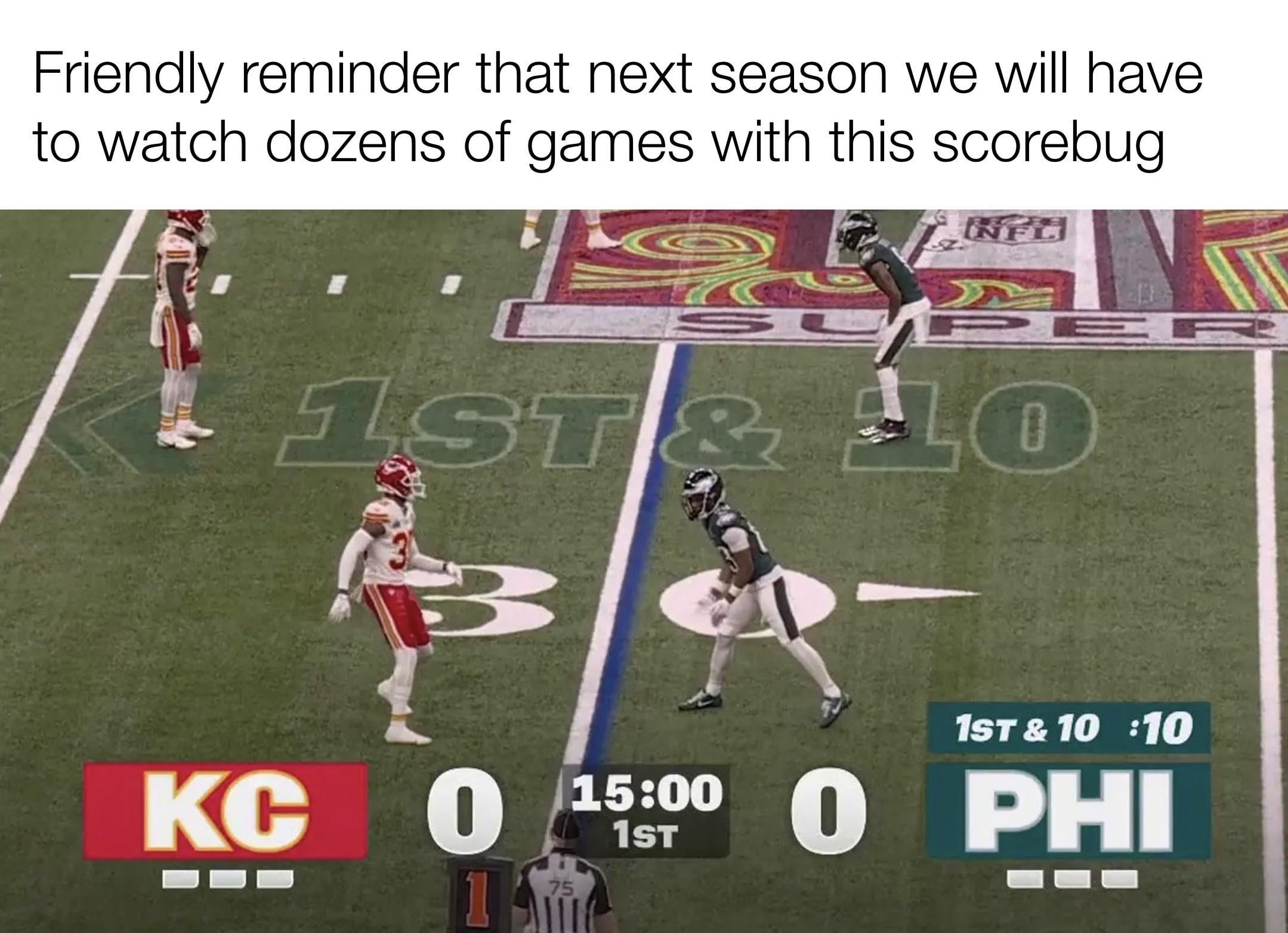
This scorebug was worse than the cheifs in the superbowl
I think that FOX will go back to their regular one because the Super Bowl LIX scorebug was just so bad.
I like it. I think a transparent design is a must.
Every time a station changes the scoreboard I don’t care for it. Then I get used to it and it’s fine. This one is more of the same
It’d be fine if it was just smaller
Am I the only sports fan to never have a problem with a scorebug? Ive never seen one that I couldn’t get the relevant info from. And also never seen one that obscured the action. I could not care less about a scorebug as long as it tells me what I need to know and doesn’t obstruct the action. And every scorebug Ive ever seen has met those qualifications
I’m expecting them to modify it because they got so much flak for it.
We spent more time complaining about the graphic than watching the game lol. That was the most memorable part
Can we just go back to the small corner ones from like 10 years ago?
I’m just gonna say it: all I can about is that the scoreboard is unobtrusive and easy to read. And this scoreboard succeeds in both points. I don’t care that it’s “ugly”
With smart tvs everywhere there should be an option to watch the game with no scoreboard at all. Old school like how my dad watched as a kid
Don’t remind me of this visual atrocity.
This scorebug is great. Clean, fresh and easy to read. They should absolutely make this the standard.
No network logos. No team graphics. Nothing more than absolutely needed.
I feel like people have way too strong opinions on score bugs. But, you do you
If you think art is a silly thing to do for work, this is what you get when you don’t hire an artist and an engineer does his best in paint.
I didn’t care for this one. I seem to remember years ago one of the networks used to also show what yardline the LOS was on screen. I liked that because I could glance and see where it was otw in or out of the room. I wish they still did that.
Just use the Fox UFL one. It’s so much better.
Where is the Draft Kings ad???
Just want the ones back from the 2000s
I think it needs to be a little bit larger…
I normally don’t really care about scorebugs but this one is pretty gross
…. the boomer in me is disgusted

Wish they would do it like soccer games. Tiny box, top left, done. You get to see more of the field and players.
The previous CBS one was perfect
I actually really like this one from an accessibility standpoint . So many of the scorebugs are terrible for the average low vision viewer.
I am once again requesting that the current yard line be added as a stat on the scorebug
I think it looks good
espn and cbs are the best
I don’t understand what the problem is… I thought it was cool and different. Are people that afraid of change??
They think “modern” and “shitty” means the same thing
Honestly? I don’t hate it. It’s the sans serif devoid of all emotion scorebug that we deserve in 2025.
Baseball has already had P 0 0 P a couple of times

34 comments
The current ESPN one is the best one I’ve seen imo
I’ll stand by it, I like this score board. It eats up so much less of the screen allowing us to see more of field.
This scorebug was worse than the cheifs in the superbowl
I think that FOX will go back to their regular one because the Super Bowl LIX scorebug was just so bad.
I like it. I think a transparent design is a must.
Every time a station changes the scoreboard I don’t care for it. Then I get used to it and it’s fine. This one is more of the same
It’d be fine if it was just smaller
Am I the only sports fan to never have a problem with a scorebug? Ive never seen one that I couldn’t get the relevant info from. And also never seen one that obscured the action. I could not care less about a scorebug as long as it tells me what I need to know and doesn’t obstruct the action. And every scorebug Ive ever seen has met those qualifications
I’m expecting them to modify it because they got so much flak for it.
We spent more time complaining about the graphic than watching the game lol. That was the most memorable part
Can we just go back to the small corner ones from like 10 years ago?
I’m just gonna say it: all I can about is that the scoreboard is unobtrusive and easy to read. And this scoreboard succeeds in both points. I don’t care that it’s “ugly”
With smart tvs everywhere there should be an option to watch the game with no scoreboard at all. Old school like how my dad watched as a kid
Don’t remind me of this visual atrocity.
This scorebug is great. Clean, fresh and easy to read. They should absolutely make this the standard.
No network logos. No team graphics. Nothing more than absolutely needed.
I feel like people have way too strong opinions on score bugs. But, you do you
If you think art is a silly thing to do for work, this is what you get when you don’t hire an artist and an engineer does his best in paint.
I didn’t care for this one. I seem to remember years ago one of the networks used to also show what yardline the LOS was on screen. I liked that because I could glance and see where it was otw in or out of the room. I wish they still did that.
Just use the Fox UFL one. It’s so much better.
Where is the Draft Kings ad???
Just want the ones back from the 2000s
I think it needs to be a little bit larger…
I normally don’t really care about scorebugs but this one is pretty gross
…. the boomer in me is disgusted

Wish they would do it like soccer games. Tiny box, top left, done. You get to see more of the field and players.
The previous CBS one was perfect
I actually really like this one from an accessibility standpoint . So many of the scorebugs are terrible for the average low vision viewer.
I am once again requesting that the current yard line be added as a stat on the scorebug
I think it looks good
espn and cbs are the best
I don’t understand what the problem is… I thought it was cool and different. Are people that afraid of change??
They think “modern” and “shitty” means the same thing
Honestly? I don’t hate it. It’s the sans serif devoid of all emotion scorebug that we deserve in 2025.
Baseball has already had P 0 0 P a couple of times