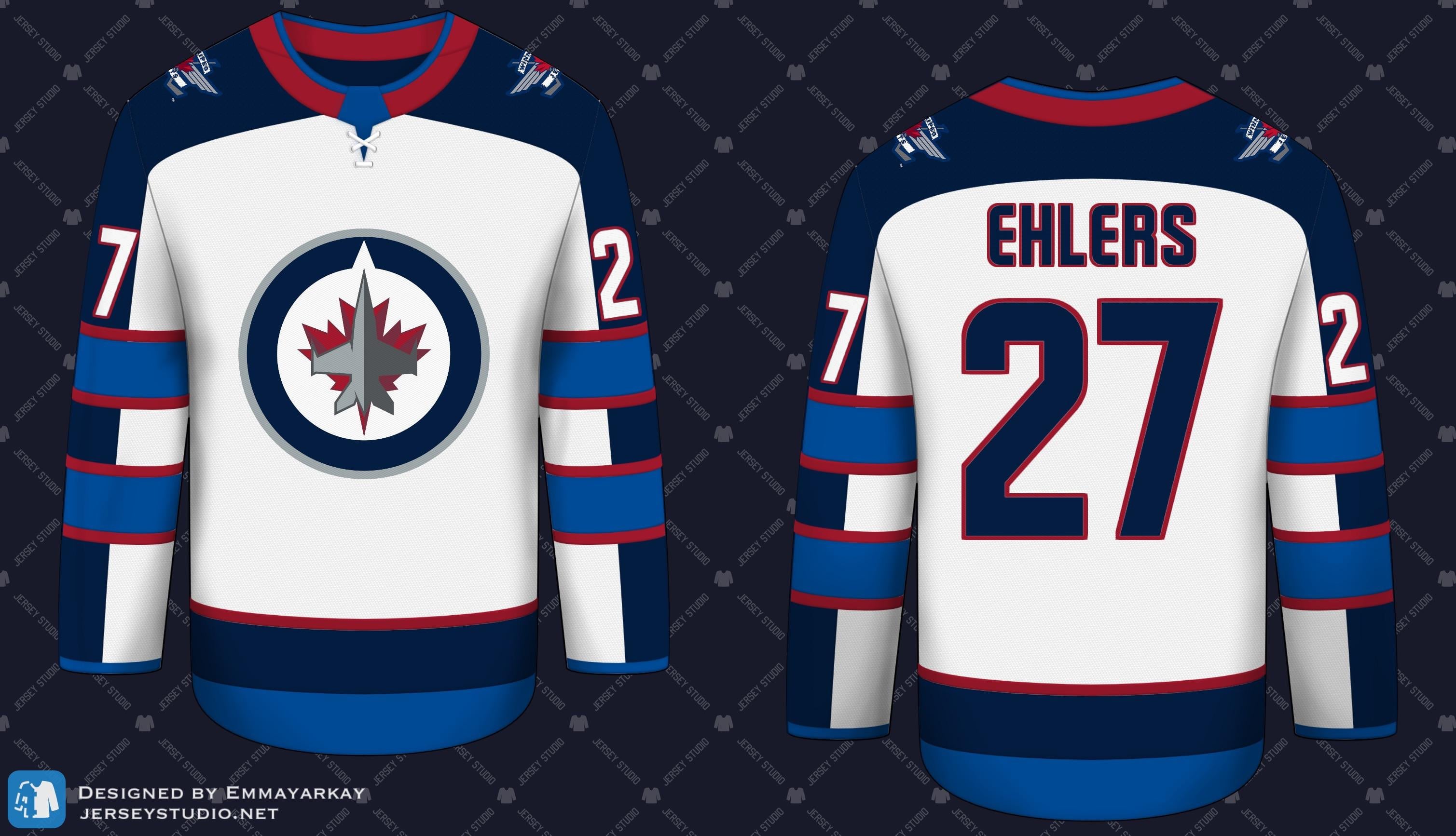
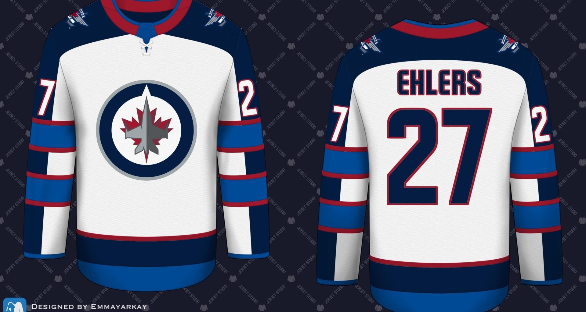
I thought the Jets primary jerseys could use a little red.
June 14, 2025
I thought the Jets primary jerseys could use a little red.
7 comments
The red does make the blue stripes/lettering pop more on the first, but the other two hit me as a little bit blue jackets-ish. Maybe even a little too much going on with two blues vying for space. But it would be interesting to see the first one as a third jersey, with the same effect on the socks.
Sorry but the red doesn’t work well splashed onto the current jerseys. It clashes hard with the light blue.
It’s a trade off. Either you go red and blue like the heritages or dark blue/light blue like the regular home and aways.
I like the second one with the red accents!
First two are heat, too much red in the third makes it look like an American team
I’ll take it if the name on the back is included.
What is this? Team am*rica?
This! It’s too USA for me.