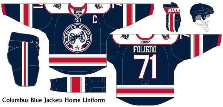
I found this on Pinterest, I kinda like it. What do you all think?
11 comments
*sigh*
No
I’ve seen better fan concepts
This concept cannon uni is nowhere near as good as the current cannon look. They need to make the current cannon the primary
Why does it say Foligno
I wouldnt hold my breath. Thats a foligno jersey meaning its a concept from a while ago. Also it looks like a rangers reverse retro
Honestly I like our home and alternate uniforms the way they are. I do prefer the cannon over the home but they wear the cannon jerseys a lot. I think last year they wore it for every home Metro game.
IMO we should move away from the rwb color scheme for the simple fact too many teams use it. I love our third colors. I love the use of silver in our stadium uniforms.
Sweet goodness, I sure hope not.
If they want to truly lean into the civil war look they should drop the red white and blue. Solely use the Navy, Powder blue and white color scheme it would be more unique and more accurate
Honestly would rather just keep our current Jersey over this. Plus I like the cannon as our third. If they want to keep current scheme of colors then the stadium series layout is the way to go. Throw a new logo on there and bam.