
Personally I think they’re solid, but the bear logo on only one shoulder feels off. Would’ve looked cleaner on both. Are they trying to be the Steelers?

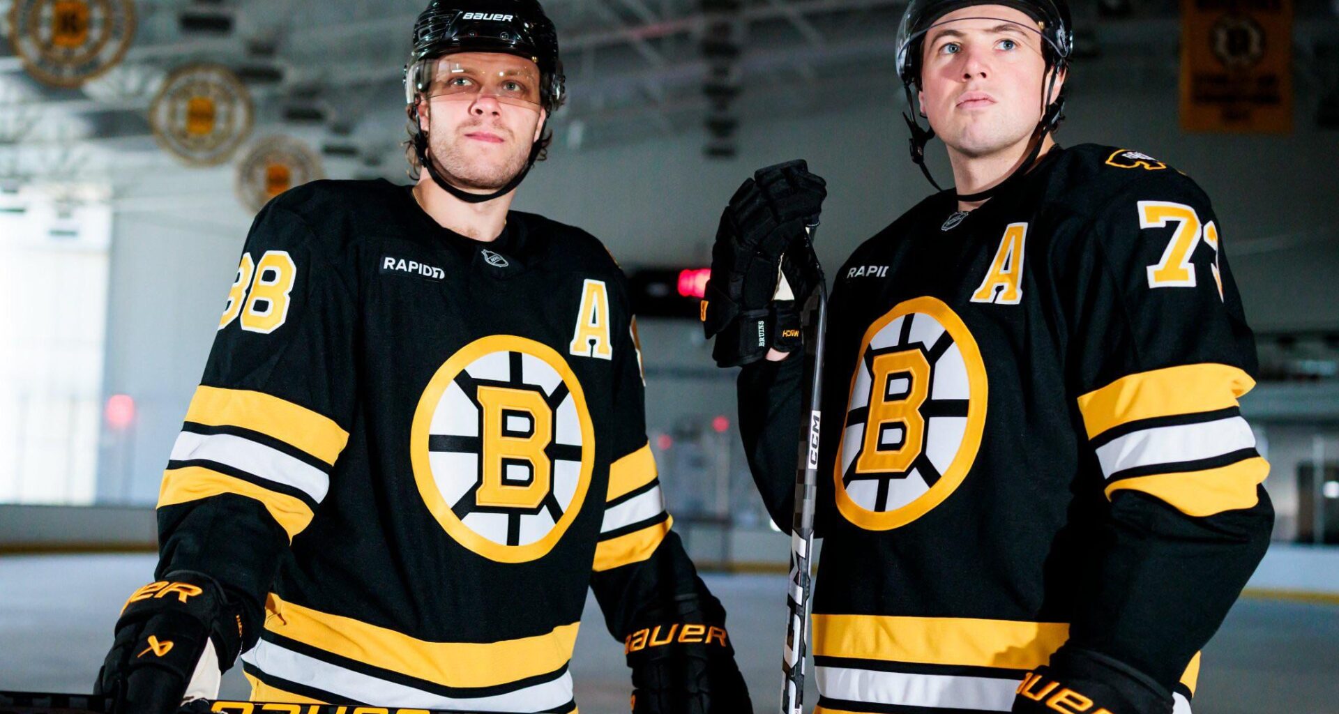
Personally I think they’re solid, but the bear logo on only one shoulder feels off. Would’ve looked cleaner on both. Are they trying to be the Steelers?
41 comments
Also what was the point of going back to the old ones last year only to bring these ones from the special anniversary year
Keeping the other shoulder open for speciality patches I bet
They look like every other uniform the Bruins have had. What am I missing
Kind of hilarious to see an Original 6 franchise keep fucking with their threads.
What’s the difference ?
They look the same…..
“New” yea alr
Would look better without the ad
The yellow B is alright. That’s the logo Happy Gilmore had in his jersey
Missing yellow socks and I still think losing the yellow collar was a negative but overall they look great and I’m glad they went “back” to these
I hate how charmin keeps changing the designs on their toilet paper.
for some reason the proportion of stripes to logo seems off, like it looks like a stadium series jersey.
They’ve gone back to the 80s and early 90s look. Cool, I guess.
They’re the same picture.gif
What colour are the socks?
They just left empty space on another shoulder for advertisement
I kinda wish they’d just go whole hog with the bear logo
Idk maybe I just have more of an eye for it but these are different. The logo, gold socks, number colors, and the yellow is more yellow than gold. Go look at a pic of a bruins jersey from before or open your closet. They’re different
https://www.nhl.com/bruins/news/the-evolution-of-the-boston-bruins-sweater-290032176
“Happy learned how to putt. Uh ohhhh”
Oh god these are beauts!!! Finally got these back
Subtle changes, but I enjoy the bear logo a lot
I wonder if they will both keep “A’s” this season or if one of them gets the “C”.
We need more methbear
remember when they used to wear yellow socks
These are nice. I prefer the yellow B
I really like these uniforms. They are much nicer than their predecessors.
I’m sure some people like it, but I would never be excited to wear merch with a logo that’s just a giant B
pasta’s A looks photoshopped
Something about them is eerily familiar…
Where are the yellow socks? We want Pooh/Meth bear!!
Just give Charlie the ‘C’ already
If it was the cocaine bear as the shoulder patch instead it’d be perfect
Looks like the unis from the Cam Neely days
“Hey Pasta! You SUCK… ya jackass”
They look exactly the same as the old ones
These are better than the old ones ngl. I’m curious to see the aways though.
Could they at least try not to copy the Mammoth? Talk about copy/paste
They look like an alibaba special… bring back the tie and ccm jerseys
Seems like a c is missing here
lol the bruins make the most subtle changes