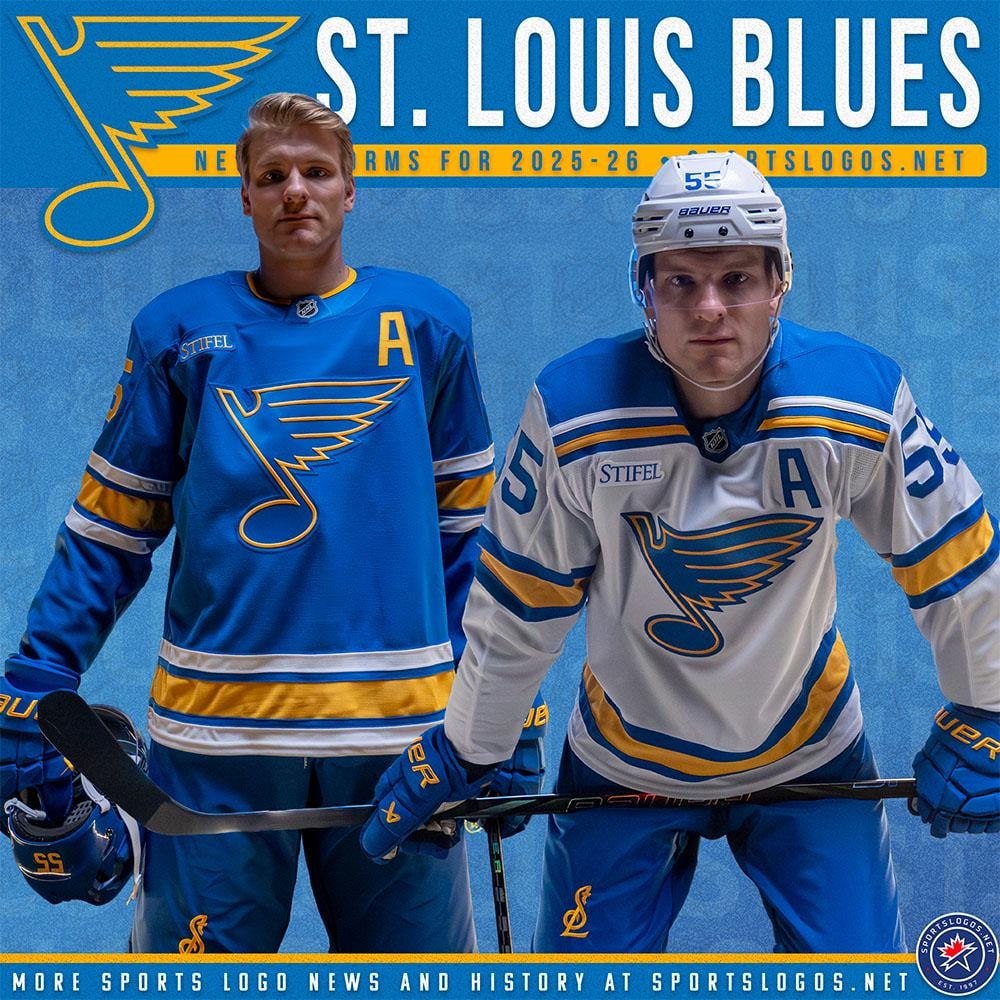
I think the Blue Jersey is the best that they could've done. Classic 1967 style jerseys their Dark Blue was good though.

I think the Blue Jersey is the best that they could've done. Classic 1967 style jerseys their Dark Blue was good though.
36 comments
Someone please tell me what the difference between this one and the old one is? They look the same to me at first glance 😛
As a hawks fan I hate to say these are pretty clean. Changing to the lighter blue was the best thing they ever did
The best uniforms in the league, and I’m not a Blues fan.
The away looks fantastic. The home is a bit plain and it may not have enough contrast to show up on TV. The logo probably won’t show up very well
I like them a lot
Very nice love the retro feel they give off
The away looks great!
It’s hot stuff 🔥
No yellow border on the blue numbers is a choice
Aren’t these just their OG unis? They look good.
Beauty except no outline on the numbers looks budget.
Giving original simpsons animation vibes
The toughest team in the federal league!
I dig the away jersey 🙏🏽
The dark blue was definitely better.
Love them!
As a Blues fan, I love them. Only thing that’s going to take some getting used to is the solid numbers.
These are great. The blue doesn’t look cheap, which is surprising. I like it
The main logo needs to be moved lower on the jersey. It really looks crowded, especially with uniforms that have letters there.
What the hell is new imagine the amount of money they spent designing it presenting it revising it changing it and it basically to 99.9% of the people can’t tell a fucking difference
Like their 1972 uni’s
Logo should be flipped around so the note is a B , or b, and moving forwards not backwards
Maybe this is sacrilege but this would have looked way better if the chest logo on the home jersey was white
Love them! As an old Hull fan, I might even get one for myself!
New….new how?
I think they are sick but the top of the note seems really high up the chest for some reason.
Looks so much better without that weird, out of place black
They’re sick, love when they lean into this style & color, 👌
So fucking tired of the retro fad.
That I would consider buying the away jersey strictly for fashion purposes
Gives me somewhat similarish vibes to the yellow green white minnesota retros, which are one of my favorite jerseys
Hey these look familiar.
I really like how teams have gone back to historic and simple jerseys and logos. This is classy and even I want to buy one.
I apparently didn’t watch them enough last season because I don’t see anything different. Not enough to have a reaction, at least.
Beauts
The Blues have consistently been one of the best teams in the league in terms of jersey design, and this is no exception. Many other teams would be lucky to have a jersey this nice, in my opinion.
Fantastic