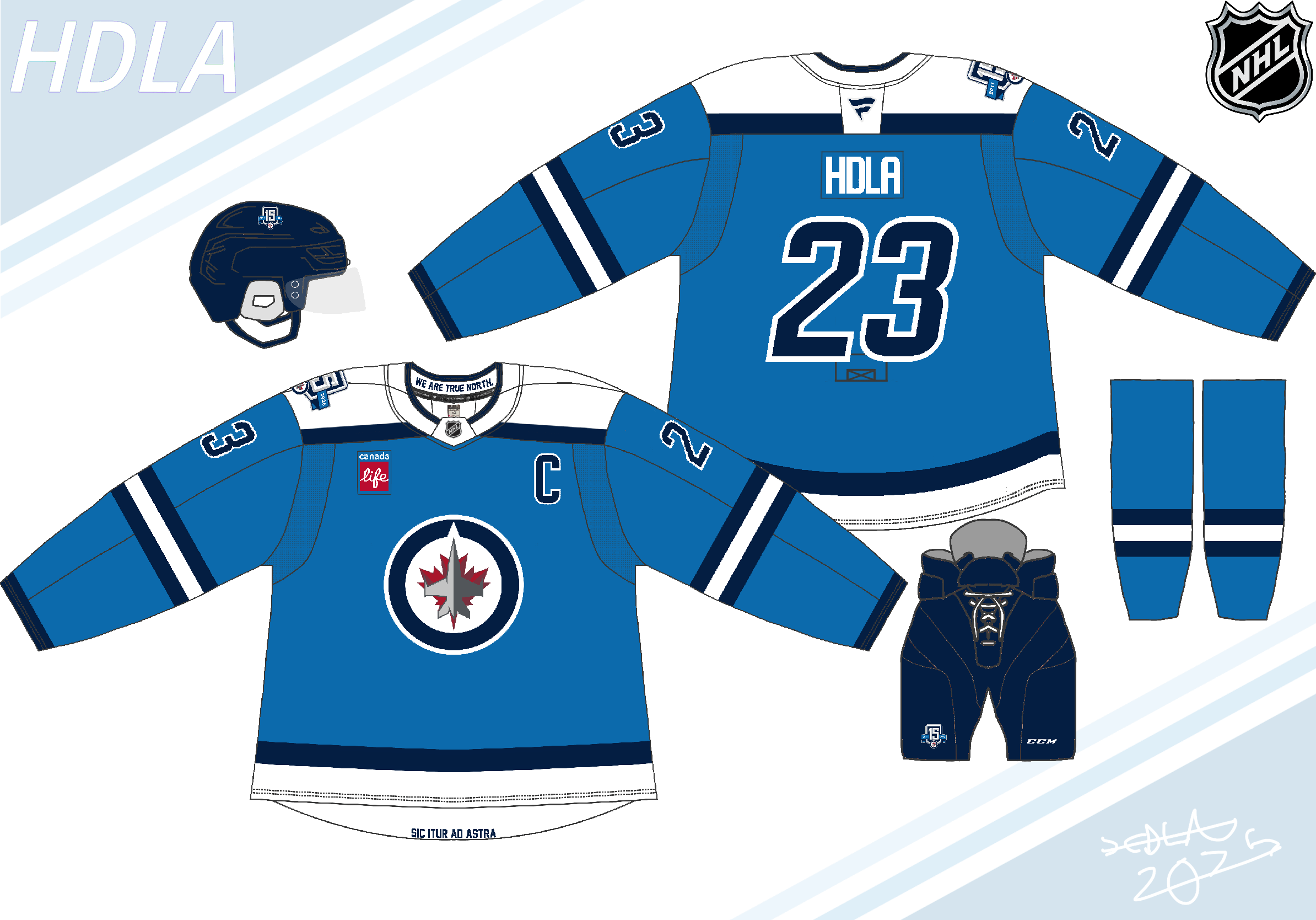
This might be the first jersey concept I kind of dig, as unlike some you don’t fuck with the logo like a lot of others do and it’s a very simple but nice design. Plus it gives off a very like classic/retro feel while still being modern. I wouldn’t want this to be their main jersey(the current ones are amazing) but I wouldn’t be upset if they wore this for a special event like the 15th anniversary.
The aviation blue was the worse selling Jets jersey, but I appreciate your creativity
Looks like something you would find in Canadian tire or walmart
The blue gives me aviator vibes (sorry) but otherwise this is pretty good.
This is solid, but I sincerely hope they eventually decide to listen to… pretty much everyone in Winnipeg and switch to the heritage sweaters as the main home and away.
I get that the ‘clipart plane humping a clipart leaf’ logo was made in a rush back in 2011, and it’s served the team well, but I would be OK with never seeing it again. Maybe as a throwback in 2040 or something.
Round off the shoulders instead of having them end abruptly at the hem/sewing line.

5 comments
This might be the first jersey concept I kind of dig, as unlike some you don’t fuck with the logo like a lot of others do and it’s a very simple but nice design. Plus it gives off a very like classic/retro feel while still being modern. I wouldn’t want this to be their main jersey(the current ones are amazing) but I wouldn’t be upset if they wore this for a special event like the 15th anniversary.
The aviation blue was the worse selling Jets jersey, but I appreciate your creativity
Looks like something you would find in Canadian tire or walmart
The blue gives me aviator vibes (sorry) but otherwise this is pretty good.
This is solid, but I sincerely hope they eventually decide to listen to… pretty much everyone in Winnipeg and switch to the heritage sweaters as the main home and away.
I get that the ‘clipart plane humping a clipart leaf’ logo was made in a rush back in 2011, and it’s served the team well, but I would be OK with never seeing it again. Maybe as a throwback in 2040 or something.
Round off the shoulders instead of having them end abruptly at the hem/sewing line.