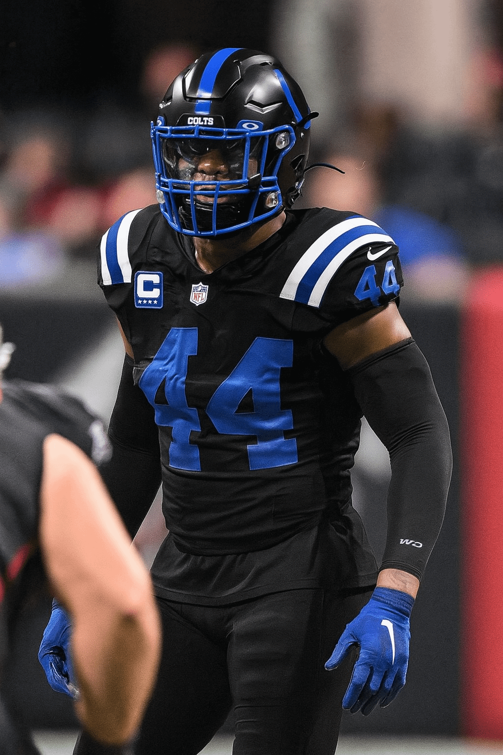
I was having a discussion with a friend what would be the ideal alternate Colts uni, and ChatGPT actually spit out a perfect representation of my idea. Just sharing to get everyone's thoughts.


I was having a discussion with a friend what would be the ideal alternate Colts uni, and ChatGPT actually spit out a perfect representation of my idea. Just sharing to get everyone's thoughts.
33 comments
Kinda ugly :/
I actually think they look pretty good until you realize the Colts are terrible. If they were a dominant team, these jerseys are actually pretty cool. Instead it just looks dorky because of how they’re inevitably going to play.
Looks like a college team, but I like the variety
Idk the helmets does go better with those than the Indiana nights. I don’t like those unis either so
I thought you were referring to Franklin. LOL
On the fence there
No Black!
We are white and blue
If anything a soft blue with dark blue outlines, white anywhere else it’s cool, but no black! (Blue Stallion Jersey) Yes I named it but you create it Ballard
Fire!
💩💩 big time
💩💩💩💩💩💩
nah these are heat bro
These are just the Lions all-black with slightly darker blue.
Blue face masks!!!
I think these suck ass and that teams should stick to their actual colors. It lessens the identity of the team to switch up to something so basic.
I personally hate when teams use black when it’s not part of their team’s colors
I like it a lot
i’d like it more without the white stripes
no shot at jack
Put a little white piping around those blue numbers and it’s pretty much those bootleg jerseys people wear.
My son’s team did this color scheme. It’s hard to see/read the blue on the black from a distance. I like the blue and white better. Sorry, OP!
I think the numbers need some white piping or something. I don’t really like straight up blue on black (Kenny Wayne Sheppard excluded).
Love them. I made something very similar on Madden 2006
I don’t like the black, it’s the opposite of our colors
I love it!!
All grey with blue highlights would be much better.
I like em!
Black facemasks instead of blue and it’s Gucci
I love the contrast against the normal white uniforms. Looks really good for big games imo.
🔥
I’m a purist, I don’t like them. It’s not a bad look, it’s just not the Colts look (to me).
Way better than those ugly ass Indiana Nights jerseys
I love the variety honestly. This particular look would
be better without the white accents personally but it doesn’t make or break the look.
I would fully support us playing 8 games in traditional uniforms – 4 home, 4 away, and the other 8 in an alternate or something like this. I know it’s probably a hot take and not a popular opinion but I think there’s just too much emphasis on the uniforms being constantly consistent. I know who my colts are on the field. Let’s let them change it up more often.
Not in love with it but at this point I’ll take anything that doesn’t look like it’s from 1958.
🔥 for the colts. Realistically our jersey selection is by far the worst in the NFL. It’s all just the same boring blue and white in different combos.
Nope. There’s no black in our colors.