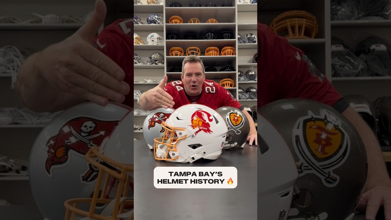
Did you know we #designed more than 15 #helmets for our 1997 rebrand? 🤯 #helmet #buccaneers #nfl
This is how it started for the Tampa Bay Buccaneers, but it could have gone a lot of different ways after that. We’re going to get into it. As the Buccaneers got into the thought process of developing a new helmet for the 1997 season, first they thought, put the skull and the cross swords on there. Black lid here. They’ve got the hat on the skeleton, the cross swords there. The flag starts coming into it now. You still have the skull, the cross swords. They have the flag on the side with the red face mask. So you can see things starting to develop here. They also try it on a black lid red and silver center striping that comes to a point in the back with the flag. The Buccaneers realized pewtor was going to be the helmet. They tried this one with the T and the B, the orange, the shield on it, and the cross swords, but not the look. In 1997, they found it. This was the look for the Buccaneers. The flag, notice it was shortened a little bit, the skull, the cross swords, the black face mask. Tampa Bay was off and running.

Did you know we #designed more than 15 #helmets for our 1997 rebrand? 🤯 #helmet #buccaneers #nfl
- July 9, 2025

20 comments
First
hey Buccaneers you dropped a pin can I have it?
Old unis were way better.
i’m super excited for the new jersey reveal. this is our year. MIKE 1K YARDS AND A HOPEFULLY A SUPERBOWL WIN!! GO BUCS
Creamsickles should've never left
Love this history lesson! Go Bucs 🏴☠️
W
Would love to see an alternate with that black throwbrack helmet 🔥🔥🔥
We got the best jerseys in the league!
Erase the orange cicle, it was hexed by Mckay!
Still the best helmet they've ever had
Like the black hat one ☝️
I like the old ones and there current one
I love them all!
The white one that shows up first is sick
Black Flag Helmet Was My Personal Favorite
The black hat logo need to find me one as a hat 🎩
Didn't y'all just upload this a couple months ago?
Love that pewter and red 90s look miss it
Are we this deep into the offseason where we’re reusing stuff from last yr