
Moving into 2026 I think they should use the batting practice hat on these uniforms and get a new BP hat. Putting the inaccurate bird aside that two tone navy blue with a red brim looks amazing. Giving me those 1940’s – 1955 vibe while looking modern.
17 comments
https://preview.redd.it/feexwsb64bff1.png?width=749&format=png&auto=webp&s=647a80784ac73837e811b5e89ca56c88303b4f8f
I’ve long thought we should go Navy-Red hats full time
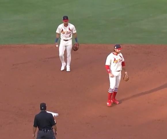
What is the square patch on the right side?
I love the hats. It’s inspired by a previous era. It’s funny because other fanbases are bitching that they are wearing their same hats. Cardinals got a cool hat and Cardinal fans bitch about them. Fans of other teams like our hats, but Cardinal fans needed another interlocking StL hat apparently.
Need the navy accessories more often
Looked good with the city connects last night as well
I’ve always thought instead of wearing the Navy with red bill on just sundays we should wear it for all day games.
The Sunday blue hats are my favorite, but at the same time, I’m glad they’re not the main cap. The red and white main cap is timeless.
Just bring back the navy caps on the road and this itch will be scratched.
Look good, but, they also look like they’d be hot on a sunny day.
They look so good all the time

Did you take this picture underwater?
I disagree, that bird logo looks like shit. Like a child drew it for father’s day and then was embroidered.
I honestly would love to see the ’40s era unis become the every day unis. The red piping on the sleeves and chest, the navy hats, the red piping on the belt loops all look great.
The Sunday hat has always been my fave hat in the rotation bc it’s two toned. Would love to see that hat with the cream uniform
Agreed, I love how they look in red hats too but this takes the cake