
NHL Anaheim Ducks Jersey Redesign Challenge!
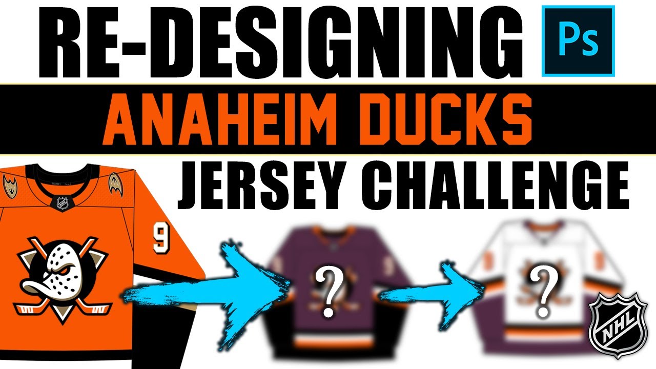
Hey everybody, Neil here from Post to Post. Thank you so much for joining me today. I really appreciate it. I’m getting back on the horse a little bit. If you’ve not seen my previous video from yesterday, we unfortunately lost our dog Luna. We had to put her down. I went through the entire story of that and uh so in case you haven’t seen that, I do apologize that I’ve been gone for two weeks, but things are going to start to get back to normal now on the channel. Now, in this video, we’re going to continue our series of where I redesigned the uh home jersey of every single NHL team. We’ve done a bunch in the past so far. Actually, in the past couple of months, Montreal, Toronto, New York, Edmonton, Florida, I think a couple of others as well, Columbus. So, we will continue. Now, obviously, if you’ve clicked on this video, then you know I’m doing the Anaheim Ducks. But there’s a reason I’m doing the Ducks next. It did get a couple of votes in that last video at in the comments. So, it was pretty high up on my list. But, uh, in the last two weeks, specifically, exactly two weeks ago, almost to the hour, honestly, we booked our next trip. And our next trip is going to be uh kind of in California. Actually, not all of it, but basically half of the trip, a little bit of a road trip is going to be in California. And five nights are going to be in Anaheim. So, I’ve not been to Anaheim before. I’ve technically driven around it, but I’ve not been inside Anaheim to actually visit it. So, I’m going to do Anaheim in this video. I’m going to do the LA Kings in the next video, and then the San Jose Sharks in the video after that. So, in the next three weeks, you will get all California teams in this series. And it’s a little bit of um shout out to the beautiful state of California and uh part of my little bit of a trip there. So let’s bring up the rules for my redesign thing and I’ll go through these quick. I wanted to challenge myself in a real world real world scenario as a designer where I get criteria and rules from someone above me. That person above me is just myself in this scenario. So I’m allowed to make one small change. I’m allowed to make a big change in the jersey and I’m allowed to make an optional shoulder change. that is add an shoulder patch or remove a shoulder patch, move the location of a shoulder patch maybe to you know down below here like how um how Florida does it or something like that. So um those are the rules. Now the uh template that I’m going to be using in this video is by Puck Designs. It’s the same one I’ve used in the previous ones. Not affiliated with Puck Designs. Have no idea who he or she is. They just have a free template online for you to use. So I wanted to give um you know props where props are due. And you can follow them on Instagram. It’s un_puckesign. So shout out to them. So, let’s bring up the current Anaheim Ducks home jersey. Now, this is technically new. So, the fact that I even have to redesign this is a bit annoying because I’ve been waiting for them to come out with a new home away jersey for years now, all the way back from the Reebok years and then it went into uh Adidas and they did nothing and then now that we’re in Fanatics, they did decide to do a bit of a rebrand and it’s a kind of essentially this jersey. Now, this is the Adidas alternate jersey which is taken from the Reebok jersey. So, they made a good decision. So, I’m I’m very happy with their home jersey currently. I think they did did a really good job and the direction that they went is is good. It’s not exactly what I would do, but it’s good. However, it does handcuff me a little bit in this design challenge because I can only make a small change and I can only make a big change. I can’t do exactly what I would want if I had no rules. But here’s the jersey as it is. So, my first change is going to be the big change. I really love the purple, that eggplant purple. We don’t get it enough in the NHL or in professional sports. So, I want to boom switch to the that purple as the primary color. That’s what I would like. I think a lot of other people feel the same way. And specifically about the color, not necessarily this exact design or anything like that, but the color purple and specifically with Anaheim, you know, bringing it back and utilizing a little bit more. So, that’s my big change for Anaheim is to go with that purple as their primary color. Now, my small change, I I really felt like the striping was okay. Uh the neck was okay. So, I but I didn’t like that kind of bronzy color in the logo. I’ve just never been really a fan of that. So, my small change is actually going to be to swap that with the orange. Just add more orange to the logo. It modernizes the logo a little bit. It helps with color relationship with the rest of the jersey as well. So, just add my small changes. Just adding some more orange into the logo and removing that kind of bronzy color. Now, on to the third, which is the optional shoulder change. I have exercised my right to remove the shoulder patch, and that’s uh it’s exactly what I’ve done. I think the jersey looks better without that shoulder patch, that duck foot. Nothing wrong with that logo, but I want I thought that um yeah, I thought it needed to go. One thing I did forget to mention was the color change and the numbers as well. So, uh you would see that the numbers now outlined in orange. That was part of the original big change when the color change happened. So, the fun part about this process is that yes, okay, now we have a home jersey. Now, we can see if we like it or not, but we also need to kind of invert it to see if it works as an away jersey. That was never the intention of this, but we always do it at the end of these videos just to see if it would look good. So, let’s do that now. Let’s see the inverted version. And I’m quite pleased. I think it does look I think it does look nice. I don’t know if it’s better than what they’re currently using as an away jersey. Home or away. Honestly, home or away. But I do like it. So, I like my home and I like my away, but I don’t think I love either. I think the rules prevented me from doing what I really wanted to do. So, I’m I’m I’m happy. I’m very happy with a home in a way. I think they are strong jerseys. I think they would be wellreceived by the fan base, and I think jersey collectors would uh would pick these up, but I don’t think they’re perfect. I think they’re far from perfect, but overall, I’m pretty pleased with these. Now, it’s your turn. Now, you leave your comments down below and let me know how you feel about the home and the way. Did I do an okay job with the rules? What would you have done differently? Would you have chosen some different colors? Yeah, I would love to hear from you down below in the comment section. And uh in these past videos, I’ve always asked, “What team should I do next? What team should I do next?” Well, I’ve already told you that I’m doing LA next, and I’ve already told you that I’m doing San Jose after that. So, but if you do want to leave comments and tell me what teams to do after San Jose, I’m going to need those comments big time because once I get back from my trip, I’m going to start filming right away as soon as I go home, and I’m going to need to know what team to do. So, leave your comments down below and let me know what team I should do after San Jose. So, thank you so much for watching. I appreciate it and I hope you’re having a good summer and I’ll see you in the next video coming up in a couple of days on Wednesday. Thanks for your time. Adios.
Episode 1742
Supporting the channel can be done here:
YouTube Membership: https://www.youtube.com/channel/UCnWUMMlROKuT3roikjMp9TQ/join
Monthly Patreon contributions: https://www.patreon.com/Post2Post
Direct contributions: https://www.paypal.me/Post2Post
DEALS:
Save on jerseys by **FIRST** going to https://www.coolhockey.com/post2post and then using code “POST2POST” at checkout! This will save you 10%.
Save $20 off your first purchase at https://seatgeek.com/ with code: POST2POST
Save 10% off any template at https://sportstemplates.net/ with code: POST2POST
Want to submit YOUR jersey concepts to get reviewed? Please watch this video to find out how: https://youtu.be/fb_h_mB19fo
Play games with me on Twitch!
www.twitch.tv/post2post
PO Box: Unfortunately, the PO Box is now closed.
Find us on Social Media here:
https://www.Instagram.com/Post2PostShow
Tweets by Post2PostShow
Have a business inquiry or want to send me a fan video intro?
E-mail me here: productions@post2postshow.com
*Due to the amount of e-mails, a response cannot be guaranteed*
#NHL #AnaheimDucks #Anaheim
14 comments
no like the orange, looks off with the purple.
The thing I really like about this series is that we actually get to see your ideas for jersey designs that we weren’t getting before. I think you have good ideas. It’s fun to watch you apply your skills as a graphic designer.
P.s. sorry to hear about your dog😢
They are both much better than what they currently have. 9/10. Best in the series so far
Good to see you back, man! Take care!
love it
The Ducks should look like mallords.
Both jersey absolutely came out better than what they currently use. Absolutely fire.
I like what you did but last years redesign is near perfect.
My sincerest condolences to you for your loss. May the baby rest peacefully 🙏🏼 😢
Please do the Carolina Hurricanes after the San Jose Sharks!
Love both
Like the purple jersey. Not sure about the black on the sleeves though. What about making that orange? For the next team…. Calgary Flames. Got to see what you do with my team's jersey. 😎
LA KINGS Jersey are crap! The 2008-09 jerseys were awesome! Since then, their designers fastly killed the team
Love it! Good decision to remove the shoulder patches; the style clashes with the main logo. The only nit I can pick is the lack of eggplant in the crest. Not really noticeable in the home jersey, as the entire chest is eggplant, but the Aways are missing that main color somewhere in the center. Perhaps making Wild Wing's eyes the eggplant color?