
Visiting Habs fan here! I built a tool to create these cumulative performance charts and decided to make one for every NHL team before the start of the season.
I originally created the tool for my baseball team, the Pirates, who hit a franchise milestone this season – reaching exactly .500 (10,879-10,879) on July 19th for the first time since 1903. I wanted to visualize the incredible downward spiral back to 0.500 (for those interested: Pirates chart), and it turned out so compelling that I decided to bring the concept to my second favorite sport: hockey.
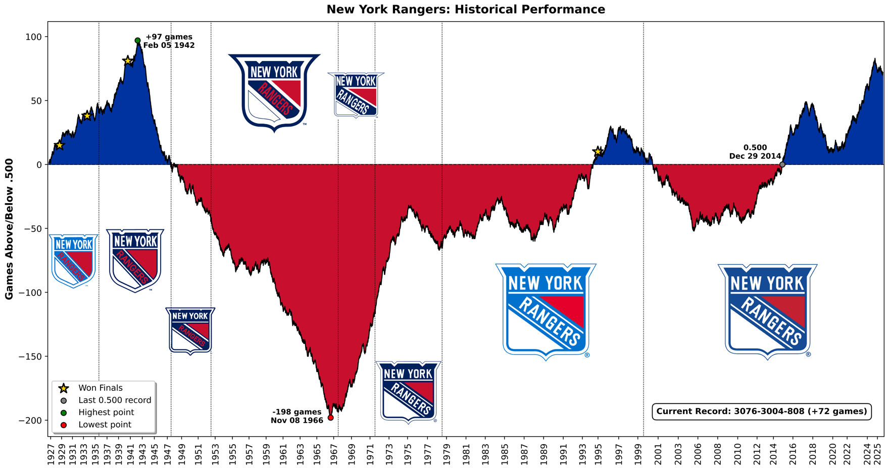
If at any point this season the Rangers have 26 more wins than losses, they will surpass their highest point, reached in February of 1942.
Technical note: Each win (regulation or OT) moves the line up +1, each loss (regulation or OT) moves it down -1, and ties keep the value unchanged. The dotted vertical lines show a logo change.
17 comments
Wow, outside of 94 and the last decade. We’ve been beyond ass.
I saw this some time ago while going through hockeydb for some info and i ended up going down the rabbit hole.
Just about awful for the majority of their existence.
Blame Ringling Bros. and Barnum & Bailey. All those years that the Rangers had to play all away playoff games cause of the damn circus lol. They might’ve had one or 2 more cups.
For all there is to complain about the rangers, this chart is a reminder of how good we’ve all had it the last 2 decades or so.
Did they not make it to the finals in the 78-79 season losing to the Canadiens…right before the Islanders took off.
Damn, and I thought the late 90s/early 2000s were painful. I’m going to do a moment of silence for post WW2-early 90s Rangers fans
Not surprising. All the top junior prospects in the 40s 50s and early 60s were territorially guaranteed to go to Toronto Montreal and Detroit. The draft and expansion era thankfully changed that
Early Rangers teams were awesome, I wish they’d get a little more official recognition from the org. Frank Boucher, Bill Cook, Bun Cook, Ivan Johnson, Lester Patrick — all Hall of Famers who won multiple Cups with the team.
To OP, thanks for putting this together, this is a cool way to visualize this data.
Yea, thanks for dosing this for [to] us.
If you were alive for 94 and went to games, the big red part is why those fuckers up top were insane and belligerent haha
The pirates graph is quite sad. Thanks for sharing this!
Neat tool and cool chart, but I feel like it might be a little misleading. At first glance the solid colors kinda hide the up and down swings. The solid red valley suggests they were a bad team during that whole time, when in fact there are a couple of SCF appearances like in the 70s. Maybe there should be another symbol for Cup appearances, and maybe a simple green-red gradient would help:
https://preview.redd.it/5qwwlqyskfhf1.png?width=1758&format=png&auto=webp&s=8e9be72d9c70a26c7b2837b1e49d89117b62707d
These are fabulous! What a great idea. A are they all available on a website for maximum rabbit holing? Seriously, these are great, thank you.
Jesus Christ
Yikes.
I hope I don’t see what the Mets’ graph looks like as that would be even more rough.
To be a fan of bad teams…
My anti depression medication intake is buried somewhere in this chart.
When you see this, and then read up on how the team was used for decades, we truly do meet the definition of a poverty franchise for most of its existence.
Crazy to think New York was used basically as a bitch team for Detroit.