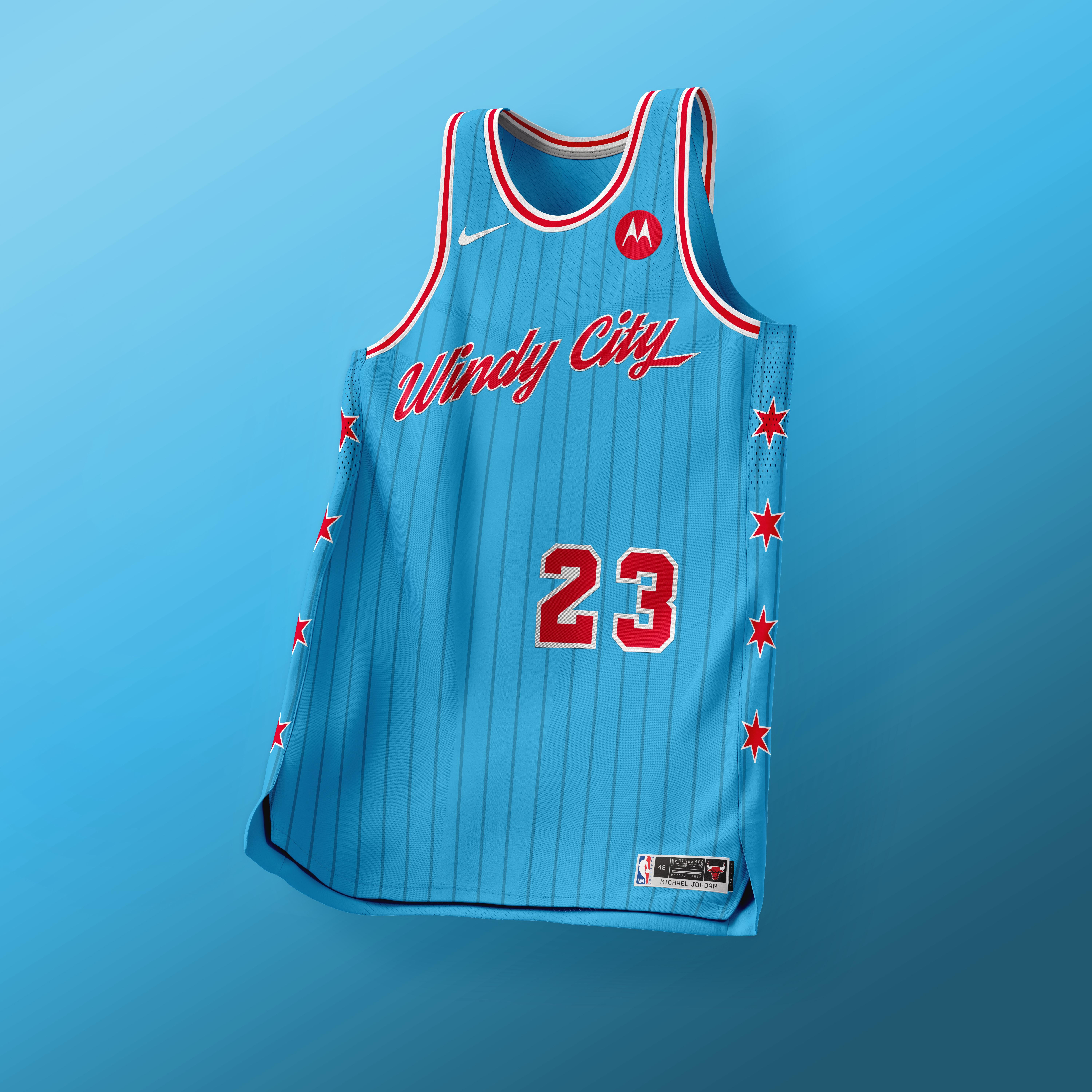
Jordan Era/CHI City Concept Jersey 🐂 let me know what you think
August 6, 2025
Jordan Era/CHI City Concept Jersey 🐂 let me know what you think
7 comments
Way too much blank space. Numbers and letters are too small.
Love the colors – go bigger with everything…stars, numbers, font.
Would do numbers at Lolla
I hate the blue. The Chicago flag is an eye sore to me and I hate any design that uses its color scheme. Especially when most of our teams don’t use those colors.
It looks like a Red Stars jersey to me more then anything.
It’s a no for me, dawg.
I agree with too much empty space but I like the concept and the colors
Edit to add: how about part of the skyline coming out of the top of the number to fill some of the blank space on the front
This is pretty similar to the white one they did Lauri’s rookie year! I always feel our teams are way to scared to embrace the sky blue and red