
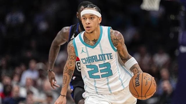
Curious to hear y’all’s thoughts on our current jerseys.
Not sure if I’m in the minority, but I really don’t like them. The teal feels too light, and the font looks childish to me. I know there are bigger issues to address as a franchise, but I really wish our front office would make the retro/classic jerseys our permanent home and away uniforms.
It’s little things like this that I think could help us be taken more seriously as a franchise.
What do y’all think?
16 comments
I agree. Our Jerseys could deff use improvements.
Needs more purple and could use some tweaks but otherwise I love them. They’re the best uniforms we’ve had since the early 2000s ones before the team moved (even though I adore the “CATS” jersey)
The current throwback (if it’s the same as last year’s) is one of the best jerseys in NBA history and I’m glad we use it. The guys all say they love them too and we wore them a ton last year. I’d love to see us make them permanent, they look just as current and good now as they did back then.
Our logo is the biggest thing in need of a rebrand
They’re great as is!
Don’t like the font and we need more purple, no idea why out main home and always are mostly teal and white.
The teal and white jerseys need more purple, but they’re fine layout wise. Tweak those colors. Which is why #3 is the best version of these. But, unfortunately, I hate this incarnation of the purple jerseys.
These designs are throwbacks to the original stripes era and that’s been fun for a few years, but it’s time to go for a new original design.
Yes
I love the bright teal and square fonts. One of the best color combos in the league!!! I wish the teal and purple were more balanced though. I wasn’t a fan during the old uniform era, so I’m not a fan of those. I also love the mint uniforms.
Jersey 3 looks like a printer error
Literally everyone thinks they need more purple but they won’t do it 😂
Like the outline on the white and teal jerseys barely register.
The modern jerseys with the purple pinstripes and collars (like the retro jerseys) would look way better.
Love them
Charlotte across the chest on the throwbacks should be on any jerseys we come up with. Maybe it’s nostalgic for me but I like the way “Charlotte” like stylistically over that blocky hornets
Best jerseys in the league.
Jersey 3, 4, and the white version of the pinstripes should just be our full time jerseys.
The granite-black jerseys with the mint accents from a few years ago were fucking AWESOME. Would love to see those come back.
Yall jerseys perfect I just wish on yall retro jerseys yall use the wing Jordan logo instead of the jumpman
Like the jerseys hate the current logo. Not saying we have to nostalgia trip back to OG Hugo, but the current logo is buns.