
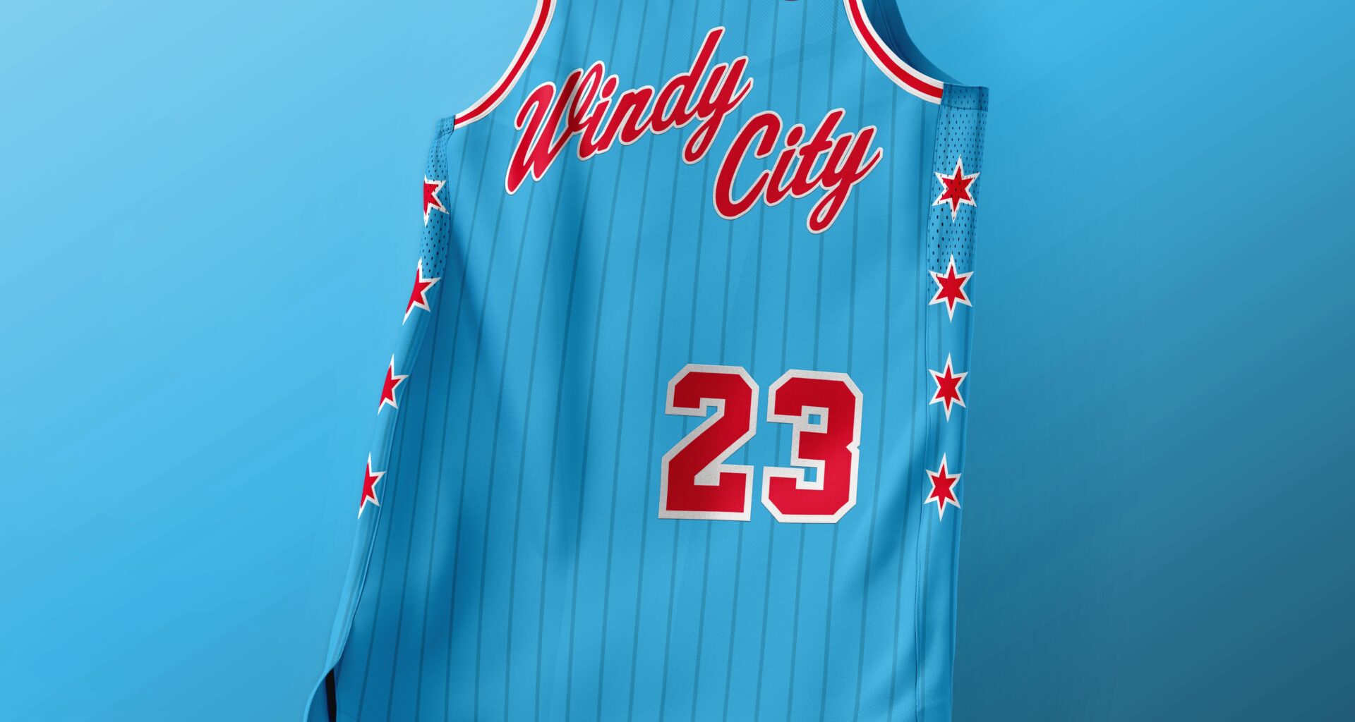
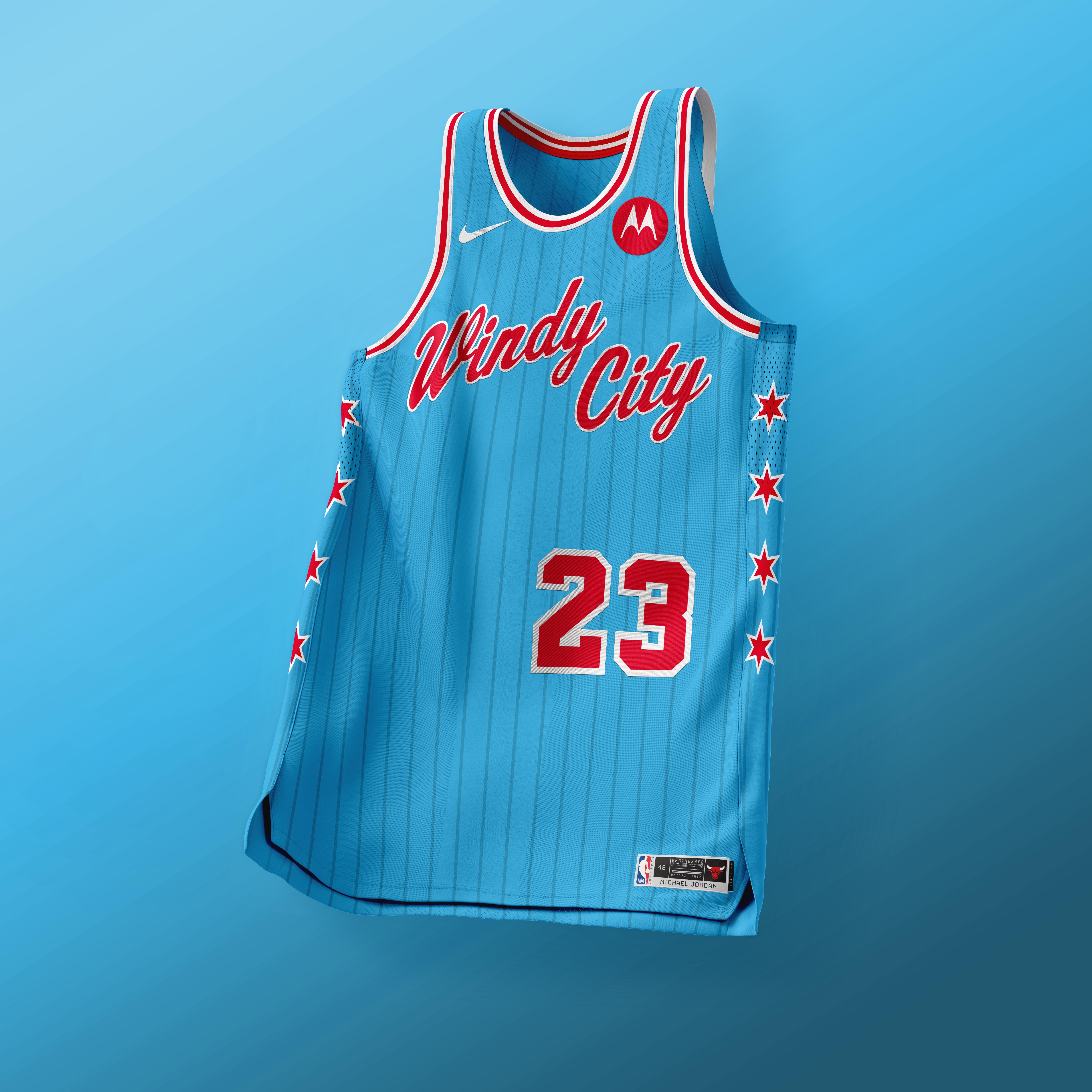
Took the advice of a few folks who commented yesterday on the original mockup.
Changes:
- “23” is slightly larger
- “Windy City” has been broken into 2 lines and is closer to the number to prevent too much free space
- Flag of Chicago stars are slightly bigger and have a more prominent outline
7 comments
The numbers just feel really far away from the text to me. I might line up the bottom of the numbers with around the top of the bottom star. But this looks awesome.
Def improved. I’d personally move Windy City down (probably so the t cross lines up with the middle of the first star). Everything’s too bunched
The outline strokes for the numbers should be reduced to match the logo. Seems out of place right now.
I’d make the side panel the stripes are on white, not sure it would work well but I’d try it to help create some additional contrast in the jersey and. It be so monotone
Dont listen to others, its awesome
I like it color like phillies
It’s even doper now…I might agree with bringing the script down a bit so you can go a smidge BIGGERRRRR (cuz I love the script). The stars are on point. Or maybe just bring the script down for it to marry up with the numbers a bit more without sizing up. (I do a little graphic design in my work and have been an artist since childhood, so I’m not just shitting on anything here.)
I love it as is, though. Send this to the BULLS/NBA – I’m buying!
I like the variation in stroke/white outlines between script and numbers.
still, too much space