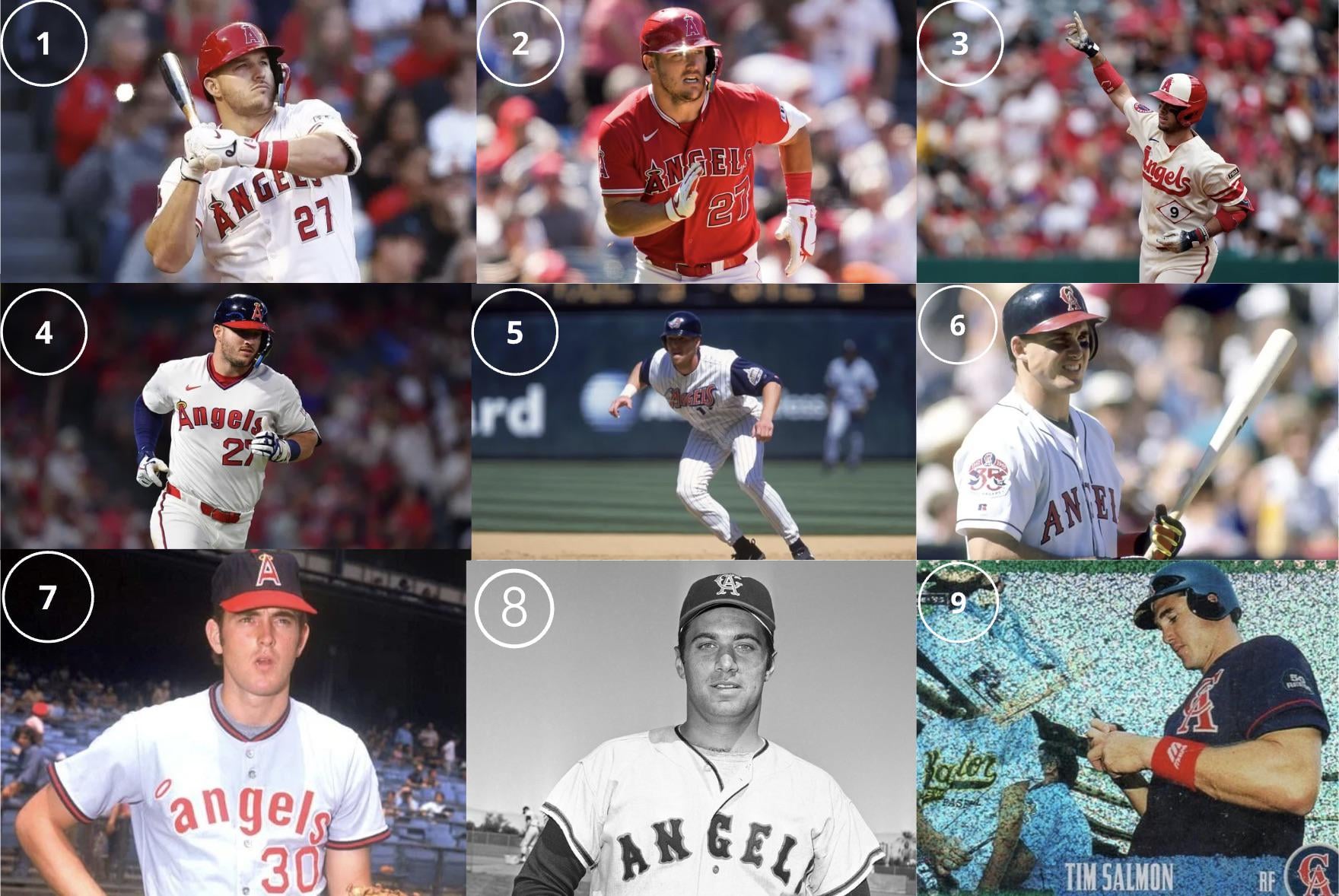
For a team with a history of diverse uniforms, there are ample opportunities for the Angels to spice up their on-field look (perhaps in the post-Arte Moreno era).
This question is pretty straightforward:
- Which uniform would you make the primary home uniforms?
- What two uniforms would you pick for alternates?
- For the sake of this exercise, which road version of these uniforms would you select?


25 comments
Primary: 4
Alternates: 3
Roads: 7
7, 4 and 3
4 and 7!
2, 3, 4
* 4 primary
* 5 roads (not pictured but the 1999 Navy alternates with Winged A logo)
* 3 Alternate jerseys (Specifically Home Alts)
* and with a 4th red as away alternates
Realized I never actually posted my choices in the OP.
Primary: 4 Alternates: 3 and 5 Road: Gotta be the grey versions of 4
https://preview.redd.it/netnjg8l9uhf1.jpeg?width=679&format=pjpg&auto=webp&s=0a4e59e28e95ff7addfddacffdc66efb013cbcd6
Call me crazy stupid whatever, but 1,2,3. We have a modern classic look as it is. Who else in the AL is straight red like us? If we go back to navy and red were would look just like Cleveland or Minnesota or even Boston. We have a unique look I wished more fans embraced. I would just alter the city connect hats. White on the hat but cream for the uniform doesn’t work for me. Maybe an all red hat?
4, 8, 9. Classic uniforms, please bring them back after Arte is done!
Number 7 (but with the lowercase a cap that was only worn for one season) as my home or home alternate. Otherwise I like all of them except the Disney-era with winged-A hat.
4, 4, and 4.
8
I’d actually make new uniforms with elements from all these uniforms mixed together
5, 5, and 5 again.
3,4,6
9,6,2 been searching high and low for that ANAHEIM across the chest jersey. Can’t find it in my sz.
I can’t complete this list without the jersey worn during the 2002 WS run—the road gray ANAHEIM jersey.
2,6,9 in that order
I want to see the grey on grey visiting uniforms
I hate the red top with grey pants.
2, 3 and 4.
I like the red jerseys and won’t apologize for it. It’s sets us apart from all our division teams and the other CA teams. Though I think the halo on the logo needs to be gold instead of the current silver. The City Connects are just nice and clean though I would go with all red hats instead of the two-tone they have now. The 80s throw backs are just terrific. I like the sharp lines. Of course I would also love to go back to being the California Angels as well.
Anything but 2.
Let’s play this game at the beginning of next season when I want to watch them play again.
#myhappyhaloisgone
All of them.
For the sake of the exercise:
Home: 4
Away: 6
Alternate: 2
I just REALLY want the mid-90s back in rotation!
Primary: 6
Road: 9
Alternate: 5
Number 4, 60% of the time, everytime.
2, 3, and 4 are the only real answers. The road versions of 4 would be the best.