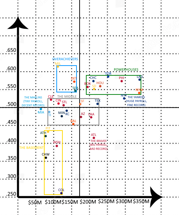
A graph comparing the record and payroll of all 30 teams.
Inspired by the graph shown in this video:
https://youtu.be/B9RPZjI4JTc?si=2YMjTj95kBC0LpmN

A graph comparing the record and payroll of all 30 teams.
Inspired by the graph shown in this video:
https://youtu.be/B9RPZjI4JTc?si=2YMjTj95kBC0LpmN
14 comments
Wow, there’s a pretty obvious correlation here.
Congrats to MIL, DET and SEA.
I know I’m biased as a dodgers fan, but this honestly seems pretty fair to me.
Obviously the teams with higher payrolls will have the “better” talent, but seeing 7-8 teams at or below the average spending and at or above the average win % suggests the game has great parity even without a salary cap or floor
So there’s 4-5 teams in our payroll range who are competitive. So we just suck at everything
I cannot fathom that the Rockies have a $125 million payroll.
That’s my Braves! At least we tried…
29/29 other organizations would’ve fired Snitker by now
Cool chart
The Braves aren’t where you want to be
Modest correlation , actually thought the correlation would be larger
I very much enjoy this (besides seeing my Rockies in the depths of the basement lol)
That’s the first time in history the Mariners have been labelled “Overachievers”
We’re a powerhouse!

A lot of people say we need a salary floor and while i initially agreed, the Rockies are pretty clear cut proof that spending more can’t fix incompetence
I thought the yellow box was labeled “The Pit” for a sec.