
NHL San Jose Sharks Jersey Redesign Challenge!
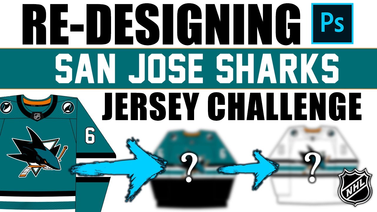
Hey everybody, Neil here from Post to Post. Hope you’re having a good day. Today we redesigned the San Jose Sharks home jersey. It’s part of a series that I’ve been doing recently on the channel where I’ve gone through every single NHL team and redesigned their home jersey. We’ve done Montreal, Toronto, uh we did LA recently, we did Anaheim recently, New York and Columbus and Florida and Edmonton. All those videos are up in the channel if you want to go check it out. But the purpose of this is to give myself the challenge of a designer in the real world and and have an actual assignment. So if you’re not a graphic designer or an artist and you don’t have that experience, yes, you can design whatever you want, but that’s not always the case because you have rules and criteria. If you get a project from Toyota and they want a marketing campaign done, they’re going to have rules. We want this like this done with this these colors with this logo. Like you you’re going to have rules and stuff. So, this is supposed to replicate that a little bit. So, let’s take a look at those rules. What rules have I gone and laid out for myself? Well, there’s three. I’m allowed a small change to the jersey. I’m allowed a big change. And I’m allowed an optional shoulder change. That’s removing a shoulder patch or adding a shoulder patch to a jersey on my discretion. So, let’s move on to what uh template we’re going to be using. It’s the Puck Designs one. That’s the one that I’ve been using for this entire series. It’s free. No idea who makes it. Just want to give a proper shout out to them for having this free online and available at least as I’m filming this. So, shout out to PuckDesigns and you can follow them at Instagram. It’s PuckDesigns_puckesigns, sorry. So, thank you to them. Uh, not affiliated by the way, not affiliated. Just wanted to give them a shout out. So, let’s look and see what San Jose is using currently. So, this is their home jersey or as close as I could design to get to it. I’m sure it’s not completely accurate down to the millimeter, but it’s pretty close. So, San Jose went through a bit of a brand change. I think it was two seasons ago if I’m not mistaken. Uh they kind of went away from that long-term Adidas kind of uh Reebok one and they went into something uh a little classic, a little modern at the same time. It’s the, you know, the striping’s changed quite a bit and uh but it’s still it’s still San Jose. Still scream San Jose. You still got the teal. You still got the logo that everyone loves and stuff. But I personally think that this was a downgrade. I like their previous home jersey more. However, I felt like I played it a little bit safe maybe with LA in the last video. So, I wanted to do something a little bit more bold with San Jose. Okay, so we went bold. So, my first decision is going to be the small change of the criteria, but you could see it as a as a big change. So, here it is. I’ve just basically removed the bottom striping and I’ve moved it up to the middle. It does change the jersey quite a bit, but I’ve not added anything. I’ve not removed anything. I’ve just moved something. So, it feels like a small change to me, even though visually it might feel a little bit more. So, I felt like, oh, my big change really needs to be big. Okay, I can’t play. I really need to go big. And I was trying to think of what to do cuz I I I wasn’t sure at all. And I got thinking about this jersey, which is their stadium series jersey. I love this jersey. I know a lot of people don’t, but I like the split aspect of it. It’s black down here. It’s teal up here. Same with the arms, black at the bottom, teal up top, split by a stripe. I thought that was a really interesting design back in the day. Not a lot of teams have done that. Only a couple. Colorado’s done it. LA has done it. San Jose has done it. I can’t think of another off the top of my head. But since San Jose has done it in the past, as you can see, why not go all the way with this one and just get a little bit risky? So, that’s what I did. My big change is going to be a split jersey design. So, we’re really utilizing more of that black and I’m changing the neck as well. I basically took the black that was in the neck and I shoved it all the way down to the bottom and just expanded it. So the neck has more room to breathe. It’s got the teal up there. And I also viewed this as kind of the brand itself in terms of the character of the shark of the environment. So what I mean by that is in the ocean, and I’ve talked about this before and we talk about gradients, but in the ocean at the bottom of the ocean, it’s dark, it’s black, it’s, you know, you can’t see anything. And as you get higher, you can start to see that light and the water gets blue and teal and green and then and you see the sky once you get, you know, on the water or out of the water, I guess. You see the blue of the sky and stuff. And this kind of jersey kind of replicates that. It’s got the spooky kind of depths at the bottom and then the lighter, you know, where the sharks are coming out. Uh, and you can see that, you know, the logo is almost coming out of the water there or out of the depths to the top. So, that’s kind of how I viewed it as well. And I’d like to think that that’s what the designer for this was thinking as well when he did this. He or she did this one. So I I although this is very bold and I know a lot of people might not like this. I don’t mind it. I actually think it’s better than what they currently use just because I’m just I’m not a huge fan of it. So I I do like it. However, we need to make the inverse of this. We need to see if this translates well to an away jersey because that’s also part of the process. I’m designing a home jersey but for funsies we want to see if it inverses to an away. So, let’s see. Now, I did try to do the split with the U away. It was too dark. There’s no way the NHL would allow it. I think it’s just it was way too much darkness or color. So, I decided to not do the split for the away, which I think is okay, but just keep the striping the same same. Keep everything else the same. Okay. Um, I do I do like this. I think the numbers would have to change from from white potentially. I think maybe I forgot to do that. I apologize. They should maybe be teal or black or something. But uh yeah, I’m I’m okay with this away jersey, honestly. But overall, neither of these would be my first things that I would do. I I’ve said that a couple times throughout the series for multiple teams, but I’m happy with the home and I’m relatively happy with the away. I just don’t think that either necessarily better than what they currently use in terms of what most people will think. I think most people think that both of these are worse than what they currently use. That’s totally fine. But at least they’re interesting. At least they’re a little bit bold and I’m not playing it safe. So, let me know what you think down below in the comment section of this bold design. Taking some aspects from this jersey, plopping it into the home jersey, and then doing it in a way which kind of resembles it. Let me know what you think down below in the comment section. And now, this is the fun part. Down below in the comment section, let me know what team I should do next cuz I’ve not designed the next one. I have no idea no idea what team I’m going to do next. Currently, I am as I’m releasing this video, not as I’m filming it, but as I’m releasing it, I’m in California. And I don’t remember which date, but I actually might be around San Jose in this moment when this video gets released. I can’t remember the date, but I’m going to try and go to the team store if I can. So, yeah, I love I love me some San Jose merch. Uh they’re my second favorite team. So, yeah, big love big love for San Jose and San Jose fans. So, let me know what you think down below in the comment section. Hope you’re having a great day and subscribe if you’re new to join this series as it continues in the rest of the NHL. We’ll talk to you soon. Adios. [Music]
Episode 1748
Supporting the channel can be done here:
YouTube Membership: https://www.youtube.com/channel/UCnWUMMlROKuT3roikjMp9TQ/join
Monthly Patreon contributions: https://www.patreon.com/Post2Post
Direct contributions: https://www.paypal.me/Post2Post
DEALS:
Save on jerseys by **FIRST** going to https://www.coolhockey.com/post2post and then using code “POST2POST” at checkout! This will save you 10%.
Save $20 off your first purchase at https://seatgeek.com/ with code: POST2POST
Save 10% off any template at https://sportstemplates.net/ with code: POST2POST
Want to submit YOUR jersey concepts to get reviewed? Please watch this video to find out how: https://youtu.be/fb_h_mB19fo
Play games with me on Twitch!
www.twitch.tv/post2post
PO Box: Unfortunately, the PO Box is now closed.
Find us on Social Media here:
https://www.Instagram.com/Post2PostShow
Tweets by Post2PostShow
Have a business inquiry or want to send me a fan video intro?
E-mail me here: productions@post2postshow.com
*Due to the amount of e-mails, a response cannot be guaranteed*
#NHL #SanJose #Sharks #SanJoseSharks
15 comments
Please do nj love to see a new jersey
I like both of the jerseys I like the home one more and can I please get pin
Devils!
Do Pittsburgh Penguins ☺
This is probably my favourite series you’ve ever done. Would love to see the flyers done consider how little their jerseys have changed throughout the years
Great video, but the jerseys were huge misses for me, personally.
Do New Jersey devils plz
The Sharks need to bring back that orange accent striping.
The striping with the split level almost makes the middle of the jersey too busy. I would almost like to see the split with the striping still at the bottom.
Minnesota Wild
For the homes, I'd cut the striping above the black and lower the black a little then reintroduce a small orange line between the white and black stripes on the arms.
The position of the logo on both jerseys is a bit too high imo
It’s a no for me dawg
i actually think the away tarp looks better than the home
As a Sharks fan, I hate this.
Put the home sleeves on the away jersey and it gets 100x better. I do think the midde is a bit busy tho. The mddle stripe works for Montreal because it's a relatively simple logo, but SJ's logo has a bit too much details to really pull it off.