
NHL Jersey Rankings for the 2025-26 Season — Where are the MAMMOTH?
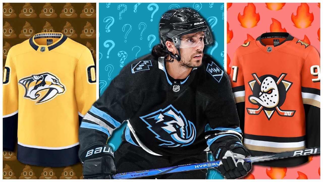
Hey Twisters. So for this video, let’s rank all 32 NHL home jerseys ahead of the 202526 season. So we’re just going to rank the home jerseys. We’re not going to pay attention to the sponsors. That would be really lame. We’re going to rank just the jersey itself, not the full uniform because you collect jerseys. You don’t collect uniforms so much. Or at least I collect the jerseys. And we’re only going to be ranking these as they kind of currently stand in the NHL, not so much a historical ranking because the original six teams should probably be at the top no matter what. I’ll talk about that a little bit more in this video. And also about halfway through, I’ll talk about something that I’m helping raised funds for. It’s an ice rink in Idaho. They need some help from the community and from outside the community if they want to continue their operations. So, I’ll tell you more about that roughly halfway through. And also let me know in the comments down below besides what you think about my amazing rankings ahead. What other stuff should I rank on this channel before we get into the 202526 season. So let’s get started with number 32. The first few jerseys here I’m not a fan of and the ones that come after it are okay. Everything else though I like quite a bit. So there aren’t that many that I don’t I don’t really care for. But this is one of them. And at 32 it’s the Washington Capitals. We all know that they should have a different logo on the front of their jersey. Whether that’s the or the screaming eagle. It’s also the design of this jersey. It’s a relic of the Reebok Edge 1.0 era with the splotchy color blocking under the arms and along the sides. Never been a fan of that. And I understand the Capitals were wearing this jersey during the Stanley Cup run of 2018. So, I understand they’re not going to change it this year, but maybe once Ovkin hangs them up, they decide to go in a different direction. All right, number 31. I’ve got the Predators. The Predators, I don’t mind them wearing yellow at home, but the thing is is that it’s just a whole lot of yellow and not much else going on except at the ends of the jersey. There are some cool details. Let’s not forget the guitar string pattern in the numbers and also you’ve got the interior collar. It’s got that uh those piano keys. But I was thinking that after 14 years of pretty much the same design, they try to find a way to mix things up. But I do give them points for wearing yellow or predators gold as it’s called. All right. Now in 30th, this is probably going to be the first disagreement here. I’ve got the Devils. I have not been a fan of this jersey design since it came into the NHL at the start of the Adidas era in 2017. It’s such a departure from what I thought was a more balanced look during the Stanley Cup years and further through the Reebok era. The logo, nothing wrong with that, but it’s the cropped shoulders. Not such a fan of that. There’s nothing going on at the bottom of the jersey except for like a thin black stripe. And then you’ve got these really thick bands on the arms, which I just think make things a little bit disproportionate here. Now, we’re going to get into sort of my okay jerseys. They’re not offensive, but they’re not exactly ones that I would go out of my way to collect. So, we’ll start in 29th. I’ve got the Tampa Bay Lightning. A lot of people say, “Hey, it’s the Maple Leafs colors. It’s the Red Wings template.” And I’m not going to disagree with that. They do have shoulder logos. They do have some outlining to the numbers to make it different. But the thing with this Tampa jersey is that the design is too simple for that simplistic of a logo. The Lightning have had a lot of imaginative designs before. I’d rather see something like that than what we have here. 28th, I’ve got the Columbus Blue Jackets. For me, it’s a lack of contrast here. I’m a big fan of having good contrasting colors. And with Columbus not having anything underneath the piping on the arm, if that were like all white on the bottom of it, at least that would stand out somewhat better. I do like the kit here with the uh name and number. I think that that looks pretty solid. The logo is fine. I imagine it looks really good up close. I haven’t seen it in person from a close distance, but of course, we’re all going to talk about, hey, they have the cannon. Why wouldn’t they put that on the front? Even so, I think that this design could be better. I do like that they have the cannon on the shoulders. Then we get to 27th. I’ve got the Vegas Golden Knights. I actually really like the body of this jersey, the torso of it, and the shoulders. That all looks great. If they were able to execute a little bit better outside of that, this could be one of my favorite jerseys. But for me, it’s the arms. The arms are just kind of wonky with that big block of white. I know it has the pattern inside of it, but I just think that that looks kind of weird against this gray and gold color scheme. Even if the gray were just black, I would be a fan of that. And some people would say like, “Hey, this is too mustard looking.” When you look up close, you’ve got that fleck, that sort of shimmer to the jersey, and it looks a lot better. 26th, I’ve got the Dallas Stars. Big fan of the victory green, the logo. There’s nothing wrong with that. Have the Stars had better jerseys in the past? Sure they have, but this is not an offensive design. It’s just not a very original design, just like Tampa Bay. Again, at least you have shoulder logos going on. They used to have the perforated numbers. Not too many teams doing that these days. One thing that sets this back, especially though, is the collar. You can’t really see it too well in the team photo that I included here, but it’s got that toilet seat collar design. I don’t know why teams haven’t all moved off of that yet, but Dallas is one that still has that going on, unfortunately. Now, this next set of jerseys for me is the good but not great tier. So, these are overall solid designs. I actually have a couple of these in my collection, but I think there have been some better designs or ones that have been brought back in recent years that are better than the ones that we have here. So, 25th, I’ve got the Hurricanes. Originally, what was an alternate jersey for them, there are some great elements with this. I I like the shoulders being that charcoal gray with the stealthy looking shoulder patches. The heathering on the waist and on the sleeves with that heathered red that looks good, too. Name and number looks solid on this. I’ve never been a big fan of this logo. I understand why people like it. They like especially that North Carolina silhouette uh in between the two storm flags. That’s cool. It’s just that this thing is too tall for me. It doesn’t look like a professional sports logo to me all that much. I know it’s really particular, but when you’re spending $180 on a blank jersey, if you’re paying full price, then yeah, you want things to be executed a little bit better. Now, at 24th, we’ve got the back-to-back defending champion Florida Panthers. I was a huge fan of this when this came out, but just like other jerseys here, my opinions have shifted over the years. The original Leaping Cat is pretty great. I used to not be as much of a fan of it, but I do like it now. But this is a good looking design for the most part. I do wish that the chest stripe would continue all the way around the jersey. There’s only one team that does that with their home jersey. The numbers on the shoulder are at least something that’s unique. I also like the um the patches that are on the arms as well and how they vary that depending on the home or away jersey and also the captaincy and alternate captain. That’s all like really cool detail there. It’s a red jersey with some gold trim. Hey, that’s that’s unique in its own way. Now we get to 23rd. We’ve got the Philadelphia Flyers and they’ve been wearing this. I think this is their third year wearing it. Always been a big fan of the Flyers logo personally, but with this one, I think that there are a couple things that could be adjusted a little bit better. I understand they’re drawing on past eras with this. I don’t mind the burnt orange. That’s a nice u way to break things up versus the more traffic cone orange that they used to wear. I’m not a huge fan of how much white there is on the arms overall. And I’ve never really been a fan of the arm design on this. It’s kind of like what the Kings used to wear in the 1980s. But hey, you got to credit this for not being conventional. Plus, you got the uh plating for the name bar. So, I’ll give them some credit where it’s due there. Hey, it wouldn’t be so bad to add a couple of shoulder logos and come up with something different there. All right, now we go to 22. I’ve got the Seattle Kraken. And some of you might be thinking, “Wo, this is way too low.” But most of these jerseys I like quite a lot. And there’s no exception to this one. I did collect it as soon as it became available. Good looking logo, unique color scheme. I guess the reason why it’s probably not as high is because I wish that maybe there was a little bit more going on up top. Whereas, you know, the the middle of the sleeve, you got that big color blocking and then there isn’t really much above that except for those uh those anchors on the shoulder and they don’t really take up all that much space. I know I’m just kind of splitting hairs there, but when you’re paying again $180, you probably want something that reflects your design preferences even more. 21st New York Islanders. This is a great looking color scheme with the royal blue and the orange. I think in this case, kind of like Seattle, it’s more about like what happens at the elbow and downward with the sleeves. It’s just a lot of color blocking there where you don’t have much going on up top with the shoulders. Like I I wish there were a couple of shoulder logos. That would be pretty nice. Not to mention, a lot of people will point out that the collar looks really awkward with that orange piece. It’s like wearing a metal. I couldn’t agree anymore. But overall, this is still an attractive, polished looking jersey for the most part. All right, and then on to 20th, we’ve got the Vancouver Conucks. And if you’ve watched my logo rankings, you’ll see that I’m not really a huge fan of the Orca. I I don’t know. It’s just I don’t know if it’s the shape of it or whatever, but I’m not saying that they have to change it unless they want to change it to the skate. This is an overall good-look jersey. Unique color scheme with blue and green. You’ve got good-looking shoulder logos with a stick and rink. Of course, a nod to the original era of the Vancouver Conucks. It’s It’s pretty straightforward, but again, with that unique color combo, I think that it does enough to, you know, set itself apart. And as soon as this jersey came out back when they had the actual word mark above the Orca, this was actually like my favorite jersey in the in the NHL, not of my favorite team. All right, everybody. Now, we’re going to take a quick break. I’m going to talk about something I’m helping raise funds for. This is a hockey association in my state of Idaho here. It’s a small community. They don’t have a ton of crazy corporate sponsors. They need the help from their community and outside the community as well. I was very fortunate to meet their director and assistant uh director on their board and they’re very passionate about growing the sport of hockey in this small community. So, they’re raising funds in particular to pay for an ice chiller. It’s something that can run several hundred,000. And with the help of a new ice chiller, they’ll be able to have operations in the arena year round. So currently they have to close down during the summer. It’s often 100 to 110° outside there in Lewon. And so kids need something to do when they can’t go outside and run around. And so that’s why they’ve been growing their hockey program out there for the past couple of decades. And it’s very important that they’re able to either buy or rent a new ice chiller. The one that they have right now is 37 years old and is constantly undergoing maintenance. So, if you could please contribute any sort of amount, that would be amazing. Let me know down below if you end up donating. Just see the link in the pin comment down below or the video description. That’ll take you directly to their website. I’ll continue shouting them out because again, the sport of hockey, especially in my state of Idaho, does mean quite a lot to me, especially being able to introduce that to more kids, make equipment more affordable, and so their programs to do that are just magnificent. So, anyway, see that link down in the pin comment or the video description and help out Lewon Hockey. Thanks so much, and let’s get back into our rankings. All right, now let’s get to our great tier. This is like our A tier right here. And we start things off with the Detroit Red Wings at 19. Yeah, because I love all these hockey jerseys. Now, the Red Wings and a couple other older teams are down here, not because their jerseys aren’t great. It’s just that we’ve seen them so much. We’re so familiar with them that there are other newer designs or designs that have come back recently that are making that impact and having that luster on them. Whereas the Red Wings, we’ve seen this for gez what, just about a hundred years. This logo is my favorite in the NHL. I’ve said that before. And even though it’s a very simple design for a jersey, the fact that you have a detailed logo makes things more balanced out that way. There’s nothing wrong with this one. It’s like I never want them to change it. 18. Very similar thing. Toronto Maple Leafs. This has been one of my favorite jerseys ever in the sport, in all of professional sports for that matter. I like this particular Maple Leaf design. I like blue more than red. So, I’ve ranked the Leafs ahead of the Red Wings. Although I like how there’s at least two arm stripes here for Toronto and um there’s really not all too much more to say about it because we know Toronto jerseys. But again, this is still one of the best ones that they’ve ever issued in my opinion. All right, now to 17. We’ve got the Ottawa Senators. There are some really great things about this. I think that that logo up close in a on ice jersey must look really good. I haven’t seen it so far yet. Black and red jersey always pretty intimidating. Although I think it was Justin in my Discord was saying it’d be great if they would put more gold into the actual design outside of the logo itself. And I completely agree that could really help set it apart from other red and black jerseys out there like Carolina, New Jersey and Chicago, but overall this is well composed. I wish that the arm uh that the numbers on the arms would be actually above the stripes. There’s another team that figured out how to do that well and we’ll talk about them later on. Now we get to 16 and I’ve got the Winnipeg Jets. This at one point was also one of my absolute favorites in the NHL. It’s a very well-designed jersey. I always love some two-tone blue or for the most part I love that color scheme quite a bit. Although I do wish the Aviator blue was a little bit lighter. I think that the contrast could be a bit better this way. I like the thick armbands. They’re one of the few teams that does that for their primary. I like the wings uh for the shoulder logos. Those look sharp. And the type face and the number kit. Like that all looks great on this one. I’ve always been a fan of that. And and the logo itself, I think on this jersey, it looks really good. It’s just a nice balanced, symmetrical jersey. Can’t go wrong with that. Then we get to 15th. I’ve got the Buffalo Sabres. And this is a great looking jersey. I mean, we’re about halfway through the rankings, but really these are such awesome jerseys. It’s so good to see the Buffalo Sabres wearing royal blue instead of the navy blue that they used to wear. This was ranking a lot higher when they first reissued this, by the way. But overall, very solid. That logo itself, I imagine looks wonderful up front. I’m sure I’ll say that about other logos here as well. Uh, but there is some pretty cool detail in that uh Bison. I do wish there was something going on with the shoulders. I guess that’s probably my my main knock. So, the flaws of these other jerseys are so minor that I mean, I would pay I would consider paying full price for most of these if I had the means to collect them in that fashion. Now, in 14th, we’ve got my team, the San Jose Sharks. I do love this jersey except for one thing. I wish that the striping on the arms and on the waist was inverted with the road jersey. I think that would look better here. And a lot of people think, “Hey, the Sharks, what is with all this teal?” Hey, if you were to actually make the equipment black with this jersey, it’s a really good look. I love the shoulder logos. That looks terrific. And of course, the logo. Don’t change it. Don’t Don’t go back to the uh to the old one. This is This is one of the best logos in sports. 13th, I’ve got the Avalanche. The way that they were able to tweak the design from the 1990s and the horrible Reebok Edge 1.0 phase, they they did everything right for the most part. A lot of people will say, “Hey, the the Yeti foot needs to be on the shoulder.” I can understand that. I like the C myself. I like something that’s a little bit more symmetrical in its design. The colors, I liked how they adjusted the blue over time, how they took out the black. I think the color scheme is a little bit more unique this way. I love the captain’s letter and the alternate captain letter and kind of like Detroit and another team that we’re going to talk about. You’ve got that arched font on the back as well. It’s It’s such a fun jersey. I I never collected this in Adidas, but hopefully one day I can uh make up for that. So, we’ve got 12 jerseys left, and I actually broke this into two tiers. We’ve got the S tier. I I think these jerseys are all terrific, but then we have the god tier ahead of them, and that’s my top five jerseys. So, in 12th, I’ve got the Canadians, the most iconic sweater in all of hockey and one of the most iconic jerseys in all of sports. The only reason why it’s here, it’s really because of that toilet seat collar that looks absolutely horrible. I miss the days of that ribbed red, white, and blue color uh collar from, I don’t know, the CCM era. Everything else about this jersey though is completely flawless and I never want Montreal to change their jersey apart from this 11th. I’ve got the Anaheim Ducks. Uh the orange uh it’s a lot of orange on the uniform, but the jersey itself, I think it’s pretty well balanced. You got that drop shadow for the font now for the uh for the numbers. I don’t know if I like that all that much. I think it might be a little bit too busy. But that aside, I like the other elements of this jersey. Having the duck foot on the shoulders, I think that’s cool. It kind of honors the team that won the Stanley Cup back in 2007. I know they weren’t wearing that on the front of the jersey, but that was still part of the branding. Of course, having the reworked Mighty Ducks logo looks awesome for 2025. I like the striping on this overall. Good color scheme, Orange County. Now we get into number 10 and I’m probably in the category of I’m probably in I don’t know the 20% of people who really really like this jersey apart from Oilers fans themselves. Yeah, Edmonton’s got a great home jersey. They have an even better away jersey in my opinion. I love this color scheme. It works so well with this jersey design. You get the three simple stripes on the arm, three simple stripes on the waist. I would like to see what this would look like without the ends of the sleeves and without the shoulder yolk being orange if they were just blue. I think that this could be better, but even so, I I just think that it stands out enough and yet it’s a very familiar design. You got the circular logo. It’s a good-look jersey. I I I especially like the way the numbers and the captain’s letter are done. Now, I’m sure a lot of you clicked on this video thinking, “All right, where do the Mammoth stack up against other teams in the NHL?” I actually really like this look. This is in ninth. Is it going to stay here forever? Maybe it slides down. I’m not entirely sure. But as soon as the logo was unveiled, I thought to myself, “Wo, that to me has got to be the best new logo that I’ve seen in the NHL in some time, it to me, it’s better than what Seattle did. It’s better than what Vegas did.” And I think both of those franchises did a really nice job with their branding. But Utah, I think, has knocked it out of the park with this mountainous mammoth. A familiar design with a great 2025 logo, and it’s black. I know that that’s kind of a copout, right? like Utah black, you know, for boating. Nah, maybe not so much, but I am a sucker for this color scheme in general. So, it looks great and I can’t wait to see this team on the ice. All right, now on to eighth. I’ve got the Minnesota Wild and this has always been a very top tier jersey for me, starting with the Adidas era. Couple things that I don’t really care for too much. One, I wish maybe there was a little bit more going on at the bottom of the jersey, maybe two of those cream stripes, but the fact that you have cream in the first place is awesome, right? And then you have that red uh stripe on the arms. It’s not in the middle of of the band. It’s just something that always has looked kind of odd. Kind of like that red collar piece as well. And you don’t have the chest stripe continuing around the back. But I love the forest green. I don’t think Minnesota should change that. As much as I like the the subway look or the, you know, classic Kelly green and gold look from the North Stars. This logo of course to a lot of people the best in the NHL and I would say it’s right up there with the Red Wings and another team we’ll talk about. All right, so that was eighth. Seventh. Yeah, I’m a Sharks fan, but I absolutely love this LA Kings look. It looks magnificent. Not to mention, you’ve got that shimmer to the silver that looks great. You got the chrome looking uh crest on the front. Brings back a lot of nostalgia for people. But the overall composition regardless, I think is has been executed pretty flawlessly. I love how the Kings did this. The senators, you need to take a a page out of the Kings book and put the numbers above the uh the elbow striping or elbow banding. It looks so much better here. Not a huge fan of the collar. I think that should just be all solid black and maybe have a couple shoulder logos. And then finishing things off with the S tier. In sixth, I’ve got the New York Rangers, the drop shadow font, the arched uh names on the back, the classic hockey design. It’s It’s a great look. I’ve always really liked the Rangers jerseys. They’re the only team that should ever have a word mark on the front of their jersey in the NHL for for a home jersey. I can’t really complain about anything except for maybe the collar piece with that red in in there. That doesn’t look very good. I love the road jerseys. I think they’re even better. All right, so that means we’re getting down to our final five. This is the creme de la creme. This is the gods tier. And kicking things off in fifth, I am so damn happy to see them take the ice like this. We’ve got the Boston Bruins. I wasn’t such a fan of their jersey design for the past, I don’t know, previous uh 15, even more going back to, you know, like the early Joe Thornton era. This is more of the the, you know, Happy Gilmore jersey, the look that they had going into the mid1 1990s. I think that was when they changed things up. I love it. It looks great. I like the reworked crest on the front. I like the striping design more. And I especially like how up top it’s not overly complex. I do wish they had uh two shoulder logos instead of just one. The Predators only have one shoulder logo. Looks kind of weird, but I don’t mind that all too much. At least it’s a cool design. Everything else looks really solid. And maybe this is the best home Boston Bruins jersey that I’ve ever seen. It’s right up there. We’ll see if the luster is still pretty shiny after a few years, but hey, this is exactly what I always hoped for with Boston. Then in fourth, I’ve got the Calgary Flames. And I’ve told people before this is my favorite look in the NHL for home games. I don’t know if it’s still at the very very top, but it’s it hasn’t gotten really any worse to me. It’s just that great assertive color combination with the red and yellow. You’ve got the flaming sea. Looks great in the white. Simple striping and banding. Very, very traditional, classic. Looks great, especially when they play the Oilers. Could they maybe have a couple blasties on the shoulder? Yeah, I wouldn’t mind that all that much. Then in third, I’ve got the Pittsburgh Penguins. I do have this jersey. Thank you so much, CJ. I have a Phil Kessle and it’s the black and yellow. That’s that’s maybe the best color combination in sports. It’s right up there. I like how this jersey template is actually still fairly unique today. Kind of borrows from like the white Red Wings jersey with a little bit more striping. I like the color blocking on this. Overall, the logo looks terrific. It’s a big logo. I’ve always really liked the Penguins logo. I can’t really say much more about this. I I just hope that Pittsburgh never deviates from this for home games. So, that means we’ve only got two jerseys left. I don’t know if I’d put them quite this high usually, but the Chicago Blackhawks did such a great job of making some adjustments for their 100th anniversary. I have to put it up here. To many, it’s the best jersey in hockey. I can respect that. Especially in this case, it looks terrific. This time, they’re going with the laces. I don’t know if they actually need that, but to kind of convey that nostalgia and a team that’s been around for a hundred years, I can see why they would do it. It just looks kind of weird with with this Fanatics template borrowed over from Adidas. But the collar outside of that, they did a really good job executing that. No more white like they previously had. It’s just red and black. I got no complaints about that. Keep it that way. Don’t ever change that. I like the Centennial patch on the shoulder. And of course, they still kept the Tomahawk the Tomahawk shoulder logos. Those are up there with the best in hockey. And I also really like the gold trim around the logo. I’m sure that for an on ice jersey that’s going to shimmer. That’s going to stand out quite a bit. It’s a Blackhawks jersey. It’s got to be still toward the top in my rankings. But for Hawks fans out there, now I’m going to kick you in the balls because I’m going to rank the Blues at number one. And they’re finally making this their home jersey. I am so happy. To me, this is right up there with my absolute favorite jerseys of all time. Like this is in that category to me. It’s timeless. Yes, it does borrow from the 2017 Winter Classic, which was an even better version of this with a stretchy collar and also the felt numbers, but even so, to see this on the ice again, I will never get tired of it on a full-time 41 home game basis. And I like this version of the Blue Note as well. I like how it’s a little bit more angular. The other one was a bit rounded at parts. I didn’t care for that quite as much. It still looked really good, but we’ve got this lighter shade of blue. We’ve got this um original shape of it and I think that it looks really good even for 2025. And as for the striping, the name, the the numbers on this, I think it all just looks really sharp, balanced, really good contrast, and it’s my favorite jersey in the NHL, and I think that it could easily stay at that top uh for for quite some time. But anyway, guys, what do you think of my rankings? Let me know in the comments and let me know if you have other ideas, especially as we lead up to the start of this upcoming season. And don’t forget, if you haven’t already, click on that link in the pin comment or the video description. Support Lewon Youth Hockey. These people are tremendous. This is a very hardworking, modest community that could use a new facility or at least a new chiller for the youth out there. And let’s grow hockey in the gem state of Idaho where I live. Anyway, Twisters, thanks so much. It’s great to be back here and I’m looking forward to interacting with a lot of you for the first time in a long time and some new faces out there of course. So, please do leave a thumbs up and spread the word. Let’s uh get Twisted Wrist Hockey back on the map and um have some banger videos uh for you guys lined up. Thanks so much for watching everybody. I’m Nick. I’ll catch you later.
Let’s rank all 32 NHL Jerseys for the 2025-26 season! From 32 to 1, I’ll give my takes on every team’s home jersey — from the original 6 teams like the Red Wings and Maple Leafs, to the newest club, the Utah Mammoth. Plus you’ll see where I’ve ranked teams that have recently changed up their logo & looks, particularly the Boston Bruins and St Louis Blues. Comment with your thoughts on my rankings and lmk what else I should rank in a future video!
SAVE YOUTH HOCKEY in Lewiston, Idaho by donating here: https://my.cheddarup.com/c/donation-12425/items
Watch Next
• The Reverse Sweep that Spawned a Dynasty https://youtu.be/2rILphLJaa8
• The Jersey “Mount Rushmore” for Every NHL Team https://youtu.be/GcnZFWIWa58
• Every NHL Team’s Fiercest Rivals https://youtu.be/APbVUG3USSk
Get EXCLUSIVE CONTENT with a Twisted Wrister Hockey Membership: more live streams, videos, and more! Join Here: https://www.youtube.com/channel/UCN7Qudr0LemvoxnfBVdzbAg/join
Support TWH:
• Shop Twisted Wrister Merch! https://twisted-wrister-hockey.creator-spring.com/
• Join our Discord community: https://discord.com/invite/hB5RGF8Zxr
• Like, Subscribe, and Follow @Nick_Pinkerton (X) + @twistedwristerhockey (Instagram)
• SuperThanks are appreciated! Also…
• PayPal: twistedwristermister@gmail.com
• Venmo: @twistedwristerhockey
• Cash App: $twistedwristerhockey
• Business & collaboration inquiries: twistedwristermister@gmail.com
39 comments
Hey Twisters! Help me save youth hockey in Lewiston, Idaho by donating to the Lewis Clark Hockey Association here https://donation-12425.cheddarup.com/.
So, what do you think of my rankings and what's your top-5? Comment below and lmk if you have ideas for rankings or other videos before the season starts. Thanks for watching, feels great to be back here!
Utah vs Colorado
What part of Idaho are you from. Come to utah and watch the sharks when they're in town
LOL for some reason I thought this was a Icethetic video.
Sup sup! Loved the intro!
Ducks fly together!!!!!!!
Lets gooo
I disagree with the Leafs being that high, and even though I’m a Lightning fan, that’s not the reason why. It’s because the Leafs’ overall jersey design hasn’t changed since the early 2000s.
I love that you’re back doing videos, but the Knights are at the bottom of the Pacific in home jerseys. Also the Calgary Flames being so high….? I just can’t, reminds me of the Kansas City Chiefs…as a Niners fan that is blasphemous. I will say I loved where you put the Mammoth. If I am not mistaken, Mammoth was a name you favored quite a bit for Utah. Its a very solid home jersey, I would expect their road jerseys to not be quite as high with their wordmark.
Everyone has an opinion, but oof…
Great vid! Not much I’d change myself, as a bruins fan I’m with you on the single shoulder patch, I wish there were 2 for symmetry! Overall a great look though, I think I like the road one even better!
NHL needs to get of the NHL logo around the neck. If there are strings, open up the neck ala the original sweaters.
I actually think the Kraken have one of the best away jerseys out there!
Let's gooooo
I am so tempted to get a CBJ jersey but I can't wait to get a Utah mammoth one
I've been saying this about the Devils jersey ever since it came out, those cropped shoulders are hideous. Stars, Devils and Preds all suffer from the same issue, solid logo, too plain and uninspiring jerseys.
If it was me id switch 32 and 31 keeps 30
14:45 oh my god, that looks so much better. I still prefer the ‘91-‘98 and ‘07-‘13 looks, but those changes just make that Sharks jersey look so much better.
Get your jerseys off the DH gate
1. Winnipeg Jets – Use the 90's Jets logo and jerseys with modern colors and current (boring) logo fitting better as a shoulder logo.
2. Washington Capitals – The Eagle logo and jerseys.
3. Pittsburgh Penguins – Use the "Flying Penguin/Robo penguin" as shoulder logo and a 3rd jersey with reverse.
4. Vancouver Canucks – The original Orca colors and jerseys / Flying skate jerseys as 3rd.
5. Dallas Stars – Go back to classic logo- and use the "Star" jerseys again.
6. New York Islanders – Go back to use the wave-jerseys and have the Fisherman logo as 3rd jersey.
7. Buffalo Sabres – Go back to fully use the Angry Bison/Goat head logo and jerseys, with the "classic" as 3rd.
8. Edmonton Oilers – Go back to the 1997-2007 colors and Oil-driller 2nd logo on the shoulders.
I wish Columbus would go to the alternates full time.
Tier inflation continues! We can't even stop with an S-tier anymore?!
Wow glad to see u back sir where the hell have u been man!!!
St. Louis looks absolutely glorious. Sorry Chicago but they deserve #1
I just realized that if you change the powder blue from the Mammoth jersey to yellow, you actually get the Bruins jersey
Personally I’ve always hated the Pens jerseys but the Bruins and Flames being top 5 is VALID
Thank you so much for the shout out. We really appreciated you sitting down with us and having a great conversation.
Once the Mammoth unveil a mascot can you please rank them all? 😊
Don’t go back to the old sharks logo? What?
You just said the current is one of the best in sports?
You lost your Team Teal card buddy…
No one in San Jose shares your sentiment.
Are you making an aways jersey rankings too?
As a uniform aficionado all I can say is great job. Some of these teams unis are significantly better in white though – particularly Rangers and Habs.
WE’RE NOT LAST! LETS GOOOOOO! (we’re 2nd to last)
The Mammoth name, logo and jersey design seems really polarizing. Everyone tends to either love or hate it.
Can't believe my Blues are #1. But that is NOT their new sweater. That is a pic of their Saturday home sweaters for the past few seasons. The new logo does NOT have the white outline around the note, just yellow. And the yellow outline is thinner too so there isn't a whole lot separating the blue of the logo from the blue of the sweater.
23:47 The Blues should’ve included the white stroke around the note, as pictured here. It’s the only flaw.
Really enjoyed this ranking video and the details you went into! Have you ranked goalie mask art yet? Ever since I found out Freddie Andersen had Lego Batman on one of his I've been obsessed with tracking own the details of goalies' art….
I’m a Caps and Stars fan. Hope for great years for them this year
As a Canes fan, thank you. A lot of Canes fans love this jersey but the logo is so awkward
We will ranking ours this upcoming week … with a little bit of a twist from last year. Thanks for the video 👍🏼