It’s much better with the logos. If they just made it smaller it’d be fine
they actually saved it lol
I can’t imagine ever caring about the design of these
Second version is definitely better than the first version but I dont really like either
I think the super bowl version was fine as a one time thing
Yes
I think they’re good.
this is good….
especially because Philly fans can’t read so now they can use pictures to know who has what score…
though they will still need someone to read the numbers for them…
Looks like the way the premier league does it
I don’t know why they changed it. I like the style that’s been used for decades.
I don’t really care, but I do like them- I even like the Super Bowl score bug more than the recent one
nothing wrong with the change. simple enough.
I don’t have an issue with either one. I think, like with a lot of things, people just get mad at any change. New team name, new uniforms, new score bug. People just love to be mad about things online.
Has Fox ever had good judgment?
I like it, do think it needs a bit of tweaking like maybe a bit smaller and the downs moved to the side.
The only time it is bad is when it is oversized and gaudy. Netflix’s comes to mind. Basically, they made a concerted effort to clean up their broadcast after the Tyson/Paul fight and didn’t clean up their boxscore.
The logo version is perfectly fine. Reducing a unique brand and logo do just team colors and an abbreviation sucks.
I didn’t hate it but it’s not very space efficient (vertically). Even though parts of it are transparent, you basically lose that whole area of the screen since anything in that area will likely be partially obscured by the opaque sections.
Who tf cares
The little minimalistic ones are the best. It doesn’t need to dominate the screen.
Both look like trash to me
I think people pay way too much attention to it. They’re fine.
I love how minimalist it is without some sort of background. Might make it slightly smaller but I’m with you. I like it. Thought the Super Bowl one was good.
I also like the way the score bug provides stats but I never see a picture of it
Smaller is better.
I thought the Super bowl version was great
Make it smaller!
My theory is that it was made because a lot of the audience is boomers who now have bad eyesight and need large font. But, they couldn’t keep the original (opaque) scorebug with large font, because it’d block a lot of the screen. So they tried to make large font with a transparent scorebug, and this is the result.
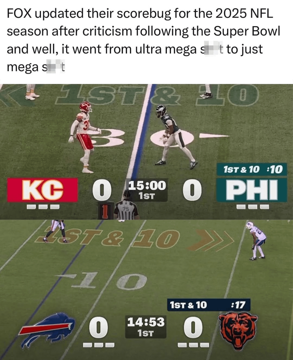
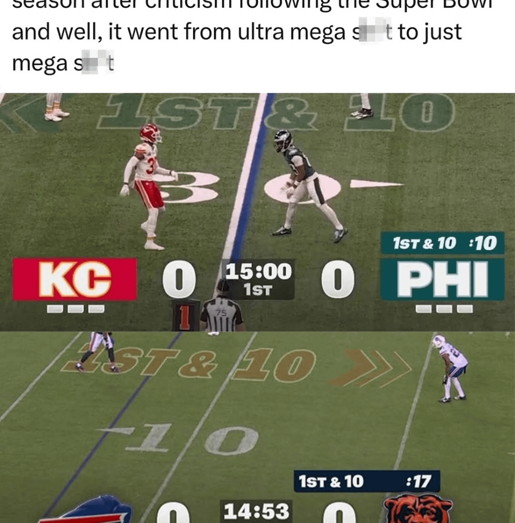
I have to say when I tuned in last night and saw the bug I thought the Bills were playing the Bengals. That looks like an orange striped tiger at first glance.
Sometimes change isn’t good.
what is this stupid censoring and it’s definitely and improvement.
Shit meme
Make them 75% the size of what they are, make the timeouts vertical instead of horizontal, and center them on both halves of the screen. I do like this simple design
people always need something to bitch about
We complaining about the scoreboards now
It looks like straight up ass. Idk who thought it was nice looking at the network.
I se no issue
Even the football scoreboards are better in Canada!
It’s better than it was, but it still sucks
Just go back to 90s box in corner
I’m okay with minimalist looks, but it’s still way too big for the concept, and so it makes it look stupid.
This shit is ass. Just give us a normal banner. This shit isn’t rocket science. Or make a poll and let people vote, again not rocket science
We need the score bug bigger. Covering 75% of the screen. And Ads playing in the top and left corner at all times.
Why won’t the NFL give us what we really want!
Why can’t the 1st and 10 and the play clock go between the time outs
I guarantee this is made to fit a vertical video better for easier tiktok-style clip sharing. That’s why it’s so big and centered
“Graphic design is my passion” ass scorebug
Both look okay to me. Imagine caring enough to make a meme and censor it lol
It doesn’t take up more space on the screen, it’s just a bigger font because they didn’t use up space on borders and padding.
These type of scorebugs look like what they needed to look like when everything was on shit TVs and SD.
Now that it’s all much better quality, can we shrink this shit down?

46 comments
It’s much better with the logos. If they just made it smaller it’d be fine
they actually saved it lol
I can’t imagine ever caring about the design of these
Second version is definitely better than the first version but I dont really like either
I think the super bowl version was fine as a one time thing
Yes
I think they’re good.
this is good….
especially because Philly fans can’t read so now they can use pictures to know who has what score…
though they will still need someone to read the numbers for them…
Looks like the way the premier league does it
I don’t know why they changed it. I like the style that’s been used for decades.
I don’t really care, but I do like them- I even like the Super Bowl score bug more than the recent one
nothing wrong with the change. simple enough.
I don’t have an issue with either one. I think, like with a lot of things, people just get mad at any change. New team name, new uniforms, new score bug. People just love to be mad about things online.
Has Fox ever had good judgment?
I like it, do think it needs a bit of tweaking like maybe a bit smaller and the downs moved to the side.
The only time it is bad is when it is oversized and gaudy. Netflix’s comes to mind. Basically, they made a concerted effort to clean up their broadcast after the Tyson/Paul fight and didn’t clean up their boxscore.
The logo version is perfectly fine. Reducing a unique brand and logo do just team colors and an abbreviation sucks.
I didn’t hate it but it’s not very space efficient (vertically). Even though parts of it are transparent, you basically lose that whole area of the screen since anything in that area will likely be partially obscured by the opaque sections.
Who tf cares
The little minimalistic ones are the best. It doesn’t need to dominate the screen.
Both look like trash to me
I think people pay way too much attention to it. They’re fine.
I love how minimalist it is without some sort of background. Might make it slightly smaller but I’m with you. I like it. Thought the Super Bowl one was good.
I also like the way the score bug provides stats but I never see a picture of it
Smaller is better.
I thought the Super bowl version was great
Make it smaller!
My theory is that it was made because a lot of the audience is boomers who now have bad eyesight and need large font. But, they couldn’t keep the original (opaque) scorebug with large font, because it’d block a lot of the screen. So they tried to make large font with a transparent scorebug, and this is the result.
I have to say when I tuned in last night and saw the bug I thought the Bills were playing the Bengals. That looks like an orange striped tiger at first glance.
Sometimes change isn’t good.
what is this stupid censoring and it’s definitely and improvement.
Shit meme
Make them 75% the size of what they are, make the timeouts vertical instead of horizontal, and center them on both halves of the screen. I do like this simple design
people always need something to bitch about
We complaining about the scoreboards now
It looks like straight up ass. Idk who thought it was nice looking at the network.
I se no issue
Even the football scoreboards are better in Canada!
It’s better than it was, but it still sucks
Just go back to 90s box in corner
I’m okay with minimalist looks, but it’s still way too big for the concept, and so it makes it look stupid.
This shit is ass. Just give us a normal banner. This shit isn’t rocket science. Or make a poll and let people vote, again not rocket science
We need the score bug bigger. Covering 75% of the screen. And Ads playing in the top and left corner at all times.
Why won’t the NFL give us what we really want!
Why can’t the 1st and 10 and the play clock go between the time outs
I guarantee this is made to fit a vertical video better for easier tiktok-style clip sharing. That’s why it’s so big and centered
“Graphic design is my passion” ass scorebug
Both look okay to me. Imagine caring enough to make a meme and censor it lol
It doesn’t take up more space on the screen, it’s just a bigger font because they didn’t use up space on borders and padding.
These type of scorebugs look like what they needed to look like when everything was on shit TVs and SD.
Now that it’s all much better quality, can we shrink this shit down?