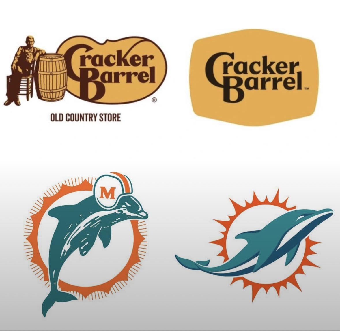
Probably a hot take, but I prefer the late-90s/early-00s version of the Dolphins; still wearing the helmet, but added navy and simplified/cleaned it up a bit.
The biggest problem I had with the Dolphins rebranding was the unis. Didn’t care much for the logo tbh.
Fuck you Dolphin!!
The newer logo is shit. It is fitting though, it looks like a beached dolphin gasping for breath, and that’s how it’s felt to be a fan for at least the last 25 years.
Honestly this one isn’t so bad. New dolphins logo is cleaned up but not overly minimalist.

Same with falcons and lions
Same odds of making the playoffs
The newest dolphins logo is not nearly as bad as the cracker barrel rebrand
Amen to that. Raiders had the best look, historically. Also, Green Bay, Chicago, Pittsburgh. Rams circa 1980 were pretty great.

11 comments
Both brands are mediocre
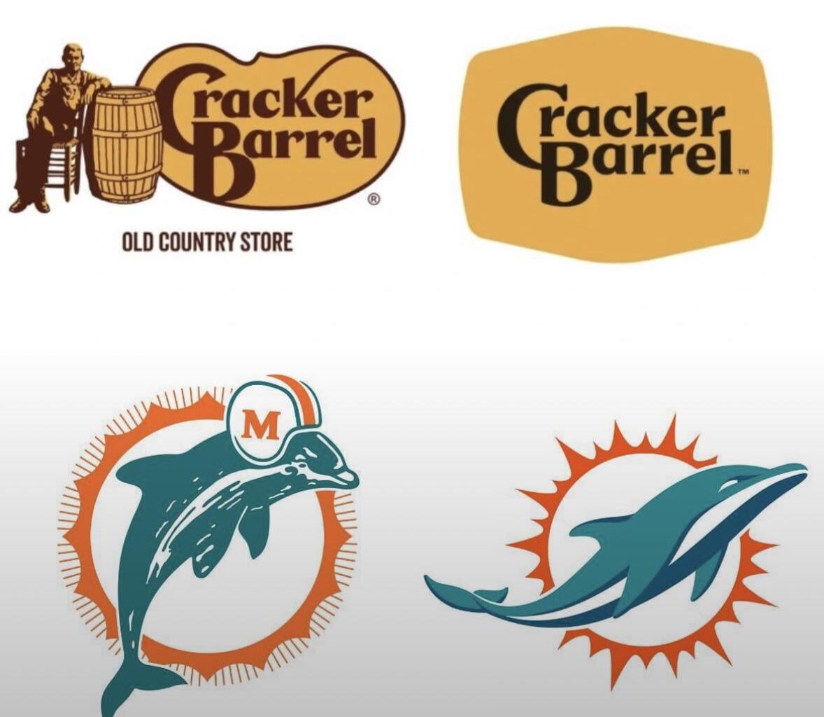
Probably a hot take, but I prefer the late-90s/early-00s version of the Dolphins; still wearing the helmet, but added navy and simplified/cleaned it up a bit.
The biggest problem I had with the Dolphins rebranding was the unis. Didn’t care much for the logo tbh.
Fuck you Dolphin!!
The newer logo is shit. It is fitting though, it looks like a beached dolphin gasping for breath, and that’s how it’s felt to be a fan for at least the last 25 years.
Honestly this one isn’t so bad. New dolphins logo is cleaned up but not overly minimalist.

Same with falcons and lions
Same odds of making the playoffs
The newest dolphins logo is not nearly as bad as the cracker barrel rebrand
Amen to that. Raiders had the best look, historically. Also, Green Bay, Chicago, Pittsburgh. Rams circa 1980 were pretty great.