They’re like a soccer team with how often they put out new uniforms lmao.
They just can’t seem to do anything right lol
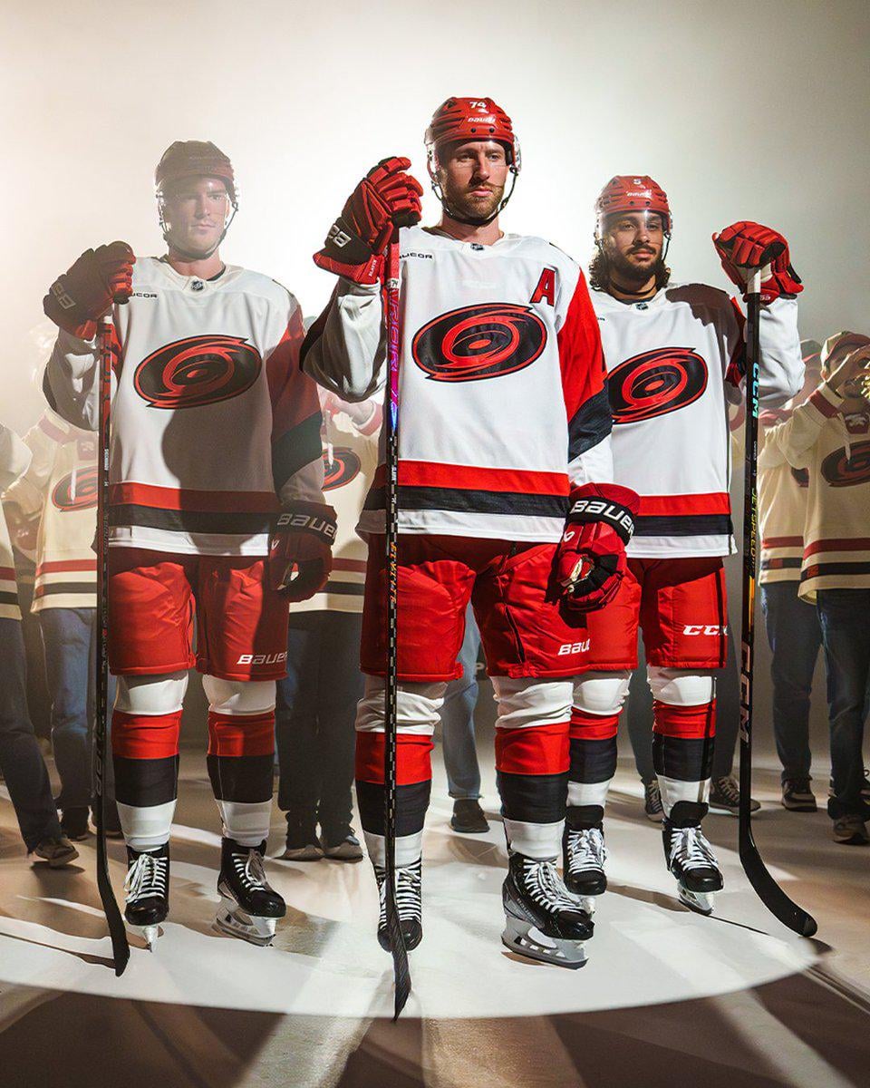
The ones in the background might honestly look better
Is that Svechnikov in the back fading into a force ghost?
These suck.
Looks like an inflamed oval shaped butthole. 🫣
Fix the logo. The logo is a yawner.
Show the shoulder patch…
Am I crazy for thinking these look dope? Apparently I’m in the minority. At least they aren’t like Boston, changing the tiniest little details year after year. You can tell these are different at a glance.
It kinda looks like the puck has been caught up in a— ♪♪ _Crossfire_ ♪♪
Sweet Caroline… your ain’t that famous song this is hockey and it’s Carolina
God damnit I knew it was gonna be something like this
Can’t wait to see the next one in 2026.
Another new Canes jersey that doesn’t match any of their other jerseys. Just give us the normal version of the logo + the warning flag stripes again
the original logo shouldn’t be messed with
Better than the ones which had just CANES
This team is crying for an identity refresh.
Everything about their logos/unis is just meh
So is this replacing the CANES one?
Jalen Chatfield is not amused by this.
One day the NHL will move back to home whites and these will look even more amazing
Who’s Caroline?
the jersey behind these on the folks in jeans looks a lot better
Ok
the bottom stripes on the jersey are the worst possible order.
Same same but different but same
I love the shoulder and sleeve design…
But the solid black in the logo… woof
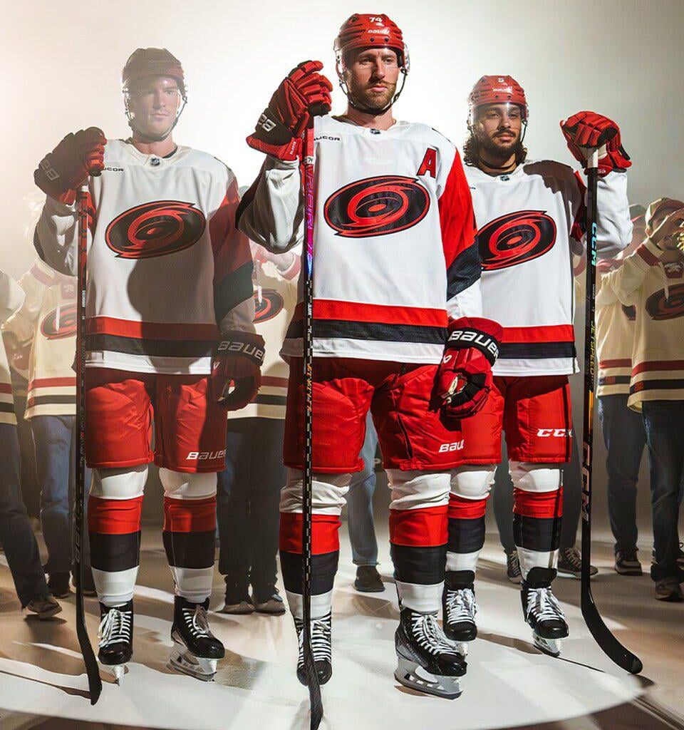
Looks tge same except the black they added in the logo. Not my team so honestly I don’t pay much attention to them so im probably missing it.
The Canes original uniforms are fantastic yet they make a new white jersey every year and continue to wear that awful black jersey that for some reason has grey shoulders
An embarrassment to the tradition of the game. A joke the league allows this franchise to degrade the game like this.
Yikes
They look so happy wearing them
These are so sick
I feel like the hurricanes have the weakest branding in the NHL. They can’t find a logo that suits them and their jerseys never stand out or excite people.
I think these will grow on me after I see them on ice
They’re lucky they have a decent team, because the way they try to market the team is shit
What’s up with the different looking jerseys behind them?
I like those. Their home jersey should be that stadium series
4th worst logo in the NHL
Canes jersey is one of the worst in league imo. Even the guy on the left is fading into the multiverse.
Still the ugliest in the NHl..
I don’t know why they don’t use the same colors as the Carolina Panthers. Much more fitting for hurricane weather. The red and white is so boring.
Why are all the people in the background wearing a different jersey? (The waist striping is different)

48 comments
The Hurricane is weirdly shiny.
They’re like a soccer team with how often they put out new uniforms lmao.
They just can’t seem to do anything right lol
The ones in the background might honestly look better
Is that Svechnikov in the back fading into a force ghost?
These suck.
Looks like an inflamed oval shaped butthole. 🫣
Fix the logo. The logo is a yawner.
Show the shoulder patch…
Am I crazy for thinking these look dope? Apparently I’m in the minority. At least they aren’t like Boston, changing the tiniest little details year after year. You can tell these are different at a glance.
It kinda looks like the puck has been caught up in a— ♪♪ _Crossfire_ ♪♪
Sweet Caroline… your ain’t that famous song this is hockey and it’s Carolina
God damnit I knew it was gonna be something like this
Can’t wait to see the next one in 2026.
Another new Canes jersey that doesn’t match any of their other jerseys. Just give us the normal version of the logo + the warning flag stripes again
the original logo shouldn’t be messed with
Better than the ones which had just CANES
This team is crying for an identity refresh.
Everything about their logos/unis is just meh
So is this replacing the CANES one?
Jalen Chatfield is not amused by this.
One day the NHL will move back to home whites and these will look even more amazing
Who’s Caroline?
the jersey behind these on the folks in jeans looks a lot better
Ok
the bottom stripes on the jersey are the worst possible order.
Same same but different but same
I love the shoulder and sleeve design…
But the solid black in the logo… woof
Looks tge same except the black they added in the logo. Not my team so honestly I don’t pay much attention to them so im probably missing it.
The Canes original uniforms are fantastic yet they make a new white jersey every year and continue to wear that awful black jersey that for some reason has grey shoulders
An embarrassment to the tradition of the game. A joke the league allows this franchise to degrade the game like this.
Yikes
They look so happy wearing them
These are so sick
I feel like the hurricanes have the weakest branding in the NHL. They can’t find a logo that suits them and their jerseys never stand out or excite people.
I think these will grow on me after I see them on ice
They’re lucky they have a decent team, because the way they try to market the team is shit
What’s up with the different looking jerseys behind them?
I like those. Their home jersey should be that stadium series
4th worst logo in the NHL
Canes jersey is one of the worst in league imo. Even the guy on the left is fading into the multiverse.
Still the ugliest in the NHl..
I don’t know why they don’t use the same colors as the Carolina Panthers. Much more fitting for hurricane weather. The red and white is so boring.
Why are all the people in the background wearing a different jersey? (The waist striping is different)
It’s a nice way to make the logo look **worse**.
It’s as ugly as their postseason runs
Still jerks
Boo urns
Stop. Using. Coloured. Helmets. With. White. Jerseys.
There’s an artist at EA Sports who just went, “Fuuuuuuucccckkkk.”