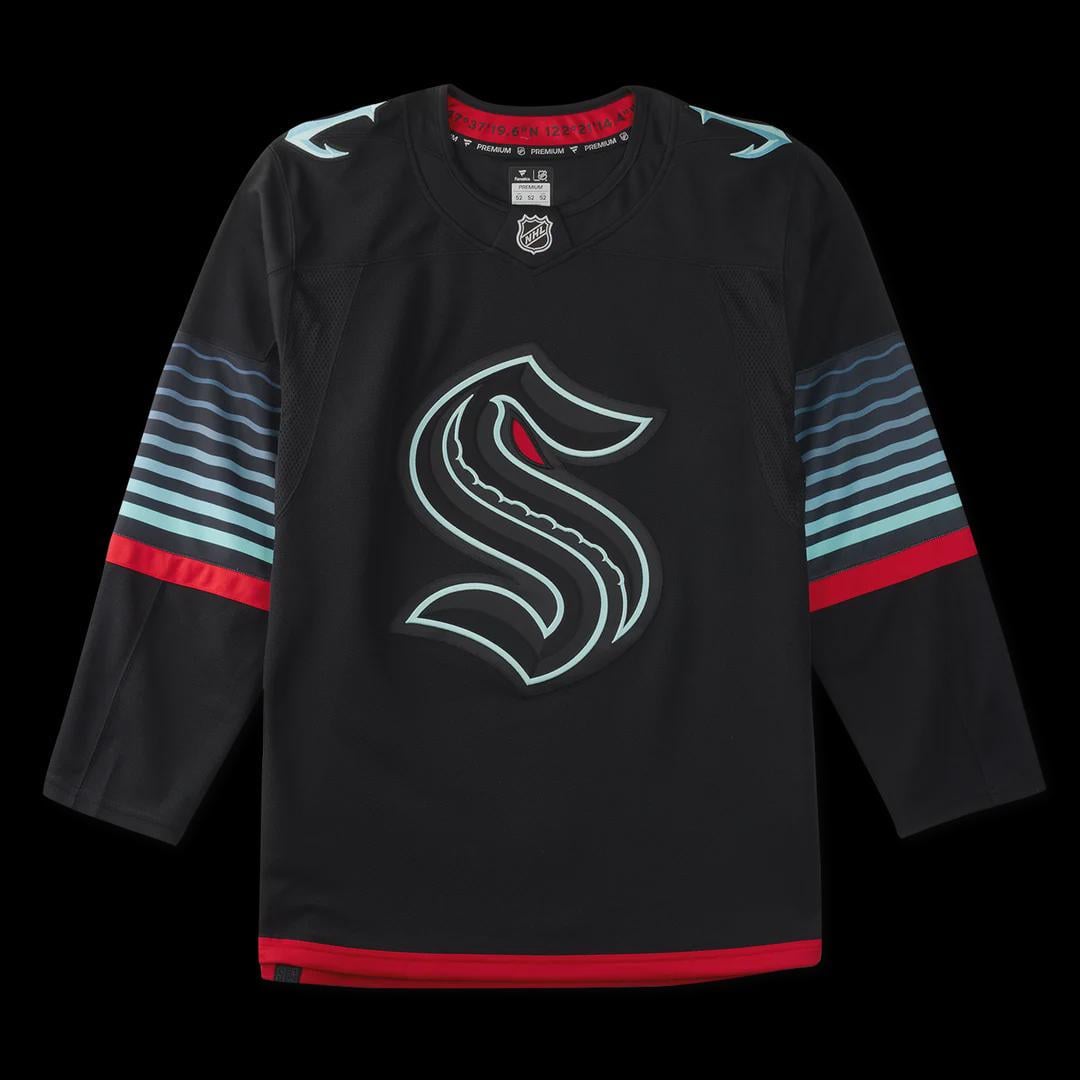
Eeewwwww, I generally love everything about the Kraken colors and logos, but not this. Not this at all.
This is rad, I love it
Put an actual kraken on the jersey good lord
Colours are coo tho
I like
Still so much they could do with this brand…. And we get an ‘S’. Do better.
Looks like a moto jersey but I still like it
Pass.
GIVE US THE CTHULHU HEAD.
WE WANT CTHULHU HEAD.
the anchor/needle logo is too good to just be a shoulder patch
Wow, so edgy and modern. I bet they spent a lot of time and money on an intern doing that color swap.
Disappointing. Why don’t they ever let fans design the jerseys? They are always the best concepts
These are dope. Everyone hates things when they are new, the true test is sales and comments in 6 months. Then, reactions when the new jersey comes out to if it’s better or worse.
Thanks I hate it
I actually don’t mind this at all, but would’ve like more cthulu for obvious reasons
Black. Zzzzzzzz.
Love it
Holy underwhelming Batman…
Dagnabbit Kraken
so ugly
The reverse Kraken logo is cool, but the stripes on the side make it look like someone made it in NHL25 building a team
I dig it
Kraken continue to lead the league in drip
I like the design but not a fan of alternates being the same color as the primary
Did they run out of time?
I don’t know if it could worse.
At least I am completely uninspired to spend any money.
It’s fine but middle logo should have been the Krak head
Who is designing these third jerseys? They all suck. Ottawa, Carolina, Seattle …
Not enough blue
Hmmm that is a jersey
Why does everybody love the damn anchor logo so much?
Where’s my giant squid??
Anyway, these aren’t getting me too hyped but I bet they’ll look cool on the ice.
fire
More black jerseys sweet /s
When are they going to come out with an actual picture of a kraken? Not an S. they are missing the chance to have the coolest jersey
Looks like boardshorts
Canucks circa 1997 Orca Bay would like to have a conversation.
Seattle’s third jersey looks like a Pacific Northwest time capsule — taking Vancouver’s 90s design DNA, filtering it through modern minimalism, and surfacing with something that feels both familiar and brand new.
That’s terrible
any idea around much they’ll be?
I love their regular jerseys, but I gotta say, these look really bad.
I’m surprised to be in the minority here. I like it a lot. I still like the S as both a nod to the Metropolitans but also the implication of the incomprehensible horror of the kraken in the design. There may be a day they actually have a Kraken design but I don’t know that it will be well received. They have to appeal to a wide demographic people have their own envisionings of the legendary creature. Doesn’t mean they can’t try, of course. Still, I like this. Solid Jersey in my opinion.
Can’t go wrong with a black jersey really
I prefer this ‘S’ to the primary one.
Joey daccord will take up even less of the net in the slimming black
tis ugly.
Wasted opportunity to not have the eye glow as well tbh. This jersey is kinda mid but I feel that it will grow on me
What a cheap, uninspired look. Looks like a knockoff.
If it glows in the dark as their incredible reveal video implies, this is pretty cool. Gotta say though, teams making a big fuss about making an alternate and it turns out to just be a black version of their jersey is starting to feel pretty stale. It seems to be happening in all sports.
The Kraken are the Seattle Mariners of ice hockey.

47 comments
Eeewwwww, I generally love everything about the Kraken colors and logos, but not this. Not this at all.
This is rad, I love it
Put an actual kraken on the jersey good lord
Colours are coo tho
I like
Still so much they could do with this brand…. And we get an ‘S’. Do better.
Looks like a moto jersey but I still like it
Pass.
GIVE US THE CTHULHU HEAD.
WE WANT CTHULHU HEAD.
the anchor/needle logo is too good to just be a shoulder patch
Wow, so edgy and modern. I bet they spent a lot of time and money on an intern doing that color swap.
Disappointing. Why don’t they ever let fans design the jerseys? They are always the best concepts
These are dope. Everyone hates things when they are new, the true test is sales and comments in 6 months. Then, reactions when the new jersey comes out to if it’s better or worse.
Thanks I hate it
I actually don’t mind this at all, but would’ve like more cthulu for obvious reasons
Black. Zzzzzzzz.
Love it
Holy underwhelming Batman…
Dagnabbit Kraken
so ugly
The reverse Kraken logo is cool, but the stripes on the side make it look like someone made it in NHL25 building a team
I dig it
Kraken continue to lead the league in drip
I like the design but not a fan of alternates being the same color as the primary
Did they run out of time?
I don’t know if it could worse.
At least I am completely uninspired to spend any money.
It’s fine but middle logo should have been the Krak head
Cool colorway. Still underwhelming overall
I want a giant octopus.
[https://www.medievalists.net/wp-content/uploads/2015/01/Kraken.png](https://www.medievalists.net/wp-content/uploads/2015/01/Kraken.png)
Who is designing these third jerseys? They all suck. Ottawa, Carolina, Seattle …
Not enough blue
Hmmm that is a jersey
Why does everybody love the damn anchor logo so much?
Where’s my giant squid??
Anyway, these aren’t getting me too hyped but I bet they’ll look cool on the ice.
fire
More black jerseys sweet /s
When are they going to come out with an actual picture of a kraken? Not an S. they are missing the chance to have the coolest jersey
Looks like boardshorts
Canucks circa 1997 Orca Bay would like to have a conversation.
Seattle’s third jersey looks like a Pacific Northwest time capsule — taking Vancouver’s 90s design DNA, filtering it through modern minimalism, and surfacing with something that feels both familiar and brand new.
That’s terrible
any idea around much they’ll be?
I love their regular jerseys, but I gotta say, these look really bad.
I’m surprised to be in the minority here. I like it a lot. I still like the S as both a nod to the Metropolitans but also the implication of the incomprehensible horror of the kraken in the design. There may be a day they actually have a Kraken design but I don’t know that it will be well received. They have to appeal to a wide demographic people have their own envisionings of the legendary creature. Doesn’t mean they can’t try, of course. Still, I like this. Solid Jersey in my opinion.
Can’t go wrong with a black jersey really
I prefer this ‘S’ to the primary one.
Joey daccord will take up even less of the net in the slimming black
tis ugly.
Wasted opportunity to not have the eye glow as well tbh. This jersey is kinda mid but I feel that it will grow on me
What a cheap, uninspired look. Looks like a knockoff.
If it glows in the dark as their incredible reveal video implies, this is pretty cool. Gotta say though, teams making a big fuss about making an alternate and it turns out to just be a black version of their jersey is starting to feel pretty stale. It seems to be happening in all sports.
The Kraken are the Seattle Mariners of ice hockey.