Just the curse of two teams using beveling drawn from their main jersey logos that are white/silver/grey (and Ohio looking like a shield)
What is odd is that while ours matches the team branding and jersey number typeface (at first glance at least) – their jersey numbers are wildly different (the core is smooth and italicized, with the throwback being a traditional block), and the beveling on their jersey is far more subtle
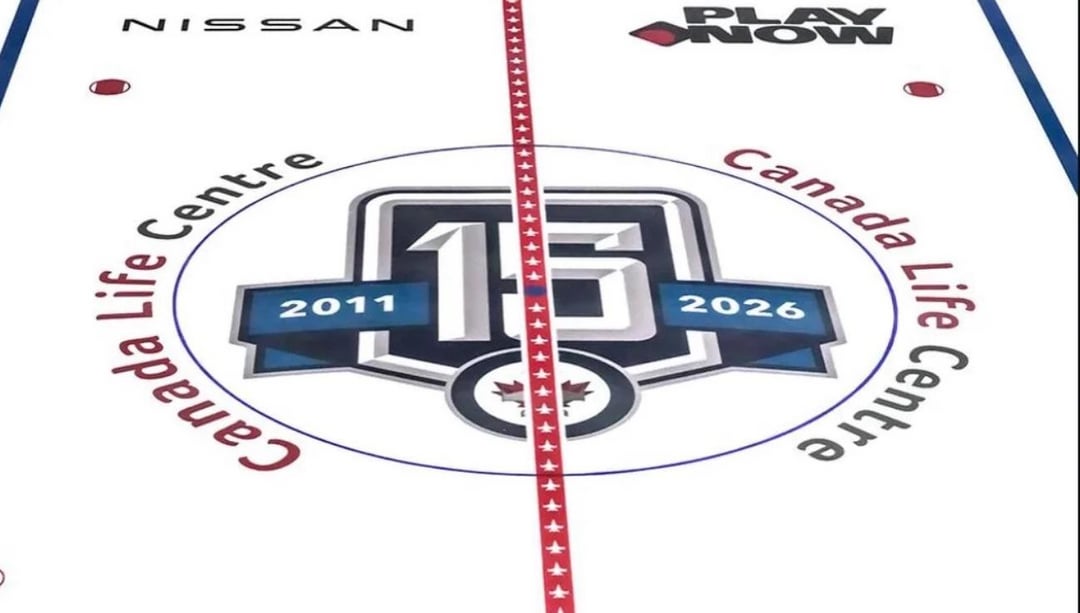
I think it matches our brand system better, and holy cow the red line placement makes theirs look janky on the ice if that’s real. Not sure if ours was designed to better incorporate the red line placement
Edit – looked back at the leak of ours and the execution is so much better (ghosted where the line intersects the graphic) although I wish the corners of Ohio weren’t clipped in ours

2 comments
Just the curse of two teams using beveling drawn from their main jersey logos that are white/silver/grey (and Ohio looking like a shield)
What is odd is that while ours matches the team branding and jersey number typeface (at first glance at least) – their jersey numbers are wildly different (the core is smooth and italicized, with the throwback being a traditional block), and the beveling on their jersey is far more subtle
I think it matches our brand system better, and holy cow the red line placement makes theirs look janky on the ice if that’s real. Not sure if ours was designed to better incorporate the red line placement
Edit – looked back at the leak of ours and the execution is so much better (ghosted where the line intersects the graphic) although I wish the corners of Ohio weren’t clipped in ours
Similar colors, different font.