
Chicago Blackhawks Made a GREAT Branding Decision!
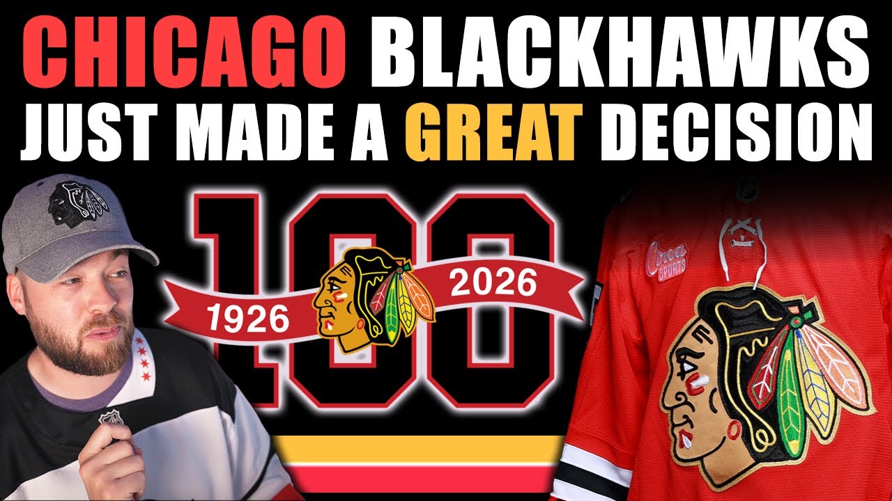
Hey friends, Neil here from Post to Post. Hope you guys are having a great day. Chicago Blackhawks. It has been a minute since I’ve had some Chicago Blackhawks merch on. I don’t wear this hat very often because it uh the elastic broken it so it doesn’t fit my head very well. And then I just have this Reebok jersey. It’s the only Blackhawks jersey that I have. I don’t have any Adidas. I don’t have any fanatics. But we just got some pretty cool news from the Chicago Blackhawks which we’re obviously here to talk about in this video. And that’s the small minor changes to the jersey coming up for this year. So, let’s jump in right away and look at these photos and give our opinions. Uh, spoiler alert, I think it’s amazing. So, let’s bring up this first one. And this is from the draft. So, just looking at it, if you don’t follow jerseys or if you don’t follow logos or the NHL in terms of like visuals that frequently, you’re going to be like, uh, that’s just a Blackhawks jersey. Like, why why are we even looking at this? But there are some small things that have changed here. the laces, the uh gold stroke around the logo, which is the the primary thing, and some other little things, other little details that we’ll look at. So, my first impression was that’s incredible. I absolutely love this decision. Original 16 that has had a lot of jerseys over the years with all the Winter Classics and whatever. You know, Chicago has has had a lot of designs, but this is probably the most subtle design that they’ve ever done or subtle change, I guess. I think it’s wonderful. I I think it’s very complimentary to have that gold in there and just it it complements the logo so well because you’re pulling that color or that same, you know, same kind of shades and and palette and stuff out of the logo on and onto the stroke of the outside of the logo. I think it looks absolutely beautiful. I know it’s small. I know it’s relatively insignificant, but I I think it’s a tremendous change. I really like it. I think it really pops off of that red jersey. Here’s another photo just a little bit more close up. And also the hat. I, you know, this isn’t a video about hats, but uh remember that Fanatics situation I had about 2 months ago? If you haven’t seen that, go check it out. I I did receive a 50% off coupon for my next Fanatics purchase off the website, and it will be my last Fanatics purchase. And I don’t want to spoil anything, but like as soon as this gets released, purchase absolutely 100%. And probably that hat as well, cuz I need to replace this. So very excited for this jersey to get officially released on the Fanatic site so I can pick it up. Now moving on to the next one, we can look at some graphics that the Chicago Blackhawks uh social media team released. They talk a little bit about the logo. I would definitely recommend going to check out their social media, whether it’s Facebook, Instagram, Twitter, it doesn’t really matter. They have this posted. Uh they’ve got some good stuff out there. And then the actual um other cool part about the jersey is the 100th anniversary patch. I’ve heard some criticism about this patch. It’s a little bit boring and stuff, but I look at these original 16s and I’m not expecting something super modern, super unique, super different. I’m looking for traditionality. And to me, this 100 100 anniversary logo is exactly what I would expect and exactly what I like. Um, I think that the 100 pops so nicely on the black and then the black pops off the red uh very nicely. You got the years in there which is great and you got that logo, that little small logo but with the gold outline. So, I I honestly I think it’s a perfect logo. I really love it. And then they just, you know, they talk about the the uh laces. It is what it is. And inside the neck, you’ve got a little bit of text, which is pretty cool, I guess. And then on the inside of the bottom of the jersey, there’s a tag that says 100 and then all the years that they won the Stanley Cup. I think that is an amazing decision. I love the fact that it’s down there. Like, usually we would see this on the inside of the neck, but it’s on the bottom inside of the jersey. Sign me up for that. That’s an amazing decision. I cannot wait to get this jersey. I’m so excited to see this in person. And then they also actually just recently released a photo with what the number kit’s going to look like. And you’ve got that gold on there as well. Now, it is a little bit conflicting with the name plate on the top because there’s no gold whatsoever on the letters or anything. I don’t love that. I wish that the name plate mimicked the style of the font or of the numbers, sorry, with the black outline or the black stroke and then the gold stroke on top of that. It’s It just feels unfinished. the name plate at this point. Uh, which is a little bit disappointing, but not a big deal. It definitely doesn’t make me think any less of the jersey. I still love it. I still love the little decisions here. But yeah, that’s what the number kit looks like. So, shout out to the Chicago Blackhawks. And also, they released what their center ice design is going to look like. We just talked about the Montreal Canadians and Vegas Golden Knights center ice changes designs uh in the previous video on the channel. So, if you have not seen that, go check it out and hear my opinions on that. But, uh, Chicago with the 100th anniversary logo in their in their center rights, I think is is tremendous. Very traditional, very simple, simplistic in a very good way. Um, yeah, really good decisions here from Chicago. It’s not a team I cheer for. It’s not a brand that I absolutely love. Jerseys are fine. Probably some of the best in the NHL just from a traditional aspect or, you know, kind of history aspect, but they’ve never blown my socks off with anything. Like, I definitely don’t cheer for them. But I really really like objectively fairly like this design. Very small decisions, but very very good decisions, very calculated decisions. So if I’m a Chicago Blackhawks fan, I don’t know, maybe I’m a little bit disappointed because it’s 100, you know, it’s the 100th anniversary. Maybe you’re expecting more, but I don’t know. As a designer, as a critic, I guess a jersey critic and collector, I don’t know what you call me. Um, I really like it. I think it’s fantastic. So big round of applause from me to the Chicago Blackhawks. very excited to get to the jersey and uh yeah and see what they look like in full uniform when the games happen, what the arena looks like, what else is going on for Chicago. Yeah, good stuff. So, let me know down below in the comment section what you think of the Chicago Blackhawks change. Did they make the right decision? Did they need to go further? The comment section exists for a reason and I hope you have a couple of minutes to leave your comments down below. I’d love to hear your take on the Chicago Blackhawks decision. Have a great day. Thank you so much for joining me for this one. Subscribe if you’re new for the next video and we’ll talk to you very soon. Adios. [Music]
Episode 1758
Supporting the channel can be done here:
YouTube Membership: https://www.youtube.com/channel/UCnWUMMlROKuT3roikjMp9TQ/join
Monthly Patreon contributions: https://www.patreon.com/Post2Post
Direct contributions: https://www.paypal.me/Post2Post
DEALS:
Save on jerseys by **FIRST** going to https://www.coolhockey.com/post2post and then using code “POST2POST” at checkout! This will save you 10%.
Save $20 off your first purchase at https://seatgeek.com/ with code: POST2POST
Save 10% off any template at https://sportstemplates.net/ with code: POST2POST
Want to submit YOUR jersey concepts to get reviewed? Please watch this video to find out how: https://youtu.be/fb_h_mB19fo
Play games with me on Twitch!
www.twitch.tv/post2post
PO Box: Unfortunately, the PO Box is now closed.
Find us on Social Media here:
https://www.Instagram.com/Post2PostShow
Tweets by Post2PostShow
Have a business inquiry or want to send me a fan video intro?
E-mail me here: productions@post2postshow.com
*Due to the amount of e-mails, a response cannot be guaranteed*
#NHL #Chicago #Blackhawks
18 comments
I so can't wait to see Blackhawks, Rangers and Red Wings to play each just because of the aura of the centennial celebration for all 3.
I'm Definitely Ordering This Blackhawks Jersey !!
The Gold is Awesome !!
Cheers Bud ! 🍁🏒🥅🍁
In the neck under the O in original has 6 Xs guessing for the 6s cups or being an original 6 team
Love the gold. Such a good compliment to an already iconic logo!
OMG those laces are terrible…in the wrong spot and clearly under the sealed neck…
everything is getting bad and worse.
I ordered my Centennial with the Blackhawks greatest player all time Stan Mikita. The Nameplate is the normal Nameplate from their normal home jersey
I pre ordered this last month. Should ship at end of the month 👍
Fits from their 80's look
I like the 100 patch and I like the Blackhawks
I like the center ice on the Blackhawks
I wish we had more Brent, I’ve been listening to the Havin A Yals lately and wish we had more podcasts or just Brent in general
the neck on the jersey is different i like that little change better it also looks better black over all the minor changes make the jersey looks better hope the changes that can stick stay around . as a hockey fan i liked Blackhawks black jersey that matched the home jersey just black i wish they came back and modernized for a couple games i know they don't need it but that jersey has a great look .
Speaking of subtle change…when is the next jersey redesign coming out?
I wonder if they are only using this jersey for the 100th anniversary for just this season and then going back to the regular one next season, kinda like how the bruins did a season ago with there anniversary jersey
as a hawks fan i absolutely love these jerseys and the 100th anniversary patch. also every surrounded by the gold really pops
Hi Neil. The Hawks jersey are really nice. I agree the gold outline on the logo really pops. Thanks for the video. Have a great rest of the week.
I think you kinda glossed over the gold eyelets with the laces. That's a nice little touch if they weren't already gold?