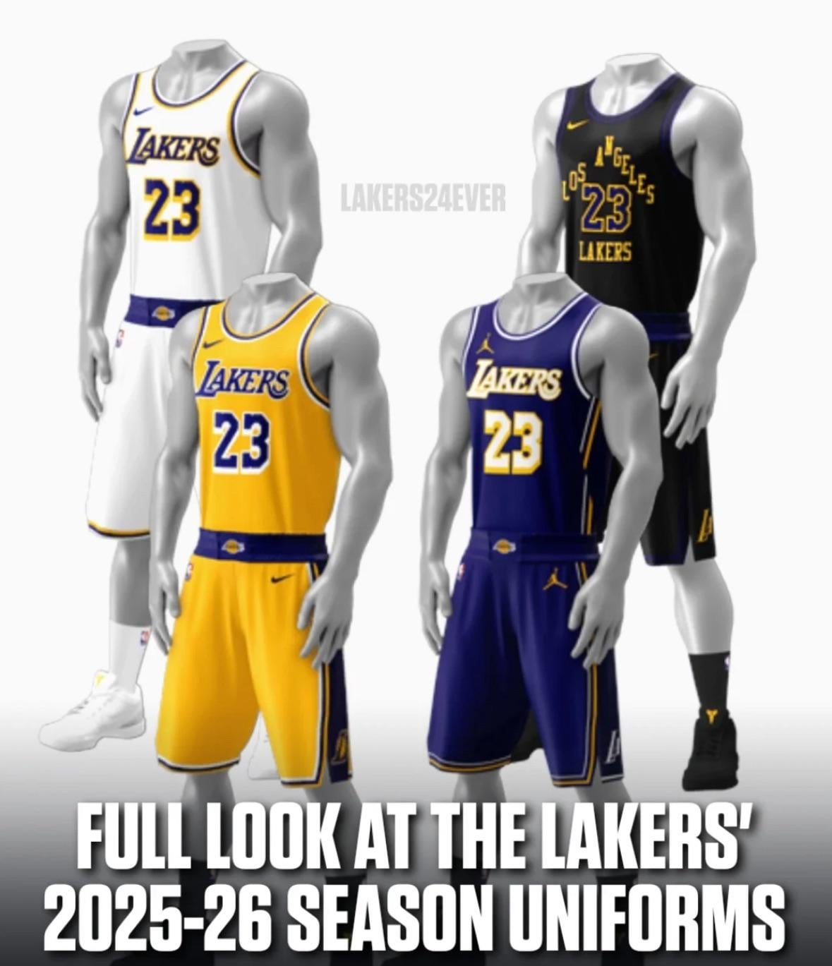
Ya’ll rocking with the jersey rotation this coming season? via @lakers24ever on Instagram
September 14, 2025
Ya’ll rocking with the jersey rotation this coming season? via @lakers24ever on Instagram
30 comments
Yah this is fine.
Could do without the black ones. Whites look nice, but wish they just stuck with Gold at home and Purple on road.
Bring back the Black mamba jerseys from 2020
Need gold home jerseys. Need yellow outlined collar on our forum blue aways. Need the black mamba jerseys. And I need the white alternates to be worn only on Sunday.
Bad enough the gold doesn’t look like gold but that doesn’t look very purple to me. The LA design on the black just needs to go.
What I now can’t unsee is the LA logo on the belt. It makes it look like we’re wearing a mini WWE belt.
The numbering on the purple, white, and yellows is sorta giving nostalgia. Feels like showtime era lakers
I just don’t understand the yellow ffs just make it Gold how difficult can it be
Black Mamba jerseys should be a permanent jersey
Why does every city jersey need to look like absolute garbage
Wtf is that belt shit lol
I like them, with the belt logos and all
I saw a different picture of the purple one and it’s pretty sweet. I’m getting one this year. I just don’t know who yet.
I hate the font and layout of those black jerseys.
Our jerseys are probably the worst they’ve ever been in the teams history. We’ve strayed so far from the classic color and design that worked.
It is what it is.
Haven’t liked our jerseys for like 8 years, not worth complaining about anymore.
They’ll fix them eventually.
The black jerseys are still garbage, but I really like the purple jerseys
I’m just glad the purple doesn’t have the black paneling anymore, I like these better.
Don’t hate the city jerseys either , we played good when we wore those lol.
I just want the old jerseys back man
Pablo Torre needs to investigate who tf designed these. Also wish they did a retro 80s/90s inspired theme.
Nice
Replace the black with the black mamba + stop making the purples weird and just have them match the white and gold versions = best jersey lineup in the league
Yellow and the whites are still clean AF
I actually like all of these🤷🏾♂️. I like the “belts”. Wish it was more of the traditional gold and purple color but I can live with it.
Please bring back the actual purple and the actual gold
Wouldn’t the belts just be hidden by how the players insert their jerseys into the shorts? It’s not like they’ll be careful about showcasing the lettering…some will have the whole lettering on the belt and some half and some none of the belt showing.
Every following year they just look worse and worse holy shit. Purple and gold my ass, more like ink and piss.
I think we should start using AI to come up with the design. Nothing to lose really
Black one is atrocious, and the yellow is still wrong and not gold
Don’t like em. White and black was so good
Bring back the mamba jerseys and the actual gold not this banana stuff