
Detroit Red Wings NEW Centennial Jersey!
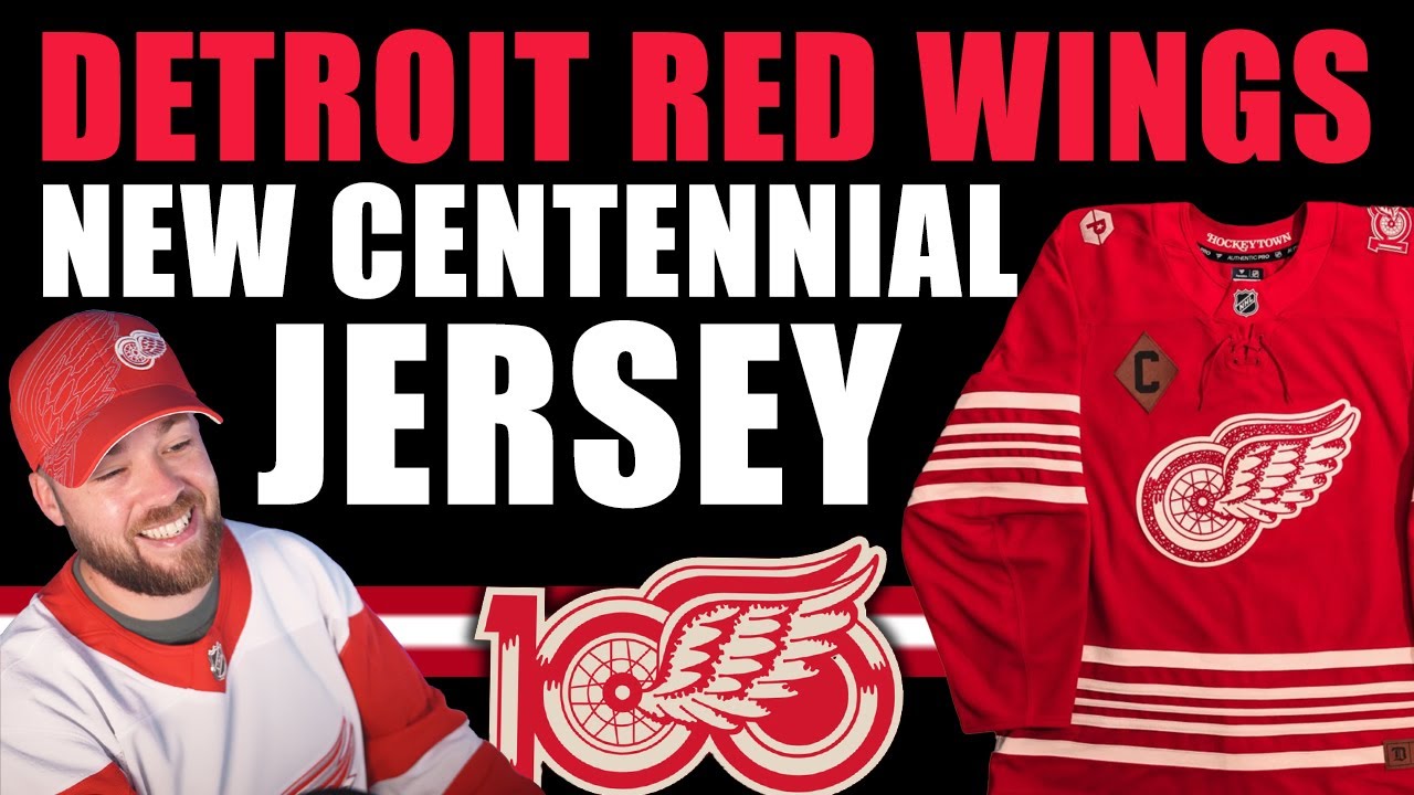
Hey everybody, Neil here from Post to Post. We got two jerseys released. The Washington Capitals alternate jersey. If you haven’t seen that video, go check it out. I just released it on the channel. And of course, the Detroit Red Wings Centennial jersey. I haven’t seen as much hype about this one, this release. And it’s making me think that like did this get released or announced or leaked and I didn’t know about it because like everyone’s talking about the Washington one it seems like online and no one’s talking about the Detroit one. So, I feel like I missed something. But to me at least, it’s brand new. It’s news to me. Uh, so we kind of knew it was coming in in terms of like a Centennial jersey, but uh, I wasn’t aware of any planned design. So, uh, let’s go through the photos as they were released or I guess as I saw them and I’ll talk to you about all the details and some of them are very spicy, very unique, and very, very off-brand for the Detroit Red Wings. So, let’s bring up the first one and I will walk you through my thoughts. So, initial thoughts were, okay, that’s a pretty Detroit Red Wings jersey. I mean, they play it safe. They don’t come out with a lot of jerseys, and when they do, it’s not flashy, okay? It’s a pretty stay-at-home team. But I did notice that there was obviously a bit of a logo change there. I noticed something on the shoulder. I had no idea what that was. And then something on the other shoulder. I couldn’t quite see it. Something else I noticed is that the red in the helmet does not match the same red tone as the jersey. I also noticed the gloves. The gloves are stark black, almost like weathered, just old school kind of gloves. And it’s a Centennial jersey. It’s a Centennial uniform. So, that is right on brand. I uh I think that’s that’s pretty cool. The next photo I got was a little bit more dynamic, you know, a little bit spooky lighting. That’s okay. But we get to see some elements that we didn’t see before in that previous one. You get to see that C patch there. You get to see a little bit more of the shoulder patch, more of the striping and more of the uniform as well. The gloves are amazing. Like even there’s there’s even little detailed logos on the gloves. I don’t know if this was like a marketing uh approach, I guess maybe is the best word in terms of aesthetics or if that’s actually the gloves they’re going to be wearing. If that’s actually the gloves they’re going to be wearing, I kind of want them. Like that’s how amazing those gloves are. You can see the logo up here, the anniversary logo. You can see the the Detroit and the in the thumb. Like, man, very very cool. Uh let’s move on to the next one where I start to notice some things I didn’t notice in the first two photos. like very specific things like the numbers are that felt kind of material. That’s like a very winter classic thing. Well, it’s a Centennial jersey, so it’s, you know, it’s a heritage kind of style jersey, so that’s expected. I just didn’t notice it in the first two photos. So, I’m glad that it’s there. You can see in the name plate on the back. The other thing I noticed was that the name plate on the back wasn’t a plate. It was just a name. It’s just text directly on a jersey. I’m not sure if they’re actually going to be produced that way, but it is something I wanted to point out because most of the jerseys in the NHL use a name plate on the back and then the name goes on it. This one does not. And we also got to peek a little bit more of the logo on the shoulder there. That’s the anniversary logo and we’ll look at that pretty soon. Now, the next photo, a very nice photo actually that they did here. Very nice call out, but we get to see the shoulder patch there. I don’t even know what that is. I assume that’s the jersey ad and it’s not going on front and it’s just going on the shoulder. The weird part about this is that Detroit consistently does not use shoulder patches. Like very rarely in their in their history do they use a shoulder patch. They’ve only done it a couple of times. And the last time that they had two shoulder patches or two two of anything on the shoulders, which I was, I believe, 2017. I believe that was also the year that they had the 100th anniversary NHL logo on the arm. So that was a pretty busy Detroit Red Wings jersey or year, whatever. Um, but this one, this is off-brand. This is off-brand for Detroit. It is. It might not seem it, but it is. Now, we do get to see that hat and that logo up there, that 100th anniversary logo. I think that is so well done. It’s so simple. It’s very nice. It’s very Detroit. Uh, moving on to the next photo that I saw. And it’s that felt material. It’s It looks like chain stitching in there. And also that felt material. What a It’s It’s a little bit busy, but it looks beautiful. Like beautifully produced. This is a jersey that I would love to have in my collection to to really appreciate those intricacies up close. I think this is going to be a great addition to anyone’s collection. And then I noticed, this is the first time I noticed it. I probably should have noticed it in the second photo, but in this photo, I noticed that the sea is like brown and like leathered. It looks like a leather patch almost. Um, I think that is a wonderful kind of call out to history. It gives it that weathered look. So, I think that is uh fantastic. I’m a little angry at myself for not noticing that in the second photo. Moving on to the next one that I saw, which was just basically the store photo. It’s the the digital version of it. And I saw something I didn’t notice in the any of the other photos. It’s just a a roll a snowball effect here. We’re on a bit of a roller coaster. Down below, we have a patch that says established 1926. And that also has that kind of leathered look. So, I thought that that was really cool, too. It’s like there there’s so many really unique things here from Detroit that they’re doing in this jersey. So, but it still looks very traditional Detroit. So, I think they did a good job here overall. And in the inside of the collar, they’ve got hockey town, which is nice to see. And then another photo here of the logo. Absolutely beautiful logo. It almost looks like like flowers or some kind of stencil or I don’t know. I can’t really describe it. It’s very intricate. It’s it’s almost it’s very pretty. It’s very beautiful. So, I think that’s pretty cool. And then a very high quality up close shot of the patch down below on the front of the jersey established 1926 Detroit Michigan. And then you can just peek on the inside at the bottom of the jersey the years that they won the Stanley Cup. That’s a that’s a pretty cool addition as well. I don’t have a specific photo of that other than what you see here, but just to call it that it does exist. So I’m a little conflicted with this patch and I’ll show you what I mean at kind of at the end of it, but I just want to go through the rest of the photos first. So this was the next photo that I saw. It’s just I think this is the team store version of the of the jersey if you want to buy from the team store. This is the photo that they have listed. So you can see that shoulder patch up there. Looks pretty good. And uh you can see that uh weathered leather look down below as well. And then this they changed this to their uh I guess I don’t even know what you call it. Like you got their logo on Twitter. Then you’ve got like the cover photo or whatever you want to call it. So they put this one up there. You can see a little bit of a different angle of the jersey and the the D up on the top left in the leather look. I think that’s a that’s that’s pretty cool. I can see a lot of like really interesting t-shirts, hats, all kinds of cool stuff coming out with the Centennial Collection. And then the other photo or the next photo I saw was a close-up of the actual numbers. So, this is a jersey that you’re probably going to want stitched if you do get it because those numbers are are very cool. Oh, and I forgot about this one. I just actually saw this one just right before I hit record. I completely forgot about it. It’s a better look at the inside of the bottom of the jersey that has all the years and then the Stanley Cup logo on both sides at the ends of those ears. Uh really, really cool addition. I think that’s a nice little subtle touch. Very nice. Overall, I mean, we we made a video, I think, not too long ago on the channel talking about the perfect alternate for the Detroit Red Wings. And we did actually have some concepts that were pretty similar to this. So, if you haven’t seen that video from a couple months ago, go check it out. I’ll throw up the thumbnail on the on the screen so you can see what it looks like. Um, but uh, yeah, very very impressed here with the Detroit Red Wings and this release uh, minus the ad patch on the shoulder, but you know, it is what it is. Um, and then this next photo I saw, I think this is from actually I don’t know where I found this, but it’s just another look at the jersey. And I want you to look at the bottom right. So that patch at the bottom was that has the D and then it says established 1926 Detroit, Michigan in that leathered kind of brown look. I like that patch a lot. I think that patch is amazing. I don’t love the position of it. And I’ll tell you why. So, when Adidas started to make jerseys in 2017, 2018, that first year, they had the little button. Actually, it’s on this jersey here. Not sure if you can see it. This little button here, they had that in that same section. And then they get rid of it. And Fanatics was also producing the breakaway jerseys at the same time. And they had uh a big patch along the bottom that said Fanatics. And it was not liked at all. Terrible. And they do continue to do that on their break wagers. I’ll show you an example right now. It’s a St. Louis jersey, but you can see where that patch is down there. It says Fanatics. It’s like, don’t put that on the jersey. Don’t put it on the design. I don’t love that. So, if we go back and we look, it’s the same position. So, like, it looks way better because it’s actually applicable to the brand. It’s weathered. It’s Detroit related. It’s it’s it’s nice, but it’s just the fact that it’s at the same spot as the Breakaway jersey tag. It just it reminds me of how much I hate that Fanatic jersey, the Breakaway jerseys. Uh, so maybe if it was just on the other side or maybe somewhere else on the jersey. I don’t know. I just don’t love that position. But that’s a really small critical thing that uh probably no one else besides me cares about. But anyways, so Washington did a great job on their jersey. Detroit did a great job on their jersey in my opinion. Obviously everything is subjective. There’s no right or wrong. Maybe you hate this. I don’t know. But if that’s the case or if you love it, let me know down below in the comment section. But both teams did a really good job on their releases. Lots of photos. Um, good job on the design, on the jersey, great marketing materials, good close-up shots. So, yes, thank you so much to the Washington Capitals and Detroit Red Wings for releasing a jersey properly with actual photos and good photos, not just a video, not just one random photo, lots of photos. Great job. So, let me know what you think. Are you going to pick this one up? Are you going to add this to your collection? And uh, yeah, love to hear from you. Hope you’re having a great day. We’ll catch you in the next video coming very soon on the channel. Adios.
Episode 1762
Supporting the channel can be done here:
YouTube Membership: https://www.youtube.com/channel/UCnWUMMlROKuT3roikjMp9TQ/join
Monthly Patreon contributions: https://www.patreon.com/Post2Post
Direct contributions: https://www.paypal.me/Post2Post
DEALS:
Save on jerseys by **FIRST** going to https://www.coolhockey.com/post2post and then using code “POST2POST” at checkout! This will save you 10%.
Save $20 off your first purchase at https://seatgeek.com/ with code: POST2POST
Save 10% off any template at https://sportstemplates.net/ with code: POST2POST
Want to submit YOUR jersey concepts to get reviewed? Please watch this video to find out how: https://youtu.be/fb_h_mB19fo
Play games with me on Twitch!
www.twitch.tv/post2post
PO Box: Unfortunately, the PO Box is now closed.
Find us on Social Media here:
https://www.Instagram.com/Post2PostShow
Tweets by Post2PostShow
Have a business inquiry or want to send me a fan video intro?
E-mail me here: productions@post2postshow.com
*Due to the amount of e-mails, a response cannot be guaranteed*
#NHL #Detroit #RedWings
7 comments
1st!
Who the fuck cares if it doesn't match the helmet with the jersey anyways
Make it their permanent alternate
Not a red wings fan but this is such a beautiful jersey, best one announced for this season imo
Beautiful
Had to do some research, but I believe the intricate detail work in the anniversary logo is called "tatting".
So far the only nicest jersey so far