Made some minor tweaks to the new road sweater. Thoughts?
September 21, 2025
Made some minor tweaks to the new road sweater. Thoughts?
5 comments
Honestly this is the better move since the double up on the stripes on both the sleeves and waist of the jersey are a bit much with the bold black and red logo
I really like the new sweater but it still feels like an event sweater rather than a true road one.
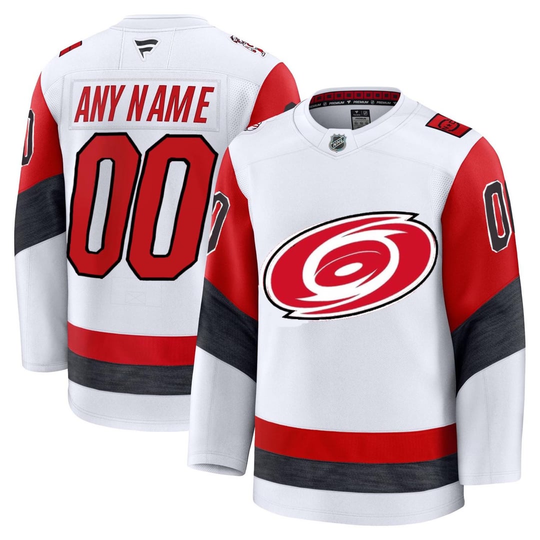
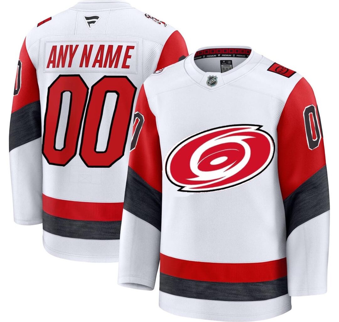
I decided to swap the black and red crest for a white and red one. I think the black crest compliments the stadium series jersey great, but it feels very heavy on this one. I think it really pulls the design together having the colors of the crest match the jersey itself.
I also added a trim to the numbers. I think giving them a bit of added color and weight makes them feel less like an event kit and more like one you’d see on a typical away sweater. Once again, a design element that works great for the stadium series but not as much in the typical arena setting. Overall I think it makes it a bit easier on the eyes too.
No big changes, but just little small things I think make the jersey fit a bit better into our kit and fix some of the issues people have with them!
This looks a lot better than the final product. I’d still prefer the regular swirl logo over a two-tone look, however the change you made is a nice upgrade nonetheless.
Can you do a version with big all-white numbers (similar to stadium series size/font/location but white instead of black) and the traditional 3-color logo? I think this is the version I would have gotten really stoked about.

5 comments
Honestly this is the better move since the double up on the stripes on both the sleeves and waist of the jersey are a bit much with the bold black and red logo
I really like the new sweater but it still feels like an event sweater rather than a true road one.
I decided to swap the black and red crest for a white and red one. I think the black crest compliments the stadium series jersey great, but it feels very heavy on this one. I think it really pulls the design together having the colors of the crest match the jersey itself.
I also added a trim to the numbers. I think giving them a bit of added color and weight makes them feel less like an event kit and more like one you’d see on a typical away sweater. Once again, a design element that works great for the stadium series but not as much in the typical arena setting. Overall I think it makes it a bit easier on the eyes too.
No big changes, but just little small things I think make the jersey fit a bit better into our kit and fix some of the issues people have with them!
This looks a lot better than the final product. I’d still prefer the regular swirl logo over a two-tone look, however the change you made is a nice upgrade nonetheless.
Can you do a version with big all-white numbers (similar to stadium series size/font/location but white instead of black) and the traditional 3-color logo? I think this is the version I would have gotten really stoked about.
https://preview.redd.it/ulrxzkjo2lqf1.png?width=1200&format=png&auto=webp&s=fdcd9d6321835434cababcc8d370ffba938cce7f
Your version is better