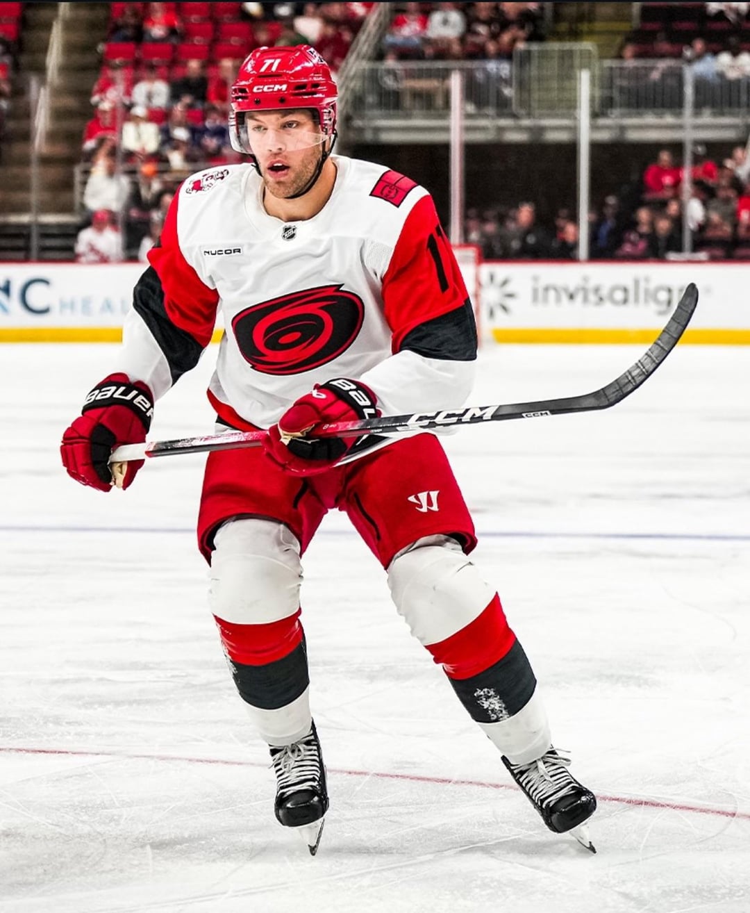
i mean, come on guys.. the jerseys arent THAT bad.
September 23, 2025
i mean, come on guys.. the jerseys arent THAT bad.
34 comments
I like them so much better than the old road jerseys.
Out of all the away jerseys, this one is my favorite. That bar to clear was in the deepest circle of hell though for me and I think I like it because Dubdon obviously wanted an away jersey that isn’t white so he put as much color in as possible.
We went from a 3/10 to a 5/10, so I’m satisfied for the time being. Maybe when the moratorium is up in three years, we can switch to a 7.
Pretty meh to me. Something about the colors going all the way up to the shoulders doesn’t look right.
I’m ngl they look so much better in person. Don’t knock them til you’ve seen them live
Temu Red Wings jersey… as someone noted earlier in the sub, they are the bastard child of the NJ Devils and Red Wings jerseys.
I love these so much
I wouldn’t buy one honestly…the color combo just looks weird
They’re fine. Might grow on some. Might not. They look better up close than from the broadcast angle.
Tbh I like them so much more than the old away kits
They kinda look like watching a game in high contrast mode.. which isn’t entirely a bad thing. Lol
As an outsider, not the biggest fan.
As time passes I hate them less and less.
I dunno, there’s just something off about them. The balance or something. Can’t put my finger on it.
My biggest issue is the black numbers on the arms are hard to read, maybe it’s easier in person or on non jumbotron feed though. I’ll take it over the old aways.
Let’s Beyblade!!!
It’s just meh. I won’t be buying a jersey.
Better than the last whites IMO.
Think I’m the only person to like the old whites lol
To me it looks better like this with the whole kit, but it’s still not a great jersey because of the sleeves.
Imo it would look great if the black and red on the sleeves were smaller and down toward the gloves so it sorta mirrors the band around the bottom of the body. With them so large and up high, I feel it makes them weird, like a box with two arms instead of a cohesive look. I’d almost like to see the black and red continue across the middle of the chest, behind the logo, with the sleeves how they are but that’s probably weird too.
Helmet logo looks retarded
Love em. Looked sick on the ice
It’s very meh. Screams of trying too hard for something “cool” or edgy. Honestly like the old jerseys. Just make a road version of the home or Alts or shoot take a page out of the rangers book and put “Carolina” across the front.
Needs some consistency
I like them.
I still don’t understand why they won’t just use the alternate jersey but make it white. It has the storm flags and everything. It’s perfect, but they won’t use it.
05/06 Canes had perfect jerseys.
They’re pretty fucking lame
These are embarrassing. And not in a good way
They are better in person but they would have looked sick with the flag logo.
The edits make them even more contrasted which is the problem with the stadium series logo.
Looks like they were designed in CorelDRAW and then remastered in Macromedia Fireworks. Retro in all the wrong ways.
FO needs to stop trying so hard with making something new and just go back to the away jerseys from the early 2000s
It’s just alright. But the numbers on the back need a black outline
I think theyre a fine alternative jersey
Terrible
as I predicted they’d look great on tv. my biggest gripe is just the logo. I think everything else is fine. though I will say I wish they made stormy wear a red jersey, the shoulder patch looks lopsided