Huh??? Are you hiring? Because I am available and you need help.
11 comments
What’s wrong with it 🤔
Our media team has been a struggle for as long as I can remember.
We have very little if any content available on any of the platforms
Super cringe video clips
Comparatively to other organizations, we are way way behind.
Embarrassing when you attend elsewhere to see how polished of a presentation it is.
I like to think it’s pre season and they could give a fuck less
I actually think the Ducks generally do a really good job at their game day presentation.
If you want to see a poorly executed fan experience, head on over to Angel Stadium 😆
It’s preseason for everyone, no need to be a jerk.
It’s preseason…for everyone 😂
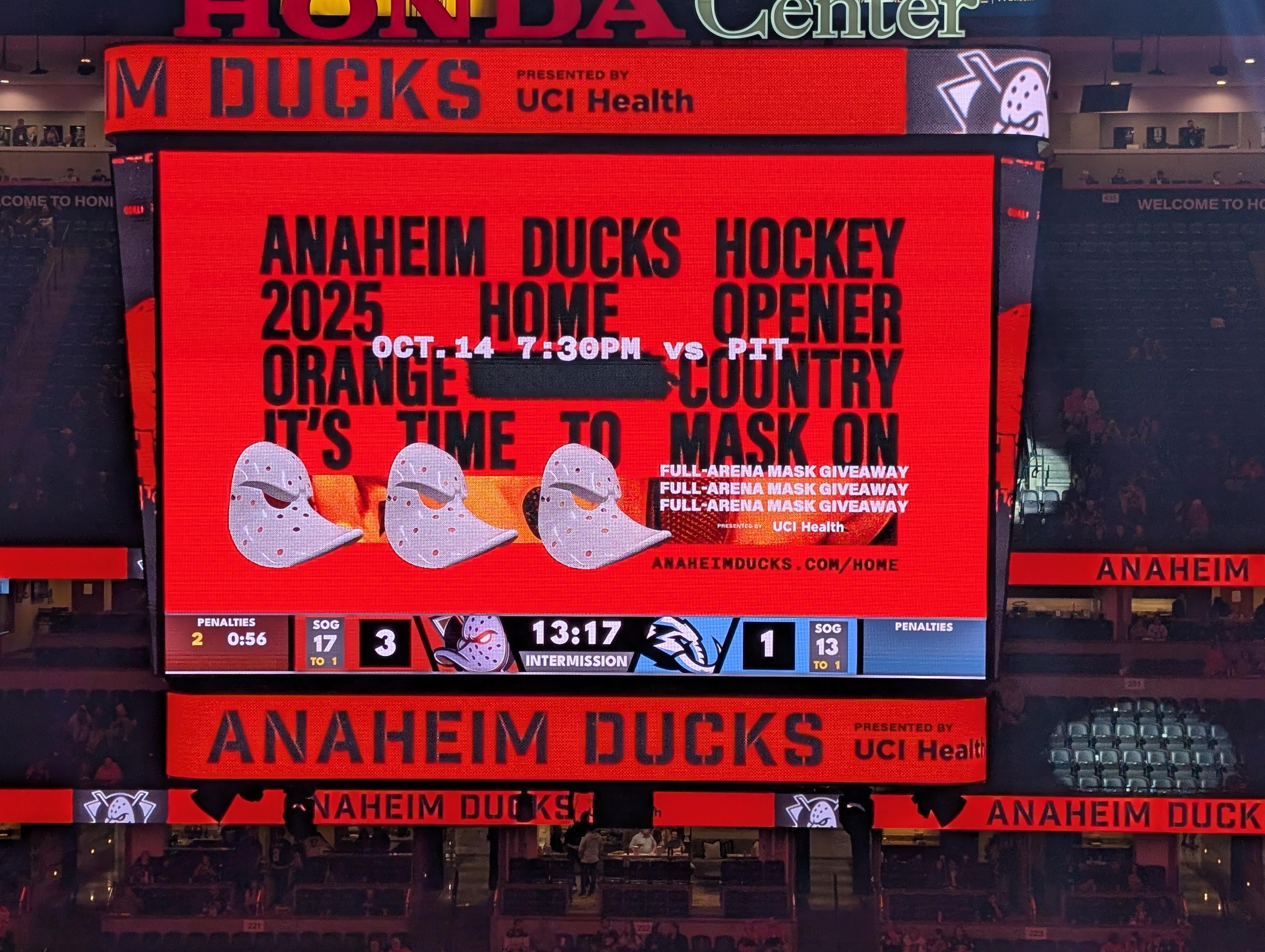
Anaheim ducks hockey 2025 home opener Orange >!County!< country it’s time to mask on
People have various visual comprehension ability, and whether you need the whole picture in one glance to understand or you just need the parts that’s important, that picture you posted marks both checkboxes.
In white you have the date, mask and supportive info it’s a mask giveaway. Some people that’s all they need and everything in black and orange is just a background. You can even throw a photo as a background and with the white info it still gets the same info across.
If you read the black text line by line, it gives you the main info in the first two lines and you may not read the rest, because that’s all you care for.
For those that need to read everything, first 2 lines in black, broken with white date and your eyes may move on to the white mask and supportive mask info. If your eyes don’t follow the white text only, it goes on to the familiar Orange Country slogan, tells you the action you need to do “it’s time to mask on”, then followed up with how to do it by getting the mask giveaway in white. If you still need more info here’s the website where your eyes would follow after reading the mask giveaway info
As for the block justification of the black text, well, the scoreboard is a block shape. The white mask is the odd object in both shape and alignment. Your eyes may gravitate to that first before anything else. It got your attention.
Whoever did the graphic got the assignment right. It may or may not be visually appealing to some because it’s not some desaturated action photo with text overlay.
And no, I don’t work for Ducks media or on a personal level know the media team.
While you’re there, talk to the person who invented “orange countRy” cause it sounds MFing awful
I haven’t enjoyed our graphics in a while. This just screams messy to me and my eyes going in 5 different directions trying to figure out what to read first.
Since everyone is piling on me like I just tapped the goaltender with my stick a couple.seconds after the whistle, I’ll go into more details what’s wrong with this.
First, the block spacing as others have pointed out, is a bad choice behind everything else. The largest text is not immediately understandable because of the spacing and that strange black line in the middle. What is that? Is it supposed to be a puck? And yes, I read it top to bottom first column instead of first row across because of this spacing and that black blob in the middle.
Second, the teeny tiny white text in the middle is not centered with the rest of everything and is hard to read.
Third, in the bottom right corner there is more teeny tiny hard to read text that is repeated three times for some reason, and also for some reason is not centered on the weird box that I also can’t tell what it is supposed to be or why it is there.

11 comments
What’s wrong with it 🤔
Our media team has been a struggle for as long as I can remember.
We have very little if any content available on any of the platforms
Super cringe video clips
Comparatively to other organizations, we are way way behind.
Embarrassing when you attend elsewhere to see how polished of a presentation it is.
I like to think it’s pre season and they could give a fuck less
I actually think the Ducks generally do a really good job at their game day presentation.
If you want to see a poorly executed fan experience, head on over to Angel Stadium 😆
It’s preseason for everyone, no need to be a jerk.
It’s preseason…for everyone 😂
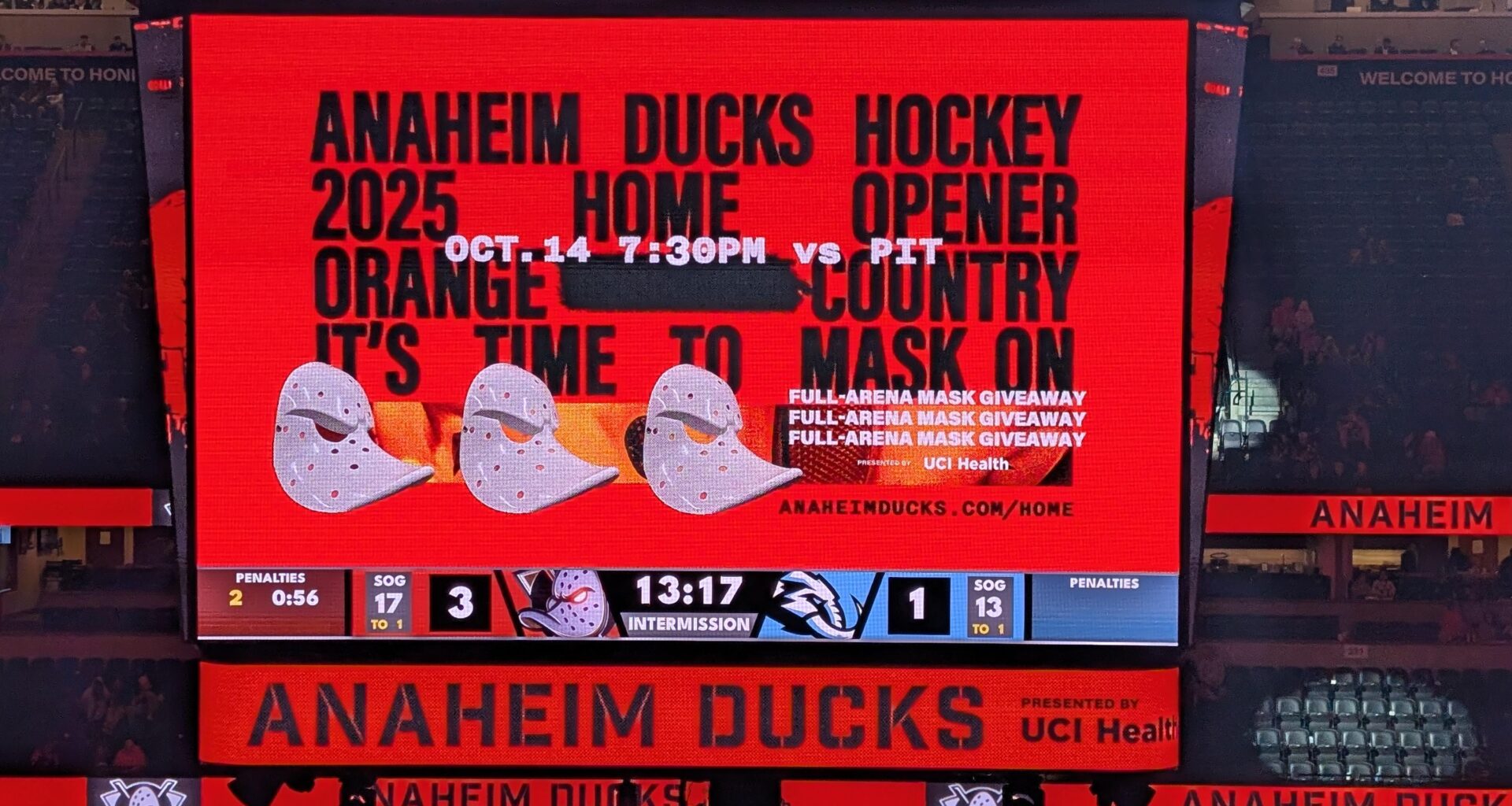
Anaheim ducks hockey 2025 home opener Orange >!County!< country it’s time to mask on
People have various visual comprehension ability, and whether you need the whole picture in one glance to understand or you just need the parts that’s important, that picture you posted marks both checkboxes.
In white you have the date, mask and supportive info it’s a mask giveaway. Some people that’s all they need and everything in black and orange is just a background. You can even throw a photo as a background and with the white info it still gets the same info across.
If you read the black text line by line, it gives you the main info in the first two lines and you may not read the rest, because that’s all you care for.
For those that need to read everything, first 2 lines in black, broken with white date and your eyes may move on to the white mask and supportive mask info. If your eyes don’t follow the white text only, it goes on to the familiar Orange Country slogan, tells you the action you need to do “it’s time to mask on”, then followed up with how to do it by getting the mask giveaway in white. If you still need more info here’s the website where your eyes would follow after reading the mask giveaway info
As for the block justification of the black text, well, the scoreboard is a block shape. The white mask is the odd object in both shape and alignment. Your eyes may gravitate to that first before anything else. It got your attention.
Whoever did the graphic got the assignment right. It may or may not be visually appealing to some because it’s not some desaturated action photo with text overlay.
And no, I don’t work for Ducks media or on a personal level know the media team.
While you’re there, talk to the person who invented “orange countRy” cause it sounds MFing awful
I haven’t enjoyed our graphics in a while. This just screams messy to me and my eyes going in 5 different directions trying to figure out what to read first.
Since everyone is piling on me like I just tapped the goaltender with my stick a couple.seconds after the whistle, I’ll go into more details what’s wrong with this.
First, the block spacing as others have pointed out, is a bad choice behind everything else. The largest text is not immediately understandable because of the spacing and that strange black line in the middle. What is that? Is it supposed to be a puck? And yes, I read it top to bottom first column instead of first row across because of this spacing and that black blob in the middle.
Second, the teeny tiny white text in the middle is not centered with the rest of everything and is hard to read.
Third, in the bottom right corner there is more teeny tiny hard to read text that is repeated three times for some reason, and also for some reason is not centered on the weird box that I also can’t tell what it is supposed to be or why it is there.
It’s a bad graphic.