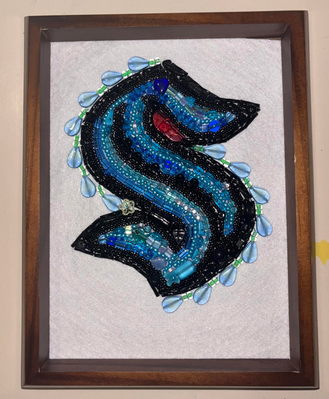
Update to finished product, added some glow in the dark effect and am really pleased. It didn’t show up that well on camera but the teardrops have a heart shape that appears.

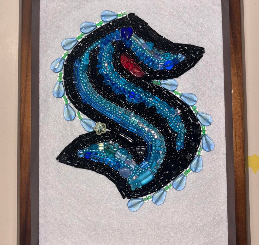
Update to finished product, added some glow in the dark effect and am really pleased. It didn’t show up that well on camera but the teardrops have a heart shape that appears.
1 comment
I liked the cleanliness of the original.
However, I *love* this jazzed-up version. The teardrops along the outline give a “water, but fabulous!” look, and the glow effect is delightful.
I’m of two minds on the flower bead. I think it’s a cleaner, more subtle look without it. On the other hand, it kind of looks like the logo is wearing a flower behind its ear, and that’s pretty cute. 🌺