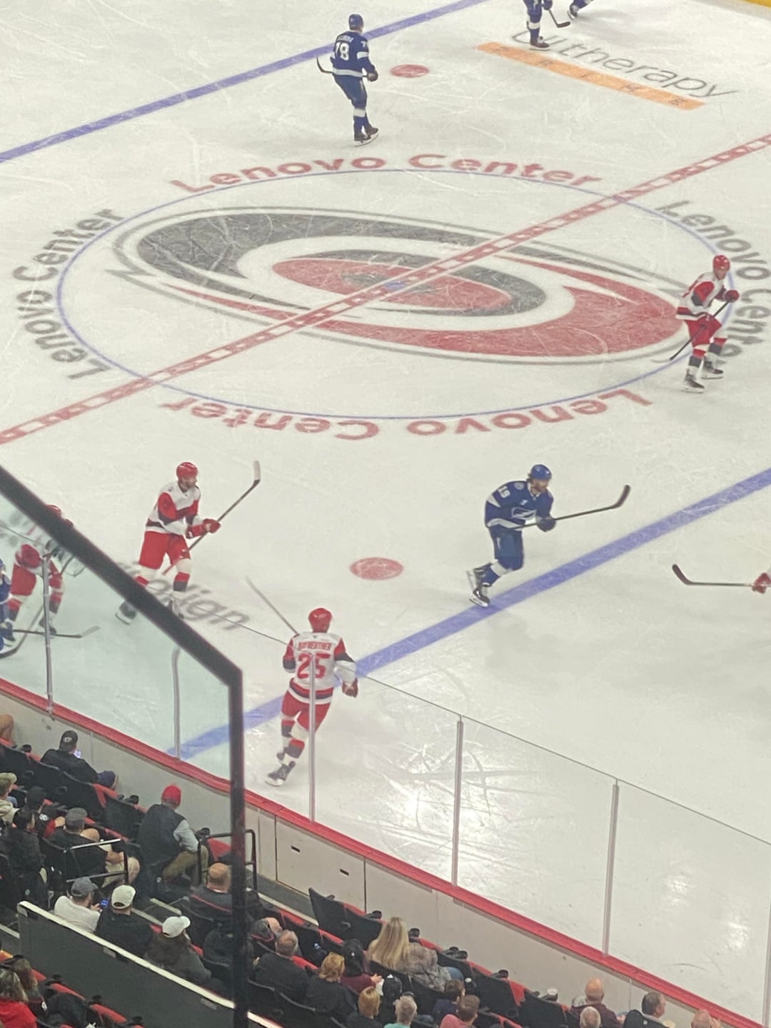
I hated the reveal, feeling like the original black version was better. I still believe this, however these jerseys are pretty aight on the ice. They look better than I thought they would, will probably grow on me

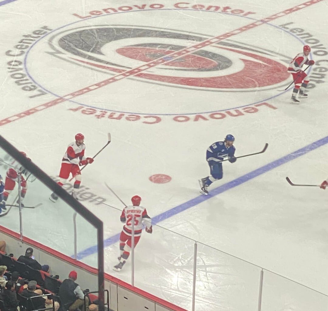
I hated the reveal, feeling like the original black version was better. I still believe this, however these jerseys are pretty aight on the ice. They look better than I thought they would, will probably grow on me
13 comments
They look like knockoff red wings jerseys imo
Man… that center logo is just… not great.
The stormy logo was the only part I like.
May be they will look better with white pants? Too much red for an away kit
It sucks.
I don’t get the love with wanting to do a road version of the stadium series jersey. The SS jersey they wore was very meh as is a lot of those things that are supposed to be worn once.
Maybe if it had the double flag I might like it but I can’t stand how awful the logo is, the rest of the jersey is crap too.
Black pants would be better
these jerseys look like bad temu knockoffs
Nah man these suck.. in every aspect these are terrible. Lazy design, poor coloring choices, and shitty brand incorporation. These are bottom tier and will probably be retired within 3 years. I’d rather see the “canes” word mark than these bullshit ass jerseys
Wow that crest looks like ill-defined shit
Hopefully management picks up on the vibe and makes a change, but i can confirm……the chest logo is absolutely awful. From close or far. I cant imagine pitching that scheme, let alone approving it. It’s actually kind of embarrassing.
The numbers/ names, but mainly numbers, need lined in black so badly. Brutal to actual try to read who’s who.
…they look even worse on the ice than in the pictures. The logo is just a blob
Same here. They looked awful in the reveal video but aren’t too bad in action