
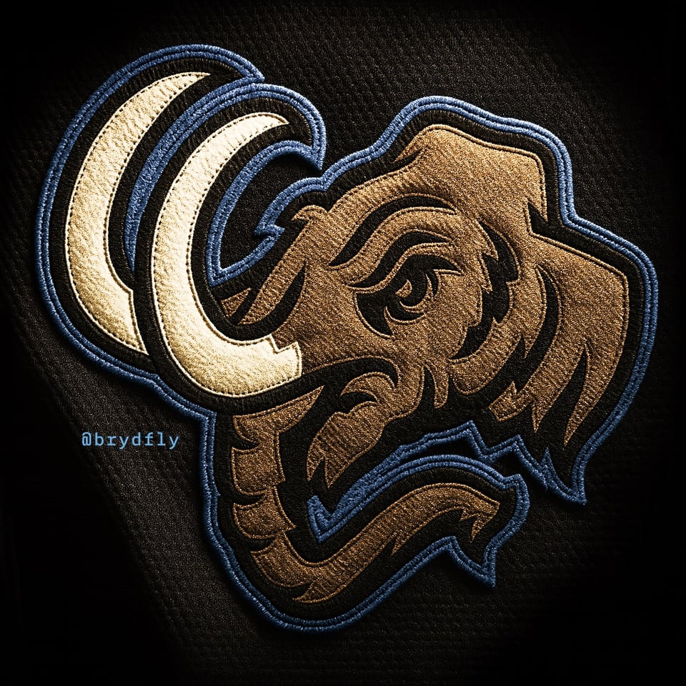
My last crack at a Mammoth logo (def my final outing logo-wise, currently working on a mammoth character for a larger hockey series) had me looking at bringing in copper (I'd only use it for the logo, prob not copper trimmed jerseys), and I liked the idea pushing the notion of a U with the tusks. Compared to where the team ended up, I wanted tusks/trunk and shifted away from "mountain" in an effort to be more "mammoth." A little hint of state outline where the tusk meets the fur. Rather than doing a broad of family of marks, I saw potential for overlap, like the tusks on the full head match the tusks from the shoulder patch. All in all I was pleased with where it ended up, so I figured it's worth a share.
2 comments
SOLID! Would be fun to see as a “retro” style sweater similar to like the classic Red Wings or Blackhawks jerseys.
I’m just saying that I NEED that Mammoth logo from your larger hockey series on a shirt. It reminds me of Mung Daal from Chowder and I love it lol