
San Jose Sharks Reveal NEW 35th Anniversary Jersey!
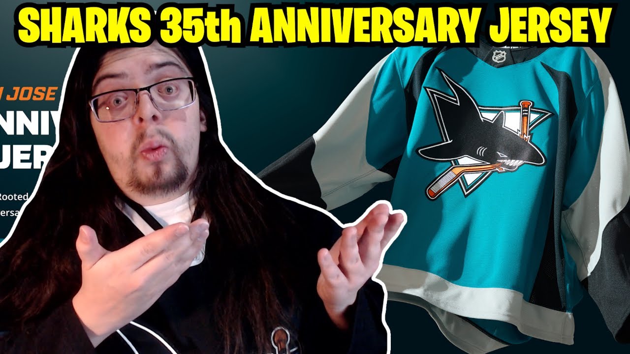
Another day, another new jersey to take a look at. This time it’s from the San Jose Sharks, revealing their 35th anniversary jersey. I’m going to be honest, I find it a little bit strange that they’re doing a 35th anniversary jersey and even celebrating their 35th anniversary. I mean, I guess you could do a patch, but I don’t even see a patch on these jerseys. So, I just found it a little bit odd. I definitely did not expect a 35th anniversary jersey from the Sharks. I didn’t even know that they were getting a new jersey this season. I didn’t know it was their 35th anniversary. So, this one was definitely a surprise to me. I did not know it until late yesterday. Well, I guess technically for you guys, it would be 2 days ago. I’m recording this on the 26th, like late at night on the 26th, so that’s why it’s going to upload in the morning on the 27th. Uh, but yeah, so for myself, late last night, I realized that they were doing an announcement and it looked like that they were probably doing a jersey announcement and that was the first time I even heard that the Sharks were getting a new jersey this season. Um, so yeah, it was just unexpected to myself, but anyways, doesn’t really matter. Before we do take a look at the jersey, if you guys are new to the channel and you like hockey jersey content, please make sure to hit subscribe. I really appreciate it. And let’s take a look. Here it is. This is the Sharks 35th anniversary jersey. It is a throwback to their 1997 to 2007 jerseys, which actually started off as a third jersey. Then it became the Away and then it became the home jersey. And of course, now it’s an anniversary jersey. So, it’s had quite the journey. I will admit I’m a little bit surprised that they brought back these jerseys, but I’m also surprised how many people say that they like these jerseys. I did not assume that people would like this thing. I guess I never really heard too many people’s opinions on this jersey, but yeah, I I definitely would have thought that if you ask me the general consensus about these jerseys, I would have said that it’s negative because it is not your usual jersey. The striping is really unique and just goes in different places. It’s very strange. Like, it’s a strange looking jersey, but I do like it. Like I’m not saying that I dislike the jersey. I like it myself. Uh but I usually like those ugly jerseys that a lot of people don’t like. For example, like the Barber Pole and the Motorist jersey and the fisherman jersey and the storm jersey. Like those jerseys that are dumb and don’t look very good. I love them. But most people, they don’t. And that’s fair. I don’t blame them. And with this one here, even though it’s definitely not on the same level as those jerseys, I thought it would fall in a similar camp. And I I guess I just never really heard too many people talk about this jersey. either when it was actually being worn or just after the fact as well. Anyways, let’s actually talk about the details on this jersey. So, yeah, kind of similar to what the Wild did where it is really, really similar to their original jersey that they’re throwing back to. There are some minor changes, but it’s very minor. It’s not a whole lot different. You do have the original Shark on the front, which I do like this logo a lot. I think the logo looks great. My only I I don’t want to say an issue because it’s not really an issue, but the one thing about this logo on uh what is now like the Prime Green logos, the uh upgraded 3D effect logos uh that you know started in Adidas and now have kind of continued over to the Fanatics is that this logo doesn’t really have a whole lot of that kind of detail in it. Like really the the biggest detail that you get out of this logo is right where the shark is breaking the stick itself cuz you really don’t have a whole lot of detail on the shark, right? The shark is just one flat thing and that’s it. And I’m not saying that as a bad thing. It just I feel like this logo doesn’t really look that fantastic. It just doesn’t really have that pizzazz I feel like that a lot of the other 3D logos have nowadays. Um, so yeah, that’s just one thing that I wanted to mention. Like I said, it’s not a flaw. It’s not a negative thing. It’s just something that I kind of thought about. With the striping though, that’s where this jersey does get really weird. So, we can take a look at the black stripes, which start at the bottom of the jersey and come up all the way right to the chest, and they just come up like kind of like teeth in a way, but they’re not really shark teeth, cuz shark teeth don’t really look like that. So, not sure exactly what that striping is supposed to be like. Uh, I don’t remember if they said back in the day what it’s supposed to be like, but yeah, it’s a weird stripe. Definitely a weird stripe that I kind of sort of like, but also I don’t like at the same time cuz it’s really awkward, but it’s different and I I don’t mind when stuff is different. But that’s not the only weird stripe because you also have the gray that starts up at the collar and goes down and then gets wider as well and kind of encapsulates the whole arm. Uh then it’s cut off by the black cuffs there. Um so yeah, it’s just weird striping that I do kind of like. Like it’s it’s unique for sure. Now, one of the things that they did change with this jersey, of course, is the collar itself because you can’t have the plunging neckline with these new Fanatics jerseys here. So, I I I feel like the collar is a little bit thick. I talked about this with the Minnesota jersey that we talked about yesterday where I prefer, honestly, the plunging collars. I think they just look a little bit better. Uh cuz these ones right here, I feel like are too thick. It’s not super distracting. I just do prefer the older collars. Our next picture though is just from the side. So, we can see that striping a little bit better and how the black even comes up from the cuff into almost like the elbow area. So, yeah, it’s weird striping that, like I said, I do think looks pretty nice. Um, one interesting thing I guess I can mention as well is the helmet. It is a matte black helmet. Uh, so yeah, that I think actually does look quite good. Um, we can see a little bit of the numbers there. So, it’s just black numbers with a white outline. I will talk about the numbers a little bit more though uh later on when we actually take a look at the back of the jersey. Before we do that, let’s take a look at inside the back of the collar. So, it has sharks for life in just a heck of a font. That font choice is awesome. It feels very I mean, I know it’s supposed to be like shark teeth, but it feels very skater vibe, like ‘9s skater vibe. That’s that’s what it reminds me of. So, I I do kind of like that. Uh, and then beside it, yeah, they just have little like actual shark teeth in an outline in teal. So, yeah, that looks different. It’s It’s something different, but it’s inside the back of the collar. Um, so I do kind of like it. Next picture is of the back of the jersey. So here we can actually see the customization. The one thing with this customization though, we’ll come back to this photo is on this graphic right here. You can see at the bottom it says classic name and number style modernized for today. But I’m going to be honest with you, I don’t notice a difference between this number kit and the older number kit. The only thing that at least I noticed, so maybe this is what they were talking about is the fact that the new one does not have a name plate or a name bar where the older one did. This new one is just the letters directly sewn onto the jersey. So maybe that’s what they were talking about when they said it was modernized because yeah, other than that, it is the same thing from at least what I can tell. And they did say that it was the same one. So yeah, maybe maybe that’s the only thing that they were saying when they said it’s modernized. I don’t really know, but they didn’t really dive any further into it. At least from what I saw, they just said that it was modernized. So, yeah, I’m going to I’m going to assume that that’s what they meant is that just the no-name plate or no name bar is the modernized version of the old school kit. Which speaking of, I love this number kit. I think it looks great. I really do like the stylization of the font, of the letters, of the numbers. I think it looks great. It fits very nicely on this jersey as well. Not quite as nice as the Wild one that we looked at yesterday or two days ago now, uh, but still very nice. Still a really solid looking jersey. One last thing that I do want to talk about with this jersey here is the gray. I’m honestly a little bit disappointed that they went with just straight gray. And what I mean by that is there was kind of two different versions with this jersey for the original time that they wore it. Now, I I don’t know the exact timeline here, so I might be a little bit off, but I believe when they first started wearing the jersey, it was under Nike. And with Nike, the gray was not just gray, it was more of a shiny silver, and it looked really, really weird. It was like a slick material. and the black was that as well. It wasn’t just the silver. So, basically, all of the sleeve and some of the shoulder was just this different material that looked really, really strange. And I think it was like that for the first two seasons, I believe. And then they switched to coho at some point. I don’t know exactly when, but when they switched to coho, uh, that is when it became, you know, just your regular gray and black. There was no kind of shiny material to it. There was no crazy aspect. It was just the regular gray, the regular black, and kind of looked exactly what these new jerseys look like. So, I do understand them not going with that shiny material because a probably maybe not the easiest to reproduce, and two, it looks really dumb. It looks really It does look dumb and I think it’s just a lot easier to go with just the straight gray and you can get away with it because that’s what they did back in the day as well. Uh, but yeah, like just looking at this thing right here, I love it. I really do. Uh, I’ve actually wanted this jersey for a while because of those sleeves, uh, because of that shiny material. It kind of looks like the same material that the older Nashville jerseys had as well. And that reverse retro 1.0 Nashville jersey. I think it was the 1.0. Yeah, it was the 1.0. I believe it was that kind of same material. So, yeah, I really definitely would have loved to see that on this new jersey. I was a little bit disappointed that I didn’t see it, but I do think that I’m in the minority there. I’ve seen a couple of people say that they would want it as well, but I don’t think too many people would have. I I like I said that one like it’s already a pretty crazy looking jersey. So to add on that shiny silver, I think that might be a step too far for some people. So I’m okay with it. I’m I’m fine with it. But yeah, my overall thoughts on this jersey are pretty positive. I do like this jersey quite a bit. I don’t think I quite like it as much as some other people. Like I I saw some people really really excited that this one is back. So for me, like I would probably give it an 8 out of 10. Like I like it. I’m happy with it for sure. Uh, but like I definitely definitely am much more excited that the Wild jersey is back uh than this one. Just comparing the two. And I’m comparing the two because they both came out like the days after each other and they’re both throwing back to a specific jersey. So, it’s a little bit easier to compare them, right? But yeah, I like this jersey. Not going to pick it up though. This is not one that I would like to get in my collection because if I did want this jersey, this style of jersey, like I said, I want it with those silver sleeves, the just the the weird ass sleeves. So, uh, yeah. Anyways, that is going to do it for me. Thank you so much for watching. Let me know what you think about this jersey in the comments down below. Do you like it more than me? I would love to hear it. That’s going to do it for me, though. Thanks so much for watching. See you guys next time. Bye.
Another one! Another one! Another jersey has been released!
Join my discord!: https://discord.gg/TgeBpaEzXH
Follow me elsewhere
TikTok: https://www.tiktok.com/@thejerseyzone
Twitter: https://twitter.com/TheJerseyZone
Instagram: https://www.instagram.com/thejerseyzoneyt/
7 comments
I won’t be adding this one either. I was never a fan of this look for them. I love their original heritage jersey and any of their black looks.
Other teams I heard will be coming out with new jerseys this season: Colorado (Nordiques throwback), Pittsburgh, Toronto, Dallas, LA Kings, Chicago (Black alternate?)
Maybe im the only one but I just feel like this is unnecessary
Why would I get this when I have one of the originals from 25 years ago?
the black helmets and pants looks so much better than the full teal.
They do need a 35th anniversary patch for sure eh😐
This is the jersey that they wore when i first became a fan. Never had the opportunity to buy in when i was younger and the Mitchell and Ness version didnt do a good job of replucating the original. This was instant purchase for me.