
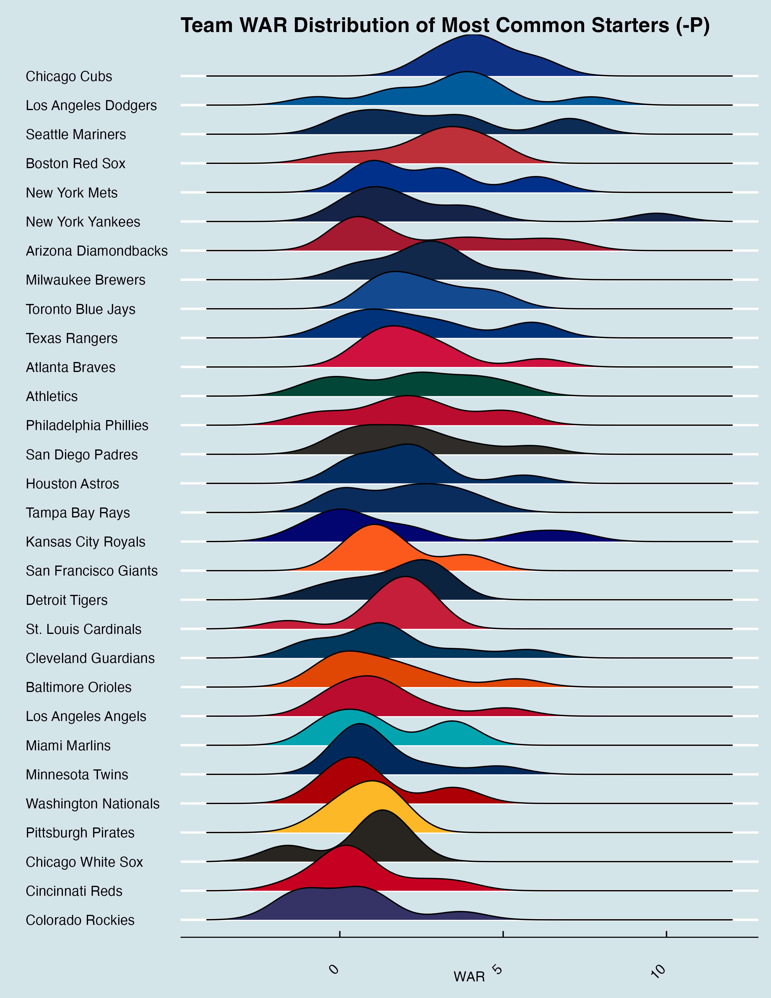
source: https://www.baseball-reference.com/leagues/majors/2025-team-starting-lineups.shtml and generated in R with geom_density_ridges().
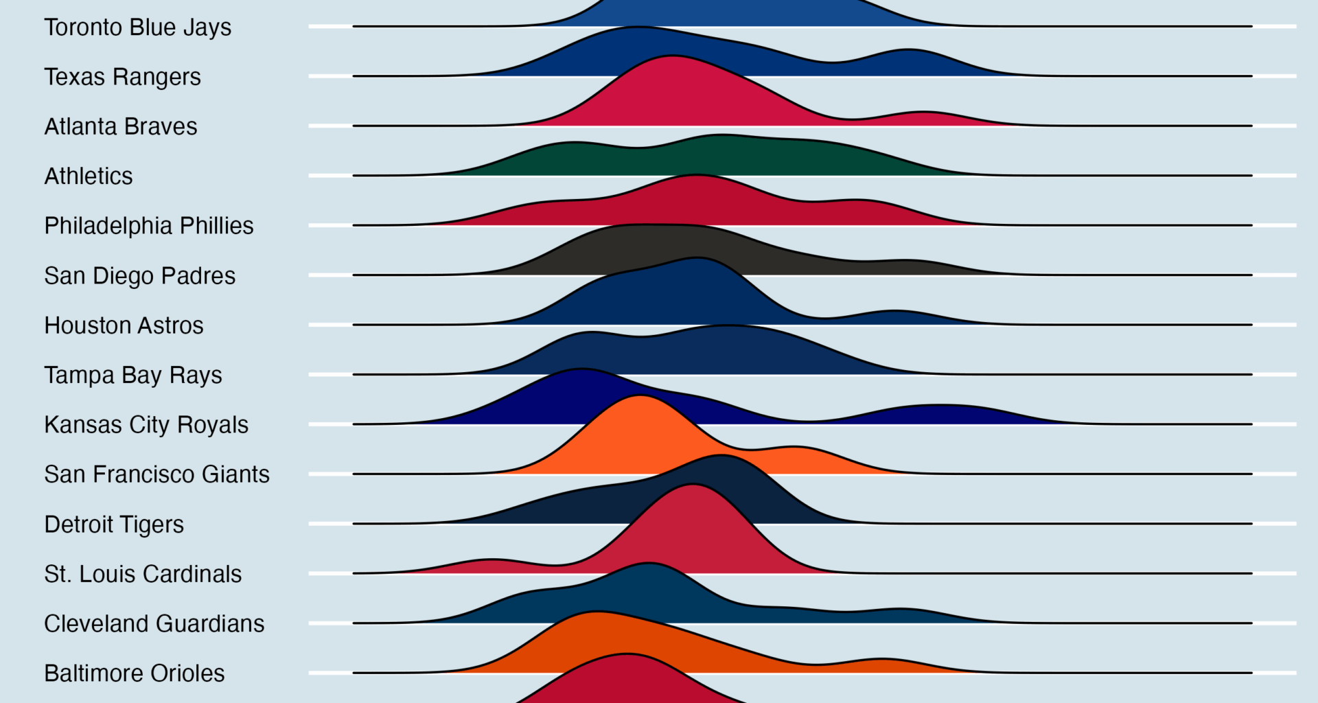
I wanted to see how the distribution of our average starting lineup looks compared to the rest of the MLB. Holy cow it‘s worse than I thought. It’s amazing that this team made the playoffs.
4 comments
Nice work, cool visual. We need some jimmies and joes
Making sure i get it, does a right ward tail indicate small number of players carrying the team?
Im going to guess if you included the rotation it would probably be a better measure of why they made the playoffs.
Reds Rank in Wins Above Average
Pos| WAA|Rank
—|—:|—:
C| -0.6|20th
1B|-2.1|25th
2B|-2.3|29th
3B|-2.4|30th
SS|1.2|17th
LF|-1.9|25th
CF|0.1|16th
RF|-1.2|20th
DH|-1.2|20th
SP|12.1|2nd
RP|1.4|4th
https://www.baseball-reference.com/leagues/majors/2025.shtml