
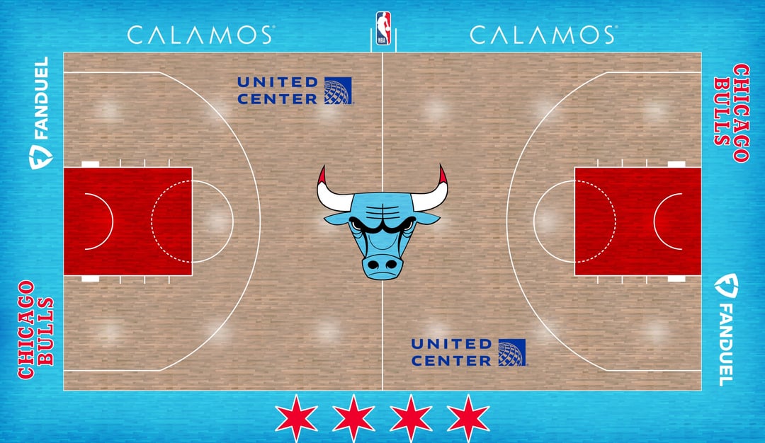
Hey Bulls Fans, I’m back again with another update to the “City of Chicago” Bulls City edition I was working on. I included a new court with the jersey I had for you guys last time. I know it’s some confusion with the design for the jersey but I’ll explain.
I used a few different elements from Bulls past to achieve this jersey I worked on:
-
Lower numbering is an element from the Michael Jordan rookie season jersey.
-
The “Windy City” across the chest is admittedly not a nod to the G League team but the city’s moniker.
-
Pinstripes from the Jordan era as well, obviously
-
Lastly, the Flag of Chicago is a heavy inspiration used all over the jersey with the sky blue and red as shown on its flag.
I hope you guys enjoy and thank you for inspiring me!
35 comments
fun project and the outcome is pretty cool, if not a little too loud, but I do love that the Bulls logo has not changed since the team started and it still looks good today
Gonna pass on this , call me old fashioned but I’m good with bulls current set-up
Gotta say i would love for the bulls to embrace the cityflag more. Personally I absolutely love the blue bull but i guess it would be to crass of a change for most people.
I think this is the court for the Chicagarlotte Bornets
Blue Bulls
I think a semi-dark grey that has a little shine to it would be cool as well. Just dark enough that it doesn’t ruin or blur the features.
Chicago has “blue bulls”
I’d love this for like the in season tourney
I’m buying all of this merch
Where did you get the jersey template from?
Only change I would make – flip the bulls logo back to red and maybe have the horn tips blue.
From a design perspective, I like it!
As a city jersey this would be cool but a full blown rebrand no. The bulls branding is the best part of the team and is iconic worldwide. Would be kinda dumb to change it permanently imo.
They should put lettering that says “FUCK ICE”
Blue tips, red face. Otherwise I can get behind this
Shoot this in the face and bury it in the desert.
I like these jerseys. I think the bull on the court being blue looks weird tho
Dope tribute, but I think you need more white or ash grey to the wood floor. Little more on brand for the flag.
Would keep the Bull logo red as well- cause it would “pop”, and bring the stars back to the flanking the logo.
The jersey is 🔥though. I’d cop on of those rn.
I like this but the logo shouldn’t change from the red. Also, so the red on the tips of the horns is blood? I mean this does make sense, I just never thought about it like that.
I think the bull on the court should stay red but everything else looks great. Jersey is dope.
Good as a City Edition but the current branding and colors are timeless
Change the mid field logo back to a red bull, and Im with ya.
Yo that jersey is dope!
would be great as a colorway but there’s no replacing the classic bulls red
Ew

Who choked out Benny? 😭
This looks dumb
I said it last time you posted. This is a great jersey like the Sox City Connect jerseys. Not sure about the court though. A little too much blue…but it’s a great concept. Keep it up.
🤮
CM PUNK !!
Blue bulls. Because they keep us teased and never follow through
This is BAD
Keep the bull red at least…
A rebrand is the last thing this organization needs
I’d like to see the classic Bulls logo somewhere smaller and off to the side, with the Windy City text center court. Thinking something similar to what Miami Heat did with Miami Vice theme and their court.