
Hey everyone! Here’s my latest concept for the Chicago Bulls City Edition, inspired directly by the Flag of Chicago
I went for a cool sky blue base with red & white accents to match the flag’s energy, and kept the Windy City script for that local flair.
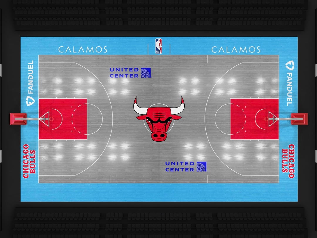
The court’s ash grey was a great suggestion from u/ajax444, and I also switched the Benny logo back to its OG color based on everyone’s feedback, appreciate y’all’s input on that 🙏
Wanted the whole set (jersey + court) to feel clean, modern, and still distinctly Chicago.
Let me know what y’all think. Any tweaks or color changes you’d make next? 👀
Lastly, sorry for all the updates and new posts. This has been a really fun concept to work on and even though it’s a divided welcoming, I enjoy every comment. Thank you again everybody!
9 comments
I dig it! I’ve always wanted a script bulls jersey that says Windy City, super cool to see others with the same vision.
This should be the in season tournament court.
Nice edit, don’t forget the iconic bull logo at the elbows. Could add Chicago flag instead or something
Like this one much better, nice design.
My guy! He’s back. Great work – love this concept. Would love to see Bulls do this and wear the Chicago City unis.
Fire! 🔥
These jerseys are really great man
Ohhh this concept goes *crazy*! 🔥 The ash grey court with that OG Benny logo update gives it such a clean, modern vibe while still keeping that classic Chicago feel. It’s got that gritty, vintage street energy — like something that perfectly fits the Bulls’ identity.
It might look cool to have the center court icon be Benny the Bull’s head (the mascot) rather than the team logo. Just an idea!
We really don’t need more of these flooding the sub every day